CRO breakdown of ACTIVE's monthly giveaway landing page. Design analysis covering contest-driven list building, product bundle display, and DTC email capture strategy by Apexure.
What is ConvertScore™? ConvertScore™ is Apexure's proprietary landing page performance metric. We evaluate every page across four dimensions — Copy & Messaging, Layout & Hierarchy, Trust & Social Proof, and CTA & Conversion Path — to produce a single score out of 100.
A DTC brand selling appliance cleaners on Amazon has a problem: Amazon owns the customer relationship. The buyer’s email, purchase history, and reorder patterns all live in Amazon’s system. The brand gets the sale but never builds a direct relationship with the buyer.
Giveaway pages solve this by building an owned email list outside Amazon. ACTIVE runs a monthly giveaway where visitors enter their name, email, and address for a chance to win a year’s supply of appliance cleaners ($110+ value). Every entrant becomes a contact ACTIVE can email directly, product tips, new launches, seasonal offers, without paying Amazon for access to their own customers.
The page is simple on purpose. Three sections, no navigation, one form, one secondary CTA. A giveaway page does not need to educate or build trust the way a product page does. The offer is free. The only conversion barrier is the form.
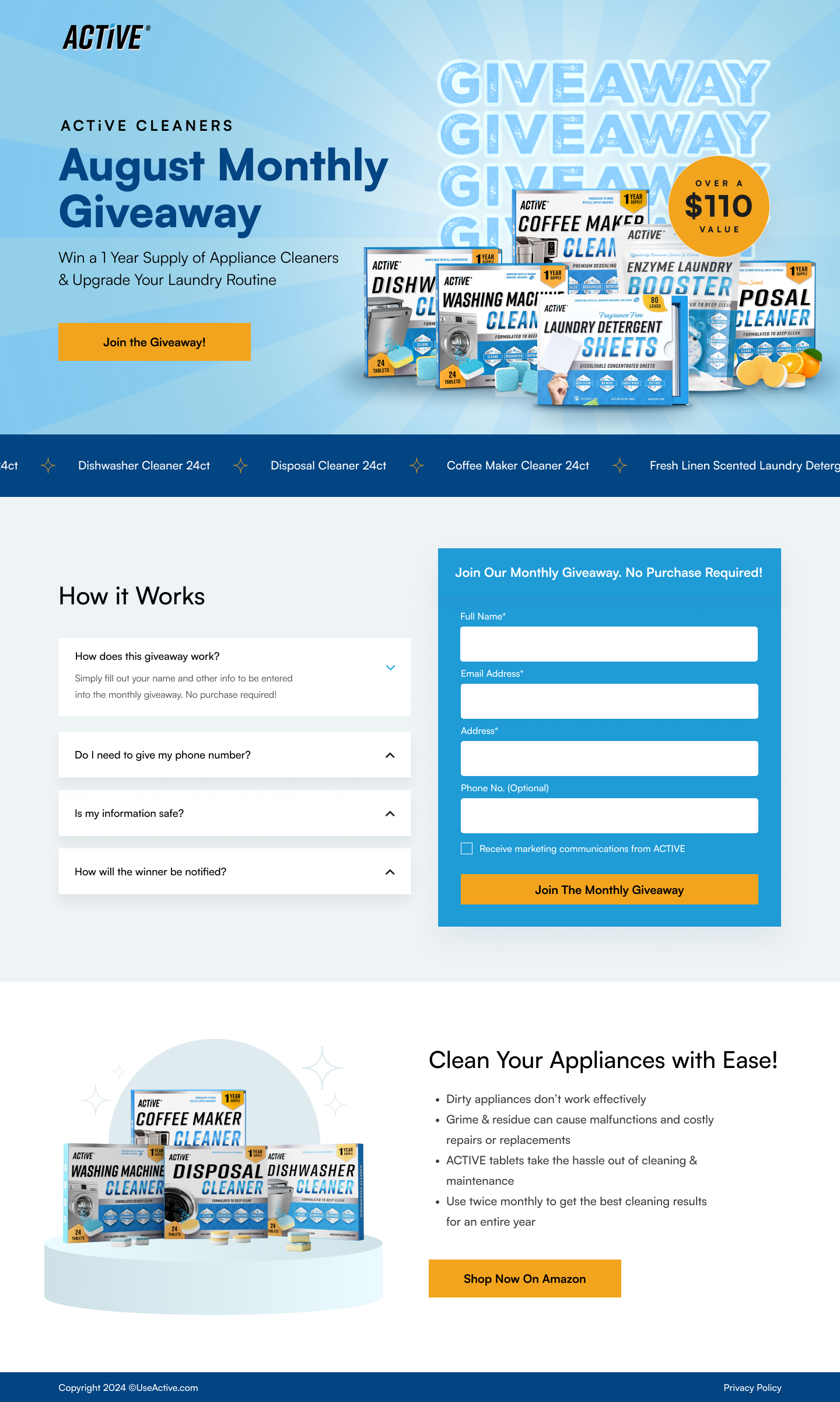
The hero shows six ACTIVE products stacked together: Coffee Maker Cleaner, Dishwasher Cleaner, Washing Machine Cleaner, Laundry Detergent Sheets, Enzyme Laundry Booster, and Disposal Cleaner. A gold badge reads “Over A $110 Value.”
The $110 figure does the heavy lifting. Without it, the visitor sees “free cleaning products”. Nice, but vague. With it, they see “$110 worth of products for free”. A specific value that makes the form worth filling out. The anchoring effect means the visitor evaluates the effort of completing the form against the $110 reward, and the reward wins easily.
The blue sunburst background radiates outward from the product stack, creating a sense of energy and celebration. This isn’t a clinical product page. It’s a contest, and the design should feel like one. The “GIVEAWAY GIVEAWAY GIVEAWAY” watermark text behind the products reinforces the message for visitors who scroll fast and only register large visual elements.
Below the hero, a horizontal scrolling ticker lists individual products: “Dishwasher Cleaner 24ct · Disposal Cleaner 24ct · Coffee Maker Cleaner 24ct · Fresh Linen Scented Laundry Detergent…”
This ticker serves two purposes. First, it adds subtle motion to an otherwise static page, keeping the visitor’s eye engaged. Second, it itemises what’s in the bundle. The hero shows the products visually, but a visitor scanning quickly might not identify each one. The ticker spells them out in text so every product registers.
Four accordion items: “How does this giveaway work?”, “Do I need to give my phone number?”, “Is my information safe?”, “How will the winner be notified?”
These aren’t generic FAQ questions. They’re the specific objections that stop people from entering giveaways. “Do I need to give my phone number?” addresses the privacy concern directly. The answer is no, it’s optional. “Is my information safe?” addresses data anxiety. “How will the winner be notified?” addresses the suspicion that giveaways are fake and nobody actually wins.
The FAQ sits to the left of the form, so the visitor can read answers to their objections while the form is visible on the right. That spatial relationship means the visitor doesn’t have to scroll away from the form to find reassurance. Both are visible simultaneously.
The side-by-side layout of FAQ and form is the page's best design decision. On most giveaway pages, the FAQ sits below the form. The visitor scrolls past the form, reads the FAQ, then has to scroll back up to enter. On this page, they read the FAQ and the form is right there. Reducing the distance between "I have a question" and "I'm ready to enter" eliminates the scroll-back friction that kills completion rates.
The form asks for: Full Name, Email Address, Address, Phone No. (Optional), and a marketing consent checkbox. That’s more fields than a typical email capture.
The address field is the important one. It does three things: qualifies the lead as a real person (bots don’t enter addresses), enables prize shipping, and gives ACTIVE geographic data for future marketing (they can send location-specific offers or identify which markets have the highest interest). The optional phone field captures extra contact data without increasing abandonment.
The marketing consent checkbox (“Receive marketing communications from ACTIVE”) is legally required and conversion-smart. A visitor who checks the box has explicitly opted in, making them a higher-quality lead than someone who entered an email without consent.
“Clean Your Appliances with Ease!” with product photography and a yellow “Shop Now On Amazon” button. This section sits below the giveaway form.
Some visitors enter the giveaway and then think: “These products look useful. I don’t want to wait to see if I win.” The Amazon CTA catches that impulse. It turns a list-building page into a sales page for the most motivated visitors, without competing with the primary giveaway entry above it.

"The Amazon CTA at the bottom was a late addition. Originally the page ended after the form. But we noticed in analytics that visitors were scrolling past the form, which meant they were interested but not entering. Adding a purchase option below the form catches two audiences: visitors who entered the giveaway and are now curious enough to buy, and visitors who skipped the giveaway but are interested in the products. Both are valuable."
Giveaway trust is built on legitimacy. Visitors need to believe the contest is real and their data is safe.
Real product boxes and packaging shown in detail. The visitor can see exact product names, quantities, and packaging design. This isn’t a vague “win a prize” page. It’s a specific bundle of identifiable products worth a stated dollar amount.
“How does this giveaway work?” and “How will the winner be notified?” directly address the suspicion that online giveaways are scams. Answering these questions proactively signals legitimacy.
The ACTIVE brand name, consistent blue colour palette, and 10xActive.com footer URL establish that this is an official brand page, not a third-party scam. The same brand that sells on Amazon is running this giveaway, which transfers Amazon’s trust to the giveaway page.
The "No Purchase Required!" text above the form does two things: it meets legal requirements for contest rules, and it removes the visitor's concern that they will be charged. For a DTC brand, "no purchase required" is both compliance and conversion copy.
One form, two CTAs. The primary conversion is the giveaway entry form (email list building). The secondary conversion is the Amazon purchase CTA (immediate revenue). The page is 2,400 pixels tall. Short enough that the visitor sees the entire offering in 2-3 scrolls.
The yellow/orange CTA buttons contrast sharply against the blue backgrounds. Yellow on blue is one of the highest-visibility colour combinations, matching ACTIVE’s brand palette while making the buttons impossible to miss.
"This page is 2,400 pixels tall. That's it. No scrolling through sections of educational content. No testimonial sliders. No feature grids. The offer is simple (enter to win $110 of products) and the page matches that simplicity. We've built giveaway pages that were 8,000 pixels long and they converted worse than this one. For a free offer, the page should be as fast to complete as the offer is easy to understand."
SwipePages was chosen because ACTIVE runs monthly giveaways with different product bundles. The client needs to swap the hero product photography, update the bundle value, and reset the form each month without rebuilding the page. SwipePages handles that with minimal friction.
Giveaway entries skew heavily mobile. People encounter these pages through social media ads on their phones. The page is short enough that the entire offering fits in 3-4 phone scrolls. The form stacks below the FAQ on mobile with full-width inputs. The address field auto-suggests via browser autocomplete, reducing typing on a phone keyboard.
At 2,400 pixels with a few product images and a form, this page has no excuse to load slowly. The product photography is the heaviest asset. We compressed the bundle hero image and made the sunburst background CSS-generated, not an image file. The page loads under 1.5 seconds on mobile, which matters for social media ad traffic where the visitor's patience is measured in fractions of a second.
Hypothesis 1: add a countdown timer for the monthly drawing. “Giveaway ends in 12 days 4 hours” would create urgency. Monthly giveaways have a natural deadline, and showing it creates a reason to enter now rather than bookmarking and forgetting. Expected impact: medium-high. Countdown timers on contest pages increase entries by 10-20% in our testing.
Hypothesis 2: add social sharing for bonus entries. “Share with a friend for 2x entries” would turn each entrant into a distribution channel. The visitor gets better odds, ACTIVE gets viral reach. Expected impact: high. Social sharing mechanics on giveaway pages can double reach with minimal additional cost.
Hypothesis 3: show a previous winner. A photo and quote from a past winner (“I won the June bundle and now I use ACTIVE for all my appliances!”) would address the #1 giveaway objection: “Nobody actually wins these things.” Expected impact: medium. Proof that someone real won would raise trust and entry rates.
"The missing element is proof that someone won. Every giveaway page fights the same objection: 'These are fake.' One photo of a real winner holding the product bundle (with their name, city, and a one-line quote) would convert more sceptical visitors than any design improvement. We'd add a 'Last Month's Winner' section above the form if the client has that content available."
This page earns a strong score because it does one thing and does it well: capture giveaway entries with minimal friction. The side-by-side FAQ and form layout, the $110 value anchor, the no-navigation focus, the short page length, and the secondary Amazon CTA all add up to a clean, high-converting page.
What earns the score: simplicity, clear value proposition, smart form design (address for qualification, optional phone), and the dual conversion model (giveaway + Amazon purchase). What holds it back: no countdown timer for urgency, no social sharing mechanic for viral reach, and no previous winner proof to address legitimacy concerns.
For a DTC giveaway landing page designed for monthly email list building, 83 shows strong conversion fundamentals with room to add urgency and social mechanics.
Browse our full collection of landing page examples to see how we apply these principles across industries. For more on e-commerce conversion, read our ecommerce landing page examples guide.
Giving something valuable first (free guide, tool, audit) creates an obligation to reciprocate.
People feel losses more strongly than gains. Framing around what they will miss motivates action.
The first piece of information shapes all subsequent judgements. Price comparisons and headline stats set expectations.
This principle influences visitor behaviour and supports the page's conversion goal.
People follow the actions of others. Testimonials, reviews, and client logos build trust and reduce hesitation.
A discount attracts price-sensitive buyers who may never purchase at full price. A giveaway attracts people who are genuinely interested in the product category, they want to try appliance cleaners but have not committed to a brand yet. The email list built from a giveaway contains prospects who are curious about the products, which makes them responsive to follow-up emails featuring product education, usage tips, and eventual purchase CTAs. A 10% discount code builds a list of bargain hunters. A giveaway builds a list of potential long-term customers.
The address field serves two purposes. First, it is necessary to ship the prize to the winner. Second, it qualifies the lead as a real person in a real location. Email-only giveaways attract bots and throwaway addresses. When someone provides their home address, the lead quality goes up significantly because the friction of entering an address filters out low-intent entries. The phone number field is optional, which reduces form abandonment while still capturing it from visitors willing to share.
The bottom section with 'Shop Now On Amazon' catches visitors who entered the giveaway and are now curious enough to buy immediately. They just spent 30 seconds reading about the products and entering their details. Some percentage of those visitors think: why wait for the giveaway result when I can just buy it now? The Amazon CTA captures that impulse without competing with the giveaway form above it. It is a secondary conversion that turns a list-building page into a sales page for the most motivated visitors.
A giveaway page like this takes 1-2 weeks because the scope is focused: hero with product photography, form, FAQ, and a secondary CTA. The main design challenge is making a $110 product bundle look valuable enough to justify sharing personal information. The build uses SwipePages for fast iteration, the client runs monthly giveaways with different product bundles and needs to update the page quickly each month.
Other CRO breakdowns from our lookbook
We design high-converting landing pages for B2B and B2C brands. Let's talk about yours.
Get a Free Consultation Or browse more examples →
Founder & CEO of Apexure, Waseem worked in London's Financial Industry. He has worked on trading floors in BNP Paribas and Trafigura, developing complex business systems. Waseem loves working with Startups and combines data and design to create improved User Experiences.
Get quality posts covering insights into Conversion Rate Optimisation, Landing Pages and great design


"DTC brands that only sell on Amazon are renting their customer base. The moment Amazon changes its algorithm or a competitor outbids them on ads, they lose access to the buyers they worked to acquire. A giveaway page that captures 5,000 emails per month is not a marketing gimmick. It is the beginning of an owned customer relationship that does not depend on Amazon's rules."