
Employer logos as a career vision board.
Wizcore's SAP training page, built on Unbounce for UK career-changers weighing a course costing several thousand pounds. The Trustpilot placement, the course cards, and the graduate salary line we would put in the hero.
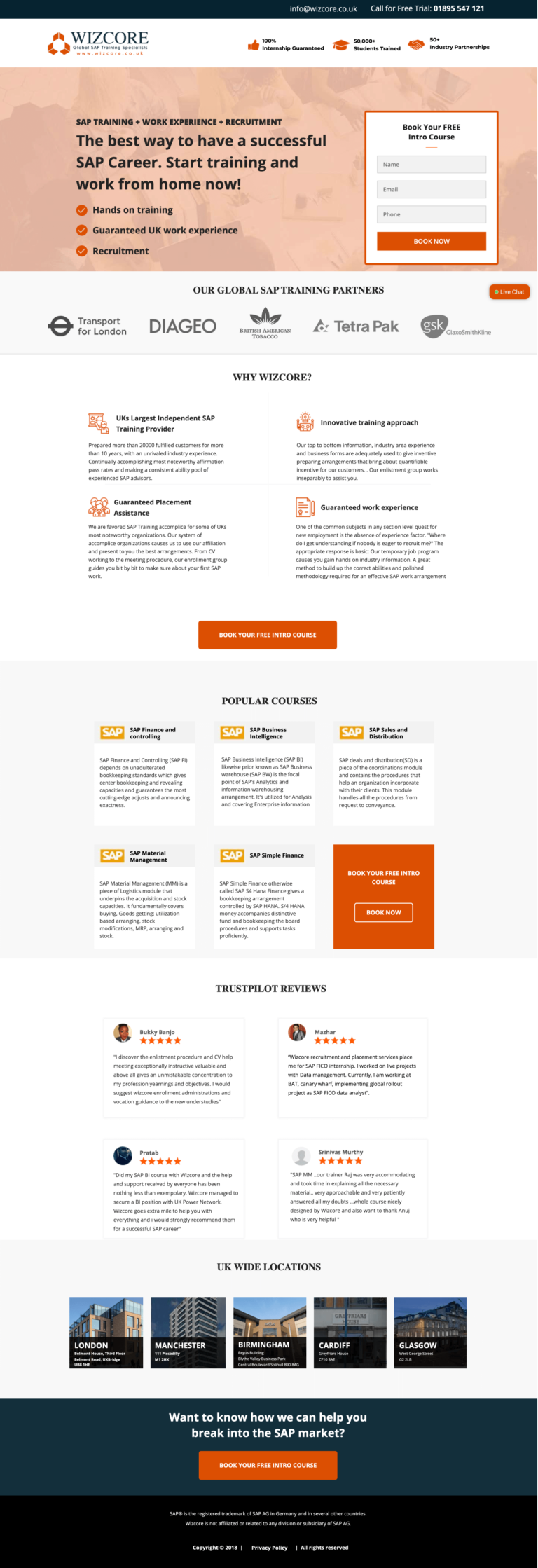
- Primary CTABook Your Free SAP Consultationthe button the page is built around
- GoalLead Generationwhat counts as a conversion
- PlatformUnbouncelead generation page
- Built forB2CEducation & Training
- The page as built, not a mockup.Analysed by Apexure, not by Wizcore.
- Client
- WizcoreEducation & Training
- Industry
- Education & Training21 examples
- Audience
- B2CLead Generation
- Platform
- Unbounce132 examples
- Page type
- Lead generationLead Generation
- Analysed by
- Waseem BashirMarch 2026
What the page does, and why
Why SAP training needs a High-Trust page
Wizcore sells SAP career training, courses that cost several thousand pounds and promise to open doors to enterprise software careers. This is a considered purchase that involves not just money but life direction. The visitor is asking: “Can I actually do this? Will it get me a job? Is this company reliable?”
Every section of the page needs to answer one of those questions. Anything else is noise.
Design decisions
The orange accent on white background system is optimistic and energetic, the right tonal choice for a page that’s selling career change. Orange reads as action and ambition; it reinforces the message that taking this course is a bold, forward-looking decision. The white base keeps the page clean and readable, which matters for a course-heavy page where information density is high.
The headline “The Best Way to Have a Successful SAP Career. Start Training and Work from Home Now” is doing four things: validating the method (best way), confirming the outcome (SAP career), addressing a logistics desire (work from home), and creating temporal urgency (now). It’s a rare headline that addresses four conversion variables simultaneously.
The training partner logos, Fujitsu, Diageo, Murex and Tetra Pak, operate as both authority signals and audience matching cues. A visitor who wants to work in FMCG sees Diageo and knows these training products lead to the kinds of companies they want to work for. The logos aren’t just “who we work with”. They’re a vision board for the visitor’s career.
The popular course cards are structured to show the course name, duration, and a brief outcome description, enough information to distinguish courses without overwhelming. Each card links to a full course page rather than trying to capture the booking on the landing page. This reduces landing page friction while still giving detail-hungry visitors the depth they need.
The Trustpilot rating near the hero communicates independent, unmanipulable evidence of quality. For a £3,000+ career training purchase, Trustpilot is the equivalent of a product review on Amazon. It’s the social proof that tips wavering buyers.
The "UK Wide Locations" section at the bottom of the page serves an important function for a blended learning provider: it proves physical presence. Online-only training companies are a dime a dozen. Showing classroom locations signals commitment, permanence, and a real business, three things that matter disproportionately for high-value training purchases.
Trust architecture
Wizcore builds trust across five vectors: official SAP partnership (authority from a recognised institution), Trustpilot rating (independent verification), named student outcome stories (proof of the transformation), partner employer logos (evidence of job placement), and UK classroom locations (proof of physical presence and stability). Each vector addresses a different form of doubt.

"For training companies, the testimonial that converts is the alumni story: 'I enrolled, completed the course, and was hired as an SAP consultant at £55k within three months.' That specific timeline and salary number is more persuasive than a hundred five-star reviews. Outcome stories, not satisfaction stories, are the currency of education conversion."
Read more about trust in our guide to Ways To Increase Landing Page Social Proof.
The FAQ section at the bottom of the page answers the questions that stop people from booking: "Can I get a job with no experience?", "How long does the course take?", "Is there a payment plan?" These questions exist because they're real objections. Answering them on the page prevents the visitor from needing to call or email, which means conversions happen outside business hours.
Conversion strategy
The lead form requests a free consultation call, not an immediate course booking. For a high-value training purchase, direct booking without conversation has lower conversion rates than booking a call where an advisor can address specific concerns. The free consultation positions the sales conversation as a service to the visitor, not a pressure situation.
"When clients say a course page isn't converting, the first thing I look at is the call-to-action commitment level. If you're asking someone to commit £2,000 with a button click, the page is doing too much work alone. Reduce the first step to a conversation or a free consultation, then let the advisor close. The page's job is to get a qualified person in the room."
Platform: Unbounce
Unbounce handles the active text replacement for paid campaigns, a visitor clicking an ad for “SAP FICO Training” sees that exact phrase in the hero headline, not a generic SAP headline. This message-to-ad matching is particularly valuable in training, where visitors search for very specific course types.
Mobile experience
Career-changers browse course options on their phones during commutes, so the mobile layout does a lot of the work. The course cards stack to single-column on mobile, with the key information (course name, outcome, duration) visible without expanding. The FAQ accordion is thumb-friendly with generous tap targets, because FAQ sections are used extensively by mobile visitors who have questions but don’t want to call.
We run speed tests on every page we build because a slow landing page is a leaking bucket. You can spend thousands driving traffic, but every additional second of load time costs conversions. We treat PageSpeed results as a to-do list, not just a score.
Evolve this page today
Three improvements for the next iteration:
- Alumni salary data in the hero: “Our graduates earn an average of £52,000 in their first SAP role” is a single line that would dramatically improve hero performance. Salary specificity converts career-change visitors faster than any other single data point.
- A comparison tool: Side-by-side comparison of SAP career paths (FICO vs. MM vs. SD) helps visitors who aren’t sure which specialisation to pursue. A visitor who has chosen their path is ready to enrol; a visitor still choosing is researching.
- Financing calculator: Monthly payment options with an interactive calculator lower the perceived barrier for the sticker price. “As little as £125/month” reframes a £3,000 decision as a manageable monthly commitment.
Browse our full collection of landing page examples or read our guide to Landing Page Call to Action Tips.
Waseem founded Apexure in 2015 and has led its work on 3,000+ pages for 300+ clients since. He writes about what the team sees after the click, which is pages, forms, tracking and the systems behind them.
What the page leans on
The principles at work on this page, each named in the analysis above.
Visual hierarchy
Controlling what visitors see first, second, and third guides them toward the conversion goal.
Social proof
People follow the actions of others. Testimonials, reviews, and client logos build trust and reduce hesitation.
Authority bias
People trust credible experts. Certifications, awards, media mentions, and expert endorsements boost credibility.
Aspiration
This principle influences visitor behaviour and supports the page's conversion goal.
What people ask about pages like this
SAP training is a career investment, the visitor is weighing a significant cost against a life-changing potential return. The page needs to answer the career outcome question first: what jobs can you get, what salary can you expect, and how quickly can you get there? Once the ROI is clear, the page's job is to make the training itself feel manageable and achievable, not overwhelming.
Trustpilot ratings work best when pulled dynamically so the score is always current, and when positioned near the form rather than mid-page. Near-form placement means the trust signal is visible at the exact moment the visitor is making their commitment decision. We always show the aggregate score AND the review count, both matter. A 4.9 from 8 reviews is less persuasive than a 4.7 from 3,000 reviews.
Partner logos are authority proxies, they borrow credibility from a brand the visitor already trusts. For SAP training, being listed as an official SAP Global Training Partner is more persuasive than any testimonial the company could provide, because the visitor knows SAP wouldn't endorse a substandard provider. Partnership logos should be prominent, never small, and always verified.
An education or training landing page takes 2–3 weeks. The primary content challenge is the course matrix, showing enough course detail to inform without overwhelming, and structuring the information so the visitor can find their relevant track without having to read everything. We invest significant time in the course cards and the FAQ section, as these handle most of the pre-enrolment objections.
Three more, taken apart the same way



Want one like this?
Tell us what the page has to do and where the traffic comes from. Within 48 hours you get a written quote from the people who wrote this breakdown. Already have a page that is not converting? Send it for a free audit instead.
UK hours, which is the East Coast morning.
"Career training pages are selling a vision, not a product. The visitor needs to be able to picture their life after completing the course, the job title, the salary, the confidence. That vision needs to be in the hero, not buried in a benefits list on page two. Lead with the transformation, not the curriculum."