CRO breakdown of Wealth Hub Australia's superannuation investment click-through. Design analysis and conversion insights by Apexure.
What is ConvertScore™? ConvertScore™ is Apexure's proprietary landing page performance metric. We evaluate every page across four dimensions — Copy & Messaging, Layout & Hierarchy, Trust & Social Proof, and CTA & Conversion Path — to produce a single score out of 100.
Most Australians have their superannuation sitting in the default fund their first employer set up for them. They know they should do something about it. They don’t know what. Wealth Hub Australia’s job is to be the page that turns that vague motivation into an informed next step.
The brief was: take someone who’s had a passing thought about their super and give them enough to understand the opportunity, then get them to raise their hand. This is not a hard sell. It’s a soft conversion: click through to a consultation booking or application.
The white and orange colour system is a deliberate positioning choice. Orange is warm, accessible, and optimistic, the psychological opposite of the anxiety that financial decisions typically provoke. Combined with family photography that shows real Australians in relaxed, comfortable settings, the design says “we help ordinary people, not just wealthy ones.”
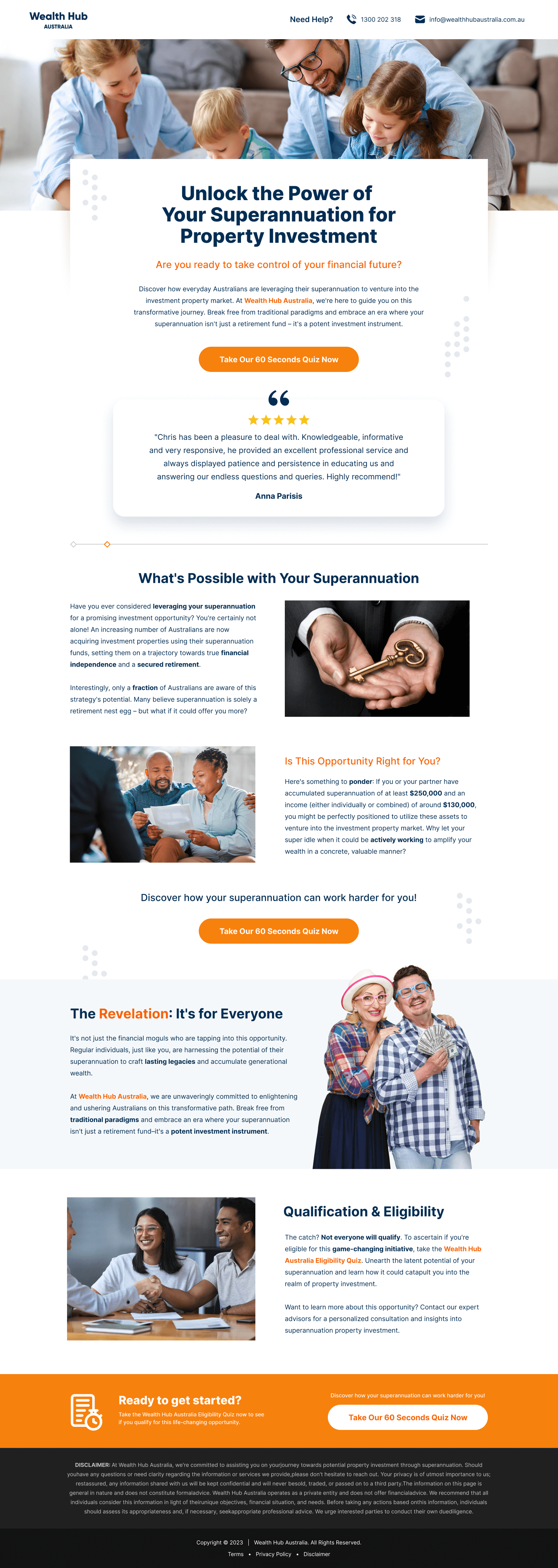
The “Unlock the Power of Your Superannuation for Property Investment” headline is specific to a strategy, not just a brand claim. It’s doing two jobs: it tells the visitor what the service is (super-to-property), and it activates the desire that brought them to this page in the first place. Generic headlines like “Get More From Your Super” don’t activate. Strategy-specific headlines do.
The “Is This Opportunity Right for You?” section with eligibility criteria is the page’s cleverest conversion mechanism. By stating “you need $X in super to qualify,” the page creates a self-selection moment. Visitors who qualify feel a sense of inclusion, “I’m eligible” triggers forward momentum. This reframes the CTA from “sign up” to “claim your spot.”
The quote and testimonial from Chris Perkins, Director, gives the page a specific human voice. Finance pages that rely only on aggregate ratings feel impersonal. A named quote with a job title and company creates a peer relationship, the visitor thinks “this is someone like me who made this decision.”
(What’s Possible, Is This Right For You, The Revolution, Qualification) creates a navigational signpost mid-page. It gives the visitor a mental map of what’s coming, reducing the “how much more is there?” anxiety that causes people to jump to the bottom of a long-form finance page without reading the detail.
Loss aversion is more powerful than gain motivation in finance. "Stop missing out on returns your super could be generating" will outperform "Grow your super faster" in most A/B tests. The page subtly uses this by framing the property strategy as an underutilised opportunity rather than a new risk.
Financial services require compliance-aware trust, the page can’t make promises, but it can signal credibility. We achieved this through named testimonials (not anonymous reviews), strategy-specific educational content that signals expertise, and professional photography that communicates established business rather than startup operation. The footer carries regulatory disclosures that satisfy compliance requirements without dominating the visual layout.

"The biggest conversion killer on finance pages is legal disclaimer copy dumped in the middle of the value proposition. Compliance text belongs in the footer, in a font size that's readable but not dominant. Hiding it doesn't serve the visitor; drowning the offer in small print doesn't either. Find the layout that's honest without being intimidating."
Read more about how we approach finance landing pages in our guide to Ways To Increase Landing Page Social Proof.
The testimonial block is positioned in the middle of the page, not at the bottom. This is because middle-page testimonials serve visitors who are still deciding, they read the value proposition, felt some interest, and now need confirmation before reading further. Placing social proof here keeps undecided visitors reading rather than losing them to a tab switch.
This is a click-through page, the CTA drives visitors to a discovery session or consultation booking, not to a direct form submission. The click-through model works well for financial services because the visitor is not yet ready to provide personal financial details to a brand they’ve just met. The CTA language “Discover How Your Super Can Work Harder” is educational rather than transactional. It promises information, not a sales call.
"In financial services, promising a consultation is less threatening than promising a sales call, and a free assessment is less threatening than a consultation. The words you choose for your next step determine whether the visitor sees it as a gift or a trap. We always test the softer framing first."
Unbounce gives us clean A/B testing infrastructure. For finance pages, headline testing often produces the largest CVR movements, a 10–15% lift from changing “Unlock the Power of Your Super” to “Is Your Super Working as Hard as You Are?” is typical. The platform also handles the active text replacement we use for paid search campaigns where the headline mirrors the ad copy.
More than 60% of Wealth Hub Australia’s visitors arrive on mobile. On mobile, the eligibility criteria section is particularly important. We made sure the checklist items are large enough to read and tap on a phone screen, because this is a section that visitors often screenshot to review later or share with a partner.
We run speed tests on every page we build because a slow landing page is a leaking bucket. You can spend thousands driving traffic, but every additional second of load time costs conversions. We treat PageSpeed results as a to-do list, not just a score.
"The Apexure team is great to work with, highly recommend."
Three changes would push this page’s performance meaningfully:
Wealth Hub Australia scores 78 on our ConvertScore framework. The page is well-structured and the colour system is right for the audience. The score is held back by the generic CTA copy, the absence of a specific dollar-value proof statement in the hero, and the relatively short testimonial that doesn’t convey the specific outcome the service delivers.
Browse our full collection of landing page examples or read our guide to Landing Page Call to Action Tips.
Controlling what visitors see first, second, and third guides them toward the conversion goal.
People follow the actions of others. Testimonials, reviews, and client logos build trust and reduce hesitation.
People trust credible experts. Certifications, awards, media mentions, and expert endorsements boost credibility.
People feel losses more strongly than gains. Framing around what they will miss motivates action.
Superannuation is a long-term decision with regulatory complexity and significant amounts of money involved. The visitor is rarely ready to convert immediately, they need education first, then validation. The page's job is to move them from 'vaguely aware I could do something with my super' to 'I understand the opportunity and want to find out more.' That's a click-through outcome, not a form submission.
Orange reads as approachable and optimistic, it counteracts the anxiety that financial decisions typically trigger. Australian financial brands that use blue project authority but can feel cold. Orange signals that this is a conversation, not a transaction. Combined with the family-oriented photography, it positions Wealth Hub as a human partner rather than an institutional service.
The Qualification & Eligibility section does the heavy lifting here. Rather than leaving the visitor to wonder whether they qualify, the page states the criteria explicitly. This serves two purposes: it pre-qualifies traffic so the sales team receives better-fit leads, and it gives eligible visitors a concrete reason to proceed. 'You qualify' is a powerful psychological motivator.
Finance requires multiple trust layers. Regulatory credentials need to be visible without being overwhelming. Client testimonials need to be specific, a quote about dollar amounts saved or returns achieved beats a generic 'great service' endorsement. Third-party press mentions (such as 'As seen in Money Magazine') operate as authority bias signals that instantly raise perceived legitimacy.
Other CRO breakdowns from our lookbook
We design high-converting landing pages for B2B and B2C brands. Let's talk about yours.
Get a Free Consultation Or browse more examples →
Founder & CEO of Apexure, Waseem worked in London's Financial Industry. He has worked on trading floors in BNP Paribas and Trafigura, developing complex business systems. Waseem loves working with Startups and combines data and design to create improved User Experiences.
Get quality posts covering insights into Conversion Rate Optimisation, Landing Pages and great design


"Finance landing pages fail when they try to explain too much. The visitor doesn't want a masterclass in superannuation law. They want to know one thing: 'Can you help me get more from my super?' Answer that clearly in the hero, then use the rest of the page to build the confidence they need to take the next step."