CRO breakdown of The UK Debt Help Team's debt relief lead generation — multi-step form, big typography, and trust signals designed for a sensitive financial audience.
What is ConvertScore™? ConvertScore™ is Apexure's proprietary landing page performance metric. We evaluate every page across four dimensions — Copy & Messaging, Layout & Hierarchy, Trust & Social Proof, and CTA & Conversion Path — to produce a single score out of 100.
Debt relief isn’t a comfortable category to design for. The visitors arriving on this page are often at a low point: carrying financial stress, possibly facing creditor calls, and sceptical that anything can actually help. The brief required a page that felt authoritative and reassuring simultaneously, without being either clinical or patronising.
The headline (“Write Off Up to 85% of Your Debt”) lands because it states the maximum possible outcome clearly. There’s no hedging. Paired with the government-approved Debt Relief Scheme credential in the sub-copy, it earns credibility while offering genuine hope.
Big typography creates instant hierarchy and communicates confidence. The bold “Write Off Up to 85%” treatment means the value proposition is absorbed even by visitors who only glance before deciding whether to scroll. In a category where anxiety shortens attention spans, type size is a CRO lever.
The debt amount selector as the first form field is a masterstroke of framing. Instead of “enter your email to get started”, the first interaction is “how much debt do you have?”. A question that feels helpful rather than extractive. It segments visitors by situation, which also improves lead quality for the sales team downstream.
The section uses bold icons and short outcome-focused labels: Write Off Up to 85%, Lower Your Repayment, Stop Creditors Harassing, Freeze Interest and Charges. Each benefit addresses a specific pain point the audience experiences. This isn’t a generic feature list. It’s a mapped response to the four things debt-stressed people most want to hear.
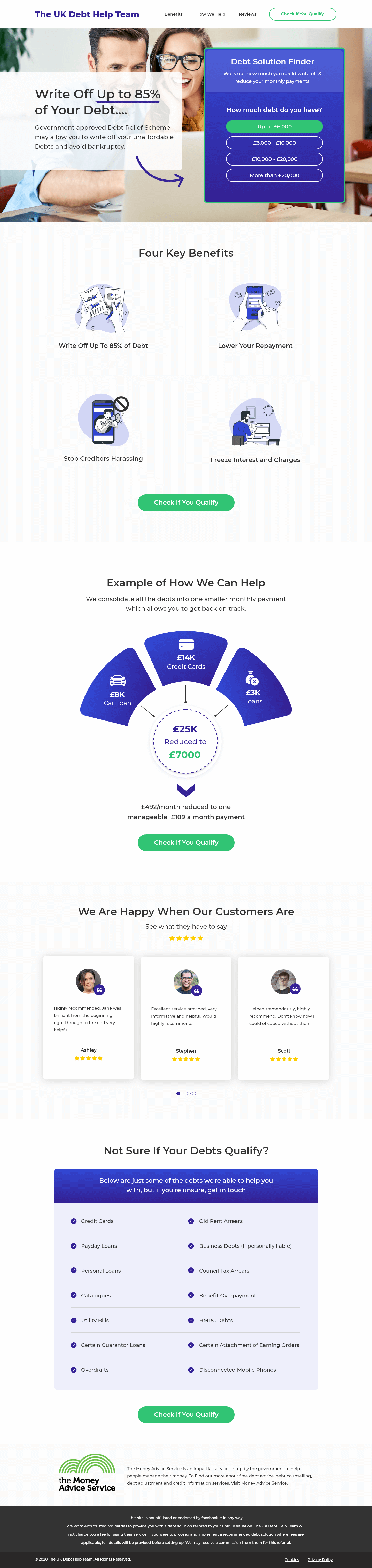
The diagram shows multiple debts collapsing into one manageable monthly payment. It’s one of the most effective elements on the page. It bridges the credibility gap between “promise” and “reality” by showing the mechanism. Visitors who might not believe the headline alone will often believe a diagram that makes the maths visible.
The carousel with named, photographed customers and star ratings provides the human layer. The names and ratings are visible before interaction, so passive scrollers still receive the social proof signal.
The debt type checklist (Credit Cards, Payday Loans, Personal Loans, Catalogues, Utility Bills, Guarantor Loans, Overdrafts, NHS Arrears, Business Debts, Council Tax, Benefit Overpayment, HMRC Debts, Attachment of Earnings, Disconnected Mobile Phones) is a conversion asset disguised as information. Every tick a visitor mentally places against their own debts deepens their identification with the solution.
Trust is layered deliberately across this page. The Money Advice Service partnership logo in the footer provides regulatory credibility. Named testimonials with star ratings in the mid-section provide peer credibility. The “Check If You Qualify” CTA framing is itself a trust mechanism. It signals that not everyone qualifies, which paradoxically increases desire (scarcity) and reduces anxiety (no hard sell, just a check).

"The CTA text matters enormously in financial services. 'Apply Now' feels like commitment. 'Get a Quote' feels like you're being sold to. 'Check If You Qualify' feels like you're the one making a decision. It shifts the power active to the visitor and removes the fear of rejection or hard sell. That small wording change has meaningful conversion implications."
Read more about how we approach trust signals in our guide to Landing Page Form Design Best Practices.
The header navigation keeps Benefits, How We Help, and Reviews visible without a hamburger menu. In sensitive financial categories, disappearing navigation can raise anxiety. Visitors want to know they can explore freely before committing. Keeping nav items visible signals openness and reduces the "trapped" feeling that hurts conversion in high-stakes categories.
The multi-step form does the heavy conversion lifting. Step one is the debt amount selector. Non-personal, situational, easy. Step two advances into contact details once the visitor has already self-identified with the product. The “Check If You Qualify” button language at every CTA instance reinforces that this is a two-way assessment, not a one-way sales funnel.
"Debt relief pages have unusually high stakes. The visitor is making a decision about something that affects their family's financial stability. That's not a context where you rush them. Every section of this page is paced to let them absorb information and build confidence before they're asked for anything personal."
WordPress gave the client the editorial control they needed to update debt type coverage and regulatory credentials as guidance changed. Important in a regulated financial category. The theme was custom-built rather than adapted from a template so every conversion element was intentional.
Debt-related searches spike late in the evening when people are alone and stress is highest. Mobile performance is therefore critical. This audience isn’t researching on a desktop at work. The page was optimised for one-handed scrolling, with the debt amount selector sized generously for touch, and the form fields large enough to complete without zooming.
We stripped all non-essential third-party scripts from this page. Debt-category visitors are privacy-conscious, and unnecessary tracking scripts both slow the page and erode trust. Only the conversion tracking and the form handler remain. Everything else was removed.
Three priority improvements with access to current data.
Add a live debt write-off calculator above the fold. Letting visitors input their actual debt total and see a personalised “you could write off up to £X” number would dramatically increase qualified lead intent.
A/B test the hero image with a single person (rather than a couple) to test whether solo identification outperforms paired identification for this audience.
Surface the Money Advice Service logo higher. Currently it sits near the footer, but moving it alongside the hero trust indicators would address early scepticism before it triggers a bounce.
This page earns 88 out of 100. The copy is emotionally precise, the form structure is excellent, and the debt type checklist is one of the smartest conversion tools we’ve seen in this category. The score shows the strong hero-to-form architecture and the appropriately layered trust signals. Points are held back by the absence of a real-time personalisation element (a calculator or live estimate) which would push this into the top tier for financial lead generation pages.
Browse our full collection of landing page examples to see how we apply these principles across industries.
Controlling what visitors see first, second, and third guides them toward the conversion goal.
People follow the actions of others. Testimonials, reviews, and client logos build trust and reduce hesitation.
People feel losses more strongly than gains. Framing around what they will miss motivates action.
This principle influences visitor behaviour and supports the page's conversion goal.
Because the visitor doesn't care about the Debt Relief Scheme, they care about relief from a problem that is causing real stress. Leading with the outcome ('write off up to 85%') rather than the mechanism ('government-approved scheme') immediately connects with the emotional state the visitor is in. Feature-first headlines make people think; benefit-first headlines make people feel seen.
The debt amount selector ('up to £5,000 / £6,000–£10,000 / more than £20,000') acts as the first micro-commitment in the multi-step form. Critically, it's a question the visitor can answer without anxiety, it's about their situation, not their identity. Once they've clicked a range, sunk cost psychology kicks in and makes the next fields feel like natural progression rather than an interrogation.
Debt relief is one of the most emotionally loaded financial categories, visitors are often embarrassed or anxious. Trust needs to work at two levels: institutional (the Money Advice Service affiliation and regulatory credentials near the footer) and human (real testimonials with names and star ratings that normalise the experience). Both are present on this page and that combination is deliberate.
The visual showing multiple debts (£8k credit cards, £6k car loan, £5k loans) consolidating to £7,000 at £309/month does the persuasion work that copy alone can't. It makes the abstract concept of debt consolidation tangible and shows the visitor exactly how their situation maps to the solution. Visual proof of mechanism is consistently more persuasive than written descriptions of the same concept.
Other CRO breakdowns from our lookbook
We design high-converting landing pages for B2B and B2C brands. Let's talk about yours.
Get a Free Consultation Or browse more examples →
Founder & CEO of Apexure, Waseem worked in London's Financial Industry. He has worked on trading floors in BNP Paribas and Trafigura, developing complex business systems. Waseem loves working with Startups and combines data and design to create improved User Experiences.
Get quality posts covering insights into Conversion Rate Optimisation, Landing Pages and great design


"When the audience is under financial stress, every word in the headline has to work harder. We tested versions with softer language ('reduce your debt significantly') and the direct version outperformed consistently. People in debt don't want vague reassurance. They want to know exactly what's possible."