CRO breakdown of Pigeons Playing Ping Pong's music fan membership click-through page. Design decisions and conversion strategy for fan community pages by Apexure.
What is ConvertScore™? ConvertScore™ is Apexure's proprietary landing page performance metric. We evaluate every page across four dimensions — Copy & Messaging, Layout & Hierarchy, Trust & Social Proof, and CTA & Conversion Path — to produce a single score out of 100.
Music fan memberships occupy an unusual conversion context. The visitor is not evaluating whether they like the band, they already do. The question is whether the membership package justifies the recurring commitment. That makes this a very different page structure from a typical e-commerce or lead generation page, where the first job is product education. Here, the product (the band’s music and live experience) is already established. The page’s only job is to close the gap between “I like this band” and “I am a member of their community.”
Pigeons Playing Ping Pong’s community is called The Nest. The framing matters: it is not a mailing list, not a fan club in the 1990s sense, but a community with access to things that non-members cannot experience. Livestreams of rehearsals, rare and unreleased tracks, exclusive BTS footage, priority venue access, and a community chat with the band. Each of these benefits appeals to a different depth of fandom, and the page needed to present them in a sequence that continuously raised the value perception as the visitor scrolled.
The design challenge was tonal. A corporate membership page would be completely wrong for a jam band’s fan community. The page needed to feel like an extension of the live experience, dark, warm, energetic, immersive, while still communicating each benefit clearly enough that a visitor could evaluate the value and commit.
puts the visitor inside the live experience immediately. The photograph shows the band on stage with a packed crowd and dramatic stage lighting, a real PPP show, not a generic concert stock photo. The band’s name in bold serif typography overlaid on the image is a statement, not a heading. The “JOIN US” button beneath it is gold on dark, the only bright element in the hero, directing the eye without disrupting the atmosphere.
Each subsequent section uses a single benefit as its narrative unit, presented with a full-bleed photo or visual, a category label (“LIVESTREAM EVENTS,” “EXCLUSIVE PERKS,” “EARLY ENTRY,” “RARE TRACKS & VIDEO,” “COMMUNITY CHAT”), and a “JOIN US” button. This one-benefit-per-section structure is deliberate. By isolating each benefit, we prevent the cognitive overload of a bullet list and allow each benefit to make its own case for the membership value. A visitor who is motivated specifically by rare tracks will find that benefit clearly and convert there, without having to parse a table of features.
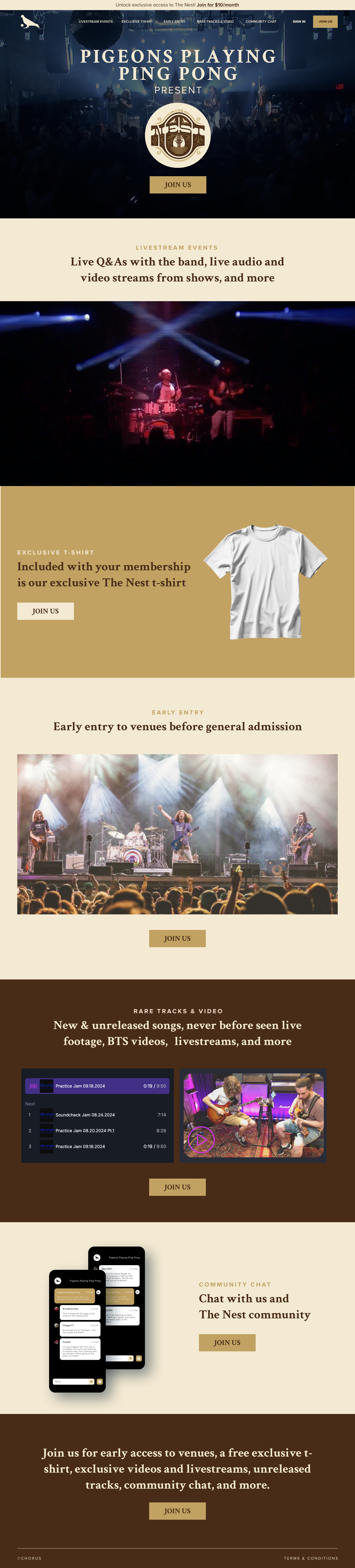
shows an actual setlist-style track listing with dates, a design choice that makes the content promise feel concrete. “New & unreleased songs” is vague. A visual that looks like a real setlist with real song titles and dates makes the content promise feel tangible and immediate.
in the final section shows a phone with a chat thread visible, real-looking messages between fans, creating the social reality of the community rather than just describing it. Showing the community in action is more persuasive than claiming “join our community.” The visitor can see what joining looks like.
throughout the page is taken from PPP’s visual identity and concert lighting aesthetic, warm stage lights, wood tones, vintage feel. This consistency between the page’s visual language and the band’s existing brand means fans who arrive from social or email already feel at home before reading a word.
The final summary section reads: "Join us for early access to venues, a free exclusive t-shirt, exclusive videos and livestreams, unreleased tracks, community chat, and more." This is a serial position recap, the last thing a visitor reads before the final CTA is a full summary of everything they're getting. By this point, each benefit has been presented individually; the summary creates the combined value perception that justifies the click.
This page works because visitors arrive with existing trust in the band. The page’s trust architecture doesn’t need to build credibility from scratch. It needs to transfer the trust fans have in the band’s music to the trust that the membership community will deliver on its promises. The live photography and the real setlist-style tracklist both serve this function.
Each benefit is illustrated with a visual that makes it feel real rather than promised. The t-shirt photo, the setlist graphic, the phone mockup with community messages, all of these make the membership feel like something that already exists and is already active, rather than something the fan would be waiting on.
“The Nest” as the community name creates a belonging identity that goes beyond a subscription. It’s not “Pigeons Playing Ping Pong Fan Club”. It is a named community with a specific culture. Names create communities; communities create retention. The membership page uses “The Nest” consistently, priming the visitor to self-identify as a potential Nest member before they’ve clicked Join.

"The t-shirt in this membership package is not a perk. It's a credential. There's a huge difference in how you frame physical merchandise in a community offer. 'Get a free t-shirt' sounds like a promotional sweetener. 'Included with your membership is the exclusive The Nest t-shirt' frames it as something that marks you as a member. The t-shirt becomes proof of belonging, which is far more motivating than a free item."
The conversion journey on this page follows the emotional progression of a fan considering community membership. It begins at the band’s identity (the hero), moves through the live experience (concert photography), then reveals benefits one by one in a deliberate sequence designed to speak to progressive depths of engagement: early entry (surface engagement), livestreams (deeper interest), exclusive merchandise (identity), rare tracks (connoisseur-level appeal), community chat (belonging). The sequence ends with the summary CTA that consolidates all benefits into one final value statement.
The “JOIN US” button appearing after each section means the page converts at the right moment for each visitor type, rather than requiring everyone to reach the same endpoint before committing.
"We've built a lot of event and entertainment pages, and the consistent finding is that the length of the persuasion needed is inversely proportional to existing brand affinity. For a new band nobody knows. You need a long page that builds the case from scratch. For an established band with a dedicated fanbase, a short atmospheric page that just needs to close the deal outperforms a feature-heavy content page every time."
“2,300 members already in The Nest” or “Join 2,300 fans who already have early entry access” adds social proof that the community is real and growing. This is particularly effective for community memberships where the perceived value of belonging increases with community size.
A thirty-second clip of the band members directly inviting fans to join, filmed in a backstage or informal setting to maintain the authentic brand tone, would increase the emotional connection and the feeling that the band personally values the community. Artist-direct invitations consistently outperform text-based membership CTAs.
Short testimonials from existing Nest members about their favourite membership benefit, “The rare track drops are incredible” or “Got to the front at Madison Square Garden”, provide peer validation from someone in the visitor’s exact position (fan considering membership). This would be most effective placed immediately before the final summary CTA.
Browse our full collection of landing page examples for more event and entertainment page examples. Building a fan membership or event page that converts? Talk to our team.
This principle influences visitor behaviour and supports the page's conversion goal.
Giving something valuable first (free guide, tool, audit) creates an obligation to reciprocate.
This principle influences visitor behaviour and supports the page's conversion goal.
This principle influences visitor behaviour and supports the page's conversion goal.
People follow the actions of others. Testimonials, reviews, and client logos build trust and reduce hesitation.
Fan membership pages attract visitors at different stages of fandom. A die-hard fan who has followed the band for years will convert on the first CTA after seeing the headline and the exclusive t-shirt offer. A casual fan who recently discovered the band needs to see all the benefits, livestreams, rare tracks, community access, venue priority, before they feel the membership is worth it. Repeating 'Join Us' after each benefit section means both visitor types can convert the moment they've seen enough. The alternative, a single CTA at the bottom, loses the high-intent fans who were ready to join after screen one.
Physical merchandise for music fans is not about the object, it's about the identity signal. Wearing a band t-shirt that says 'The Nest' (the fan community name) is a declaration of belonging to an in-group. For Pigeons Playing Ping Pong's audience, the t-shirt included in the membership is positioned as a community artefact rather than a purchase. 'Included with your membership is our exclusive The Nest t-shirt' makes the shirt feel like a credential of belonging, not a promotional item. This frames the membership value differently than a discount code would.
Early entry is a high-value, zero-cost benefit for a touring band. It costs nothing to give members access 30 minutes before general admission. But for dedicated fans, front-row access to a general admission venue is the difference between an ordinary concert and a defining experience. Positioned as a membership benefit, it speaks directly to the 'I want to be as close as possible' motivation that drives fan commitment. It is also inherently exclusive, once you have 500 members and venues have limited front sections, the scarcity is real, not manufactured.
Dark page designs create an atmospheric context that matches the emotional register of live music. A white background with blue buttons would signal 'this is a functional transaction.' A dark brown/black page with warm concert photography signals 'this is an experience.' The tonality of the page should match the emotional state the visitor is already in, someone on a band's fan page is in music mode, not spreadsheet mode. Dark backgrounds also increase the visual impact of concert photography, which is doing the primary persuasion work on this page.
Other CRO breakdowns from our lookbook
We design high-converting landing pages for B2B and B2C brands. Let's talk about yours.
Get a Free Consultation Or browse more examples →
Founder & CEO of Apexure, Waseem worked in London's Financial Industry. He has worked on trading floors in BNP Paribas and Trafigura, developing complex business systems. Waseem loves working with Startups and combines data and design to create improved User Experiences.
Get quality posts covering insights into Conversion Rate Optimisation, Landing Pages and great design


"Most membership pages are built like pricing pages, a column of bullet points and a buy button. Fan communities are not transactional. They're identity-driven. The design job is to make the visitor feel the experience of belonging before they commit. Every section of this page is designed to add one more layer to the answer to the question: what does it feel like to be a member?"