CRO breakdown of Kapco's ebook lead magnet page for their inkjet receptive topcoats whitepaper. Expert analysis of lead magnet design, trust signals, and gated content conversion by Apexure.
What is ConvertScore™? ConvertScore™ is Apexure's proprietary landing page performance metric. We evaluate every page across four dimensions — Copy & Messaging, Layout & Hierarchy, Trust & Social Proof, and CTA & Conversion Path — to produce a single score out of 100.
Kapco’s customer base, print professionals, substrate manufacturers, and inkjet printing specialists. Doesn’t respond to generic lead capture forms. They want to know that the company they’re dealing with has technical depth before they start a sales conversation. A whitepaper on inkjet receptive topcoats demonstrates that depth before the first call.
The strategy here is reciprocity-led: Kapco offers genuine expertise in a downloadable format, and in exchange receives a lead’s contact details and implicit permission to follow up. The page’s job is to make the value of the exchange immediately obvious to a technically-minded visitor.
The two-column layout, form on the left at desktop, ebook visual on the right, keeps both the conversion action and the perceived value in the same viewport. The visitor doesn’t have to scroll to weigh up the decision. Both elements are visible simultaneously, which is the optimal condition for a value exchange decision.
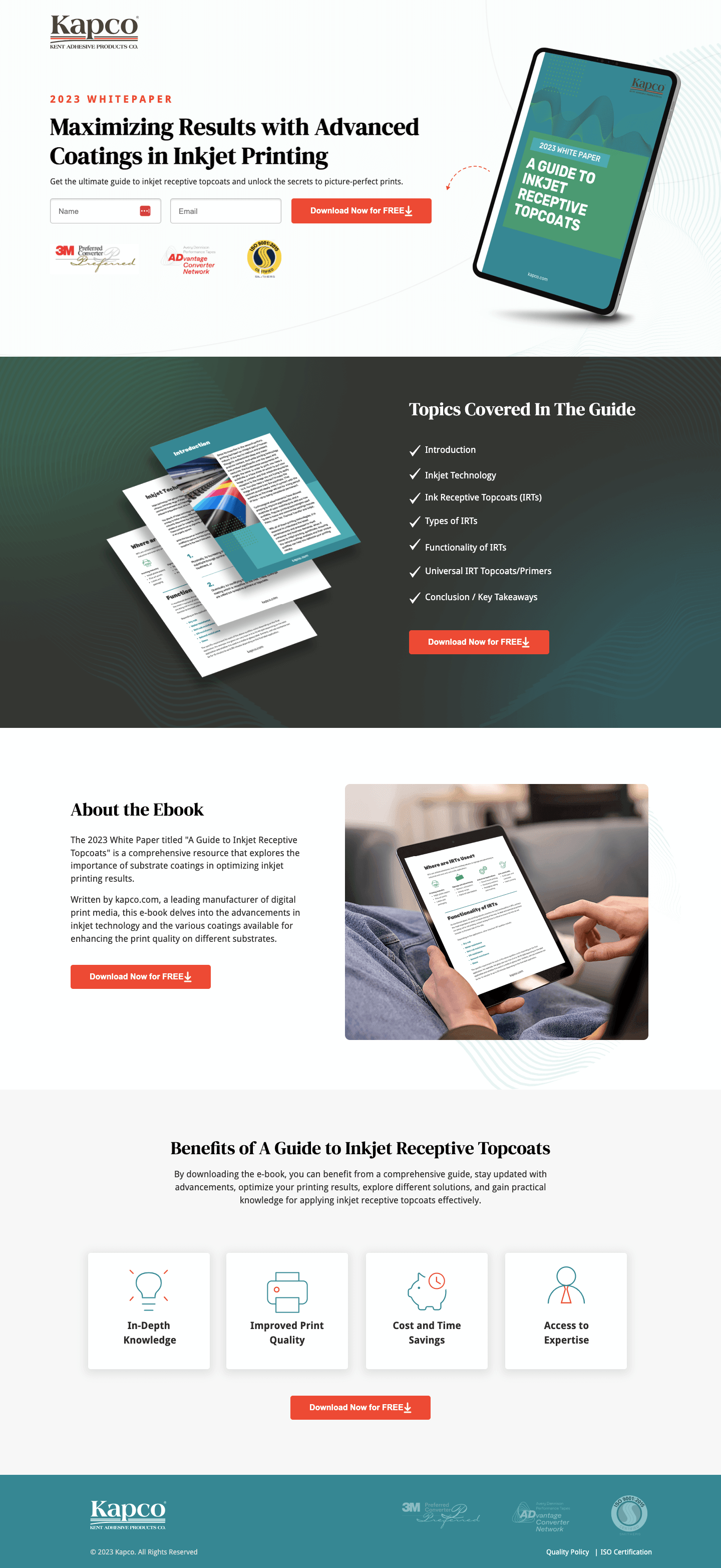
The tablet mockup of the ebook cover transforms a digital file into a tangible-feeling object. The cover design, teal accent on dark green, with “A Guide to Inkjet Receptive Topcoats” clearly titled, looks designed and substantial. Alongside it, fanned pages of the document content give a physical volume impression. The combined effect is a product that looks worth having rather than a document that sounds forgettable.
The “2023 WHITEPAPER” label and the specific topic, inkjet receptive topcoats, do important qualification work. A visitor who doesn’t work with inkjet substrates will immediately know this isn’t for them; a visitor who does will immediately know this is exactly what they need. Good lead magnet pages self-qualify their audience.
The inline form with name and email fields keeps the friction minimal. Given that the content is free, the form asks only what’s needed: a name for personalisation and an email for delivery and follow-up. We positioned the “Download Now for FREE” CTA button in high-contrast orange against the dark form background.
The table of contents on the second viewport (Introduction, Inkjet Technology, Ink Receptive Topcoats, Types of IRTs, Functionality, Universal IRT Topcoats/Primers, Conclusion) signals to a specialist that this is a complete technical treatment, not a marketing brochure. Printing professionals can evaluate whether the content addresses their specific knowledge gaps before deciding whether it’s worth their email.
The table of contents is a pre-qualification and persuasion tool simultaneously. It pre-qualifies by filtering out visitors who don't need this content, which improves lead quality. It persuades by demonstrating completeness and structure, which increases perceived value. Both effects point toward a higher-quality conversion.
Lead magnet pages have a specific trust challenge: the visitor is weighing the value of the content against the cost of sharing their contact details, including the risk of unwanted follow-up. The page addresses this through three trust layers.
The first is brand credential logos, 3M Preferred Converter and AD Vantage Converter Programme appear below the form. These signals communicate that Kapco is not a minor player in the coatings space; they’ve been vetted by industry leaders.
The second is benefit clarity, the “Benefits of A Guide to Inkjet Receptive Topcoats” section with four icons (In-Depth Knowledge, Improved Print Quality, Cost and Time Savings, Access to Expertise) tells the visitor exactly what value they’ll receive. This reduces the risk perception around the download.
The third is implied expertise, the “About the Ebook” section explains that the guide was written by Kapco, a manufacturer of digital print media. Manufacturer-produced technical content carries more credibility than third-party editorial content because the source has real-world application experience.

"The best trust signal on a gated content page isn't a review. It's proof that the content is real and specific. Showing the actual table of contents, displaying the cover design, and naming the sections all communicate that there's a real document here, not a generic PDF with a new cover on it."
Read more about lead magnet conversion strategy in our guide to Ways To Increase Landing Page Social Proof.
The dark-to-light colour transition between the hero section and the lower content sections creates a natural visual break that guides the eye. The hero dark section frames the conversion action; the lighter lower sections provide the supporting information for visitors who need more before deciding. The visual structure mirrors the decision journey.
This page has a single conversion goal: form submission. Every element either supports the case for the download or removes a barrier to it. There are no outbound links, no navigation, no competing calls to action. The second CTA, a repeated “Download Now for FREE” in the table of contents section, captures visitors who needed the topic breakdown before deciding.
The “FREE” label in the CTA copy is important. It removes the most basic objection (this costs money) immediately. Even when a download is obviously free, explicitly stating it reduces hesitation at the button.
Unbounce was chosen for its no-distraction landing page format and easy A/B testing on form length and CTA copy. The ability to test a single email field versus name + email is particularly relevant for a lead magnet page where completion rate is the primary metric.
At mobile breakpoints, the two-column layout stacks to single column with the form appearing first, above the ebook visual. This prioritisation makes sure the conversion action is immediately visible without requiring scroll on mobile. The ebook mockup scales down cleanly, retaining its visual impact at smaller sizes.
The dark green hero section frames the conversion action as premium and focused. The lighter lower sections provide supporting information in a higher-readability format. This contrast isn't accidental, it creates a visual hierarchy that says "here's what you're getting, and here's why it's worth it" in a single scroll.
Three improvements that would lift download conversion rate:
This Kapco whitepaper page demonstrates the core principles of high-converting lead magnet design: specific topic, visible table of contents, tangible ebook mockup, and minimal form friction. For a technical audience evaluating a specialist resource, these elements combine to make the value exchange feel obvious rather than uncertain.
Browse our full landing page examples collection for more lead magnet and content download examples. For thinking on form optimisation, read our guide to Landing Page Call to Action Tips.
Controlling what visitors see first, second, and third guides them toward the conversion goal.
Giving something valuable first (free guide, tool, audit) creates an obligation to reciprocate.
People trust credible experts. Certifications, awards, media mentions, and expert endorsements boost credibility.
People feel losses more strongly than gains. Framing around what they will miss motivates action.
A whitepaper landing page converts when the value exchange is clear and immediate. The visitor needs to understand exactly what they're getting (the table of contents is essential), why it's worth their contact details, and who produced it. A clean two-column layout, benefit summary on one side, form on the other, is the most proven format because it keeps the decision elements visible simultaneously.
The table of contents answers the question 'is this actually useful to me?' before the visitor submits their email. Without it, visitors are guessing about whether the content is worth their data. With it, they can verify relevance in under ten seconds. Pages that show the table of contents before the gate consistently out-convert pages that hide it.
The 3D mockup makes a digital product feel tangible. Humans assign more value to things they can perceive physically. A flat PDF file feels disposable; a designed cover displayed on a tablet or in a three-dimensional perspective looks like something worth having. The mockup treatment is a small production investment with a measurable impact on perceived value and download intent.
For a free whitepaper, the shortest form that meets your lead qualification needs is the right form. If you only need an email to send the download, use only email. If you need a first name for personalisation, add it. Every additional field beyond the minimum reduces completion rate, typically by 5-10% per field. The exception is when the additional field genuinely qualifies the lead (e.g., company size or role) and you have capacity to use that data in follow-up.
Other CRO breakdowns from our lookbook
We design high-converting landing pages for B2B and B2C brands. Let's talk about yours.
Get a Free Consultation Or browse more examples →
Founder & CEO of Apexure, Waseem worked in London's Financial Industry. He has worked on trading floors in BNP Paribas and Trafigura, developing complex business systems. Waseem loves working with Startups and combines data and design to create improved User Experiences.
Get quality posts covering insights into Conversion Rate Optimisation, Landing Pages and great design


"Lead magnet pages fail when the content sounds generic. 'Ultimate guide to printing' has zero pull. 'A Guide to Inkjet Receptive Topcoats' tells me exactly what I'm getting and whether it's relevant to my work. Specificity in the title is the most important conversion element on a whitepaper page, more than the design, more than the form length."