CRO breakdown of Free Tax Returns's viral waitlist pre-launch page. Design analysis and expert conversion insights by Apexure.
What is ConvertScore™? ConvertScore™ is Apexure's proprietary landing page performance metric. We evaluate every page across four dimensions — Copy & Messaging, Layout & Hierarchy, Trust & Social Proof, and CTA & Conversion Path — to produce a single score out of 100.
Free Tax Returns launched with a disruptive premise: free tax filing in the UK, funded by the accounts feature rather than filing fees. The category insight was simple: millions of self-employed people, landlords, and contractors pay unnecessarily for something that could be automated.
The pre-launch page’s job was to validate demand, build a list of early adopters, and create a viral acquisition loop before the product launched.
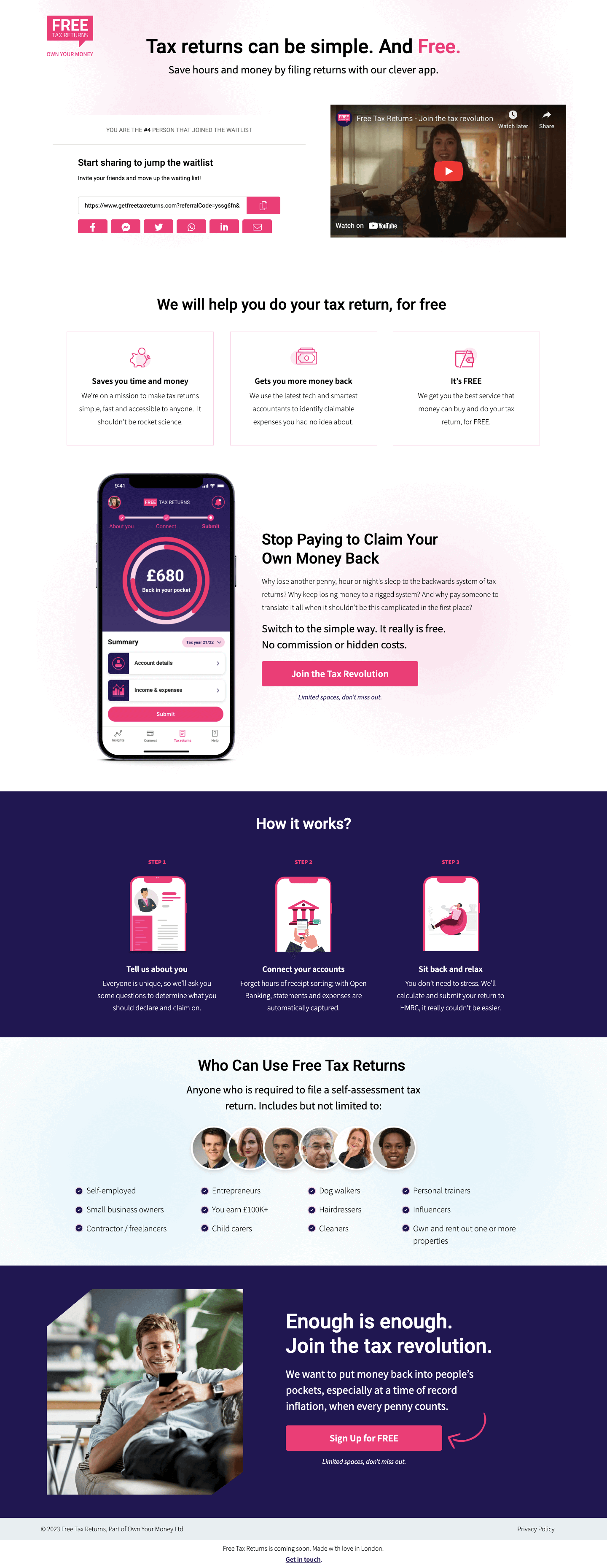
A masterclass in positioning against the category. It names the existing problem (‘tax returns can be simple’) and then adds the disruptive modifier (‘Free’). The bold orange on ‘Free’ creates a visual emphasis that makes the most important word the one the eye lands on first.
‘Share to jump the waitlist’ is the defining conversion architecture of this page. Every sign-up receives a personalised sharing URL and a visible queue position. This turns a passive waitlist into an active referral engine. Users are incentivised to share not out of affiliation, but self-interest. Sharing moves them up the queue. The mechanism shows the current sign-up count: ‘You are the Xth person to join the waitlist’ uses a live number that increases social proof as the list grows.
The video sits prominently in the hero alongside the sign-up form. The video does the heavy trust-building work (explaining why the product is free, how it works, and who built it) without requiring the visitor to read through an explanation. Video retention rates on pre-launch pages consistently outperform text at the same scroll depth.
‘We will help you do your tax return, for free’ (Saves You Time and Money / Gets You More Money Back / It’s FREE) distils the value proposition into three scannable benefits. Each one addresses a specific friction: time (‘stops being rocket science’), financial upside (‘identify claimable expenses’), and pricing (‘we get paid by the government, not you’).
This statement sits midway through the page. The reframe (the money was always yours, you’ve just been paying someone to retrieve it) creates emotional weight that the feature list above it can’t. It reframes paying for tax returns as a loss rather than a normal expense.
The 'Limited spaces, don't miss out' line below the CTA creates genuine scarcity without fabricating it. Pre-launch capacity is genuinely limited. The product doesn't exist yet, and early access is finite. When scarcity is real, stating it creates urgency. When it's manufactured, experienced buyers see through it instantly. This page uses honest urgency throughout.
The headline removes the anxiety that tax returns are complicated. If the product promise is ‘simple and free’, the barrier to sign up is minimal.
A YouTube-hosted video signals that the founders are comfortable being visible and accountable. Founders who hide behind anonymous branding are harder to trust with financial data.
The ‘Who Can Use Free Tax Returns’ section (self-employed, entrepreneurs, dog walkers, personal trainers, influencers, child carers, cleaners) signals that the product is designed for real people, not just accountants. The breadth of the list is reassuring to anyone wondering if their situation is too unusual.

"The 'How it Works' three-step section (Tell us about you / Connect your accounts / Sit back and relax) is one of the most effective sections on this page. In finance, the fear is data security and complexity. 'Sit back and relax' after step three is doing serious persuasion work. It's promising that the experience is passive once set up. That promise overcomes the biggest barrier to adoption in automated finance tools."
Read more about how we approach trust signals in our guide to Landing Page Call to Action Tips.
The 'Enough is enough. Join the tax revolution.' closing section uses movement language ('revolution' and 'Enough is enough') that frames the sign-up as a form of collective action rather than an individual transaction. People are more likely to share things they feel part of a movement around. This framing directly supports the viral sharing mechanic.
The page has a single conversion action: email sign-up for the waitlist. Every design decision exists to lower the friction to that one action. The form is two fields (email and a share-prompt), the CTA is repeated at the top and bottom, and the referral mechanism means each conversion generates additional conversions without any additional ad spend.
The ‘Enough is enough’ close pairs the emotional ‘revolution’ framing with a repeat of the CTA, so the visitor who scrolled all the way through has a final emotionally charged moment to convert.
"Pre-launch pages live or die by one metric: viral coefficient. If each sign-up generates more than one additional sign-up through sharing, the list grows without paid spend. The referral queue mechanic on this page is designed specifically to push that coefficient above 1. Getting the share link in front of the user before they leave the page (not in a follow-up email) is the critical implementation detail."
Unbounce hosts the sign-up form and integrates with the referral tracking tool. The platform’s lightweight deployment means the page loads fast even when referral tracking scripts are running, important for a product where every second of load time affects the share rate.
The page’s primary traffic came from social media shares, meaning the majority of users arrived on mobile. We placed the email input field at the very top of the viewport, made the CTA button full-width with high contrast, and made sure the queue position counter was readable at small sizes. The sharing buttons are touch-friendly with sufficient padding for reliable tapping.
The referral mechanic's JavaScript is loaded asynchronously so it doesn't block the first contentful paint. The video is embedded with a custom thumbnail rather than auto-loading the iframe, which prevents the YouTube embed from slowing the initial render. Both choices were made specifically to protect LCP scores on mobile connections.
Three improvements to further accelerate the viral loop:
Seeing a visual fill bar with a target (‘Refer 3 friends to jump to position X’) creates a goal-completion impulse that drives more shares per user than a raw number alone.
A prominent ‘Join 14,273 people already on the waitlist’ creates cascading social proof. Each new sign-up increases the counter, which increases the credibility for the next visitor.
‘Skip the queue entirely’ is a strong motivator, but ‘Get early access and never pay for a tax return again’ gives the share recipient a concrete reason to sign up, which improves referral conversion rates.
The Free Tax Returns pre-launch page shows how to build a viral acquisition engine from a landing page. The referral queue mechanic, honest scarcity, and emotionally charged closing section turned a simple waitlist into an organic growth loop.
Browse our full collection of landing page examples to see how we apply these principles across industries. For methodology, read our guide to Landing Page Call to Action Tips.
Controlling what visitors see first, second, and third guides them toward the conversion goal.
People follow the actions of others. Testimonials, reviews, and client logos build trust and reduce hesitation.
Limited availability increases perceived value. Countdown timers, limited spots, and exclusive offers drive urgency.
Eye-tracking shows people scan pages in an F-shape. Placing key content along this path increases engagement.
Pre-launch pages in finance need to do two things exceptionally well: make the value proposition undeniable ('free' is a powerful word in a category where people currently pay £100-£500 for a tax return) and make the sign-up feel risk-free. The only information asked is an email address, the friction must match the commitment level of signing up for a waitlist, not purchasing a product.
The referral waitlist ('Share to jump the queue') turns every sign-up into a potential acquisition channel. By giving users a personalised sharing link and a visual queue position, the page creates social currency, users share because they want to move up, not because they're advocates. This mechanic has driven viral pre-launch growth for companies like Robinhood, Monzo, and Superhuman. Free Tax Returns adapted it for a tax compliance product, which is an unusual but effective application.
Displaying the queue position does two things: it creates social proof (many people have already joined) and it creates urgency (positions are filling up). The specific number is more convincing than vague crowd signals like 'thousands of people', a numbered queue feels real and finite. Seeing your position in the queue also creates a gamification layer that increases the motivation to share.
A pre-launch page like this takes 1-2 weeks from brief to launch, faster than a full lead generation page because the conversion action is simpler (email only) and there's no product to explain in depth. The integration with the referral platform (typically Viral Loops or SparkLoop) requires an additional development day to configure queue position tracking and personalised sharing links.
Other CRO breakdowns from our lookbook
We design high-converting landing pages for B2B and B2C brands. Let's talk about yours.
Get a Free Consultation Or browse more examples →
Founder & CEO of Apexure, Waseem worked in London's Financial Industry. He has worked on trading floors in BNP Paribas and Trafigura, developing complex business systems. Waseem loves working with Startups and combines data and design to create improved User Experiences.
Get quality posts covering insights into Conversion Rate Optimisation, Landing Pages and great design


"The word 'free' in a finance headline is one of the most powerful conversion levers available. Tax returns cost people real money: £200, £400, sometimes more. When you put 'free' next to 'tax returns', the visitor's first reaction is scepticism. The page's job is to overcome that scepticism with a clear 'why', and on this page, the YouTube video does that work faster than any amount of copy."