
No form until the visitor has already decided.
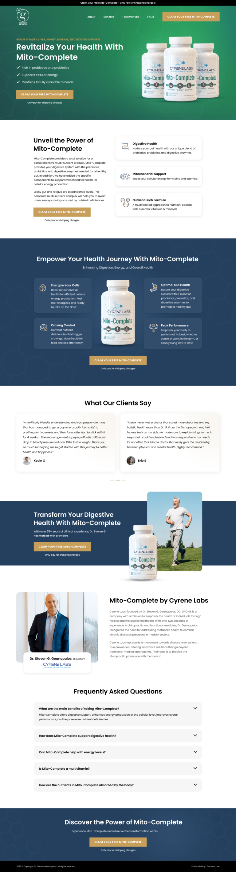
Dr. G's healthcare click-through page, built on WordPress for consumers who decide fast and bounce faster. How oversized type, video and logos carry the trust, and the CTA copy and hero proof we would change.
- Primary CTAGet Startedthe button the page is built around
- GoalClick-Throughwhat counts as a conversion
- PlatformWordPressclick-through page
- Built forB2CHealthcare
- The page as built, not a mockup.Analysed by Apexure, not by Dr. G.
- Client
- Dr. GHealthcare
- Industry
- Healthcare24 examples
- Audience
- B2CClick-Through
- Platform
- WordPress96 examples
- Page type
- Click-throughClick-Through
- Analysed by
- Waseem BashirMarch 2026
What the page does, and why
Why we built this healthcare click-through
When Dr. G needed a click-through that converts B2C visitors, the brief came down to one question: what does this specific audience need to see before they’ll take action?
We started by identifying the conversion barriers. In the healthcare space, consumers make faster decisions but they’re also quicker to bounce. The page has three seconds to earn their attention. Every design decision that followed was a direct response to those barriers.
Design decisions
We used oversized typography, not for decoration but for hierarchy. We created three distinct text colour levels: the headline in full contrast, supporting text in a softened mid-tone, and secondary details in a lighter shade. That layered approach means visitors absorb the most important message first without the fatigue of reading uniformly weighted text. When every paragraph is the same size and weight, nothing stands out. Hierarchy is what guides the eye.
We used a slider to show multiple proof points without overwhelming the layout. The slider creates an implicit message: “we have so many examples that we need a carousel to contain them.” Each slide’s headline is visible before interaction, so visitors who never click still absorb the credibility signal. We avoided auto-rotation. Forced movement frustrates visitors and reduces engagement with the content that matters.
We replaced static screenshots with embedded video because video builds trust faster than any other medium. Visitors see real people, hear real voices, watch the product or service in action. The performance trade-off is worth it. Video viewers are significantly more likely to convert than those who only read text. We configured the embed for lazy loading so it doesn’t impact initial page speed.
We positioned client logos and proof points prominently because social proof from recognised names creates an immediate trust transfer. The key insight is placement. Logos above the fold reduce bounce rate because visitors who recognise even one brand feel an instant sense of “this is legitimate.” We chose which logos to show carefully, featuring brands the target audience would recognise rather than just the biggest names in the portfolio.
The clean, solid background was a deliberate decision to let the content sell. When in doubt, we double the padding rather than add visual elements. Whitespace isn’t empty space. It’s breathing room for the visitor. Digestible content improves focus and clarifies the offering. If a page feels overwhelming, the solution is almost always removing elements, not adding them.
We set a single objective for this page, one CTA, one goal. The beauty of a landing page is the single canvas to persuade the visitor to do one thing. Adding a secondary objective (promote the blog, link to careers, present other products) dilutes everything.
Trust architecture
Trust signals are woven throughout the page, not isolated in one section. Reviews and ratings sit near the hero because that’s where bounce happens; social proof from real people reduces it. Testimonials with full names and photos appear in the mid-section because anonymous quotes carry no weight. Guarantees or trust badges sit near the CTA because that’s where commitment anxiety peaks.
"The biggest mistake in B2C is burying social proof at the bottom. Testimonials and reviews near the top of the page reduce bounce rate immediately because visitors see that real people, people like them, have already made this decision successfully."
Read more about how we approach trust signals in our guide to How to Optimize Your Landing Page Headlines.
We marked a testimonial from someone the target audience would identify with. People want to see that someone like them made this decision successfully. The closer the testimonial matches the visitor's situation, the stronger the persuasion.
Conversion strategy
As a click-through page, we deliberately avoided putting a form above the fold. The visitor absorbs the value proposition, sees proof, and only commits when they click through to the next step. By the time they reach the form, they’ve already decided. The form is just the mechanism. That sequencing tends to outperform direct lead capture for healthcare offerings.
"The biggest tell that a page was built without design experience is black text at maximum contrast on a white background. We always soften the blow: off-white backgrounds, a subtle grey text hierarchy, enough spacing that reading feels effortless. Those details seem small but they compound into a significantly better experience."
Platform: WordPress
We chose WordPress for this project because it gives us the right balance of design flexibility and conversion tooling. The platform integrates with the client’s existing content ecosystem, making the landing page part of their marketing stack rather than an isolated experiment.
Mobile experience
More than 60% of Dr. G’s visitors arrive on mobile. We didn’t just make the page responsive. We loaded it on a phone, read the text aloud, tried the navigation, and attempted to convert with our thumbs. That process exposed friction points analytics would never reveal. The CTA is accessible at every scroll depth, touch targets are sized for thumbs (not mouse pointers), and the form works without zooming.
We run speed tests on every page we build because a slow landing page is a leaking bucket. You can spend thousands driving traffic, but every additional second of load time costs conversions. We treat PageSpeed results as a to-do list, not just a score.
What we’d improve today
No landing page is finished. Every page is a hypothesis that data validates or disproves. With today’s data, we’d make three changes.
CTA copy. Replace generic text with action-specific language. “Get Your Free Quote in 60 Seconds” tells the visitor exactly what happens next and lowers the perceived commitment.
Above-the-fold proof. Surface a single compelling metric near the headline to anchor perceived value before the visitor starts scrolling.
Replace, don’t add. If we added a new testimonial, we’d remove the weakest existing one. The goal is to persuade with as little as possible, not to pile on more content.
"Every page we launch is a hypothesis. We set a single objective, measure against it, and then replace the weakest element rather than adding more. The goal is to persuade with as little as possible, not to dump everything onto one page and hope something sticks."
Key takeaway
This Dr. G click-through demonstrates that effective landing page design is about strategic restraint, not visual complexity. Every element earns its place by moving visitors one step closer to conversion. Anything that doesn’t serve that purpose gets cut.
Browse our full collection of landing page examples to see how we apply these principles across industries. For methodology, read our guide to Landing Page Call to Action Tips.
Waseem founded Apexure in 2015 and has led its work on 3,000+ pages for 300+ clients since. He writes about what the team sees after the click, which is pages, forms, tracking and the systems behind them.
What the page leans on
The principles at work on this page, each named in the analysis above.
Visual hierarchy
Controlling what visitors see first, second, and third guides them toward the conversion goal.
Social proof
People follow the actions of others. Testimonials, reviews, and client logos build trust and reduce hesitation.
Authority bias
People trust credible experts. Certifications, awards, media mentions, and expert endorsements boost credibility.
F-pattern layout
Eye-tracking shows people scan pages in an F-shape. Placing key content along this path increases engagement.
What people ask about pages like this
A high-converting healthcare landing page has a single clear objective, a headline that empathises with the visitor's problem, trust signals placed strategically throughout (not buried at the bottom), and a CTA with action-specific copy. The design should reduce cognitive load through clean typography, generous whitespace, and progressive disclosure of information.
A dedicated click-through outperforms standard website pages because it has a single focused goal with no competing navigation links. Your main website serves multiple audiences and objectives, which dilutes conversion performance. A landing page removes the main nav, eliminates distractions, and guides every visitor toward one action.
The most effective CRO principles for B2C landing pages are social proof, urgency through genuine scarcity, colour psychology for CTA contrast, and empathetic copy that names the problem before presenting the solution.
A healthcare landing page typically takes 2-3 weeks from brief to launch. This includes audience research, wireframing, visual design, copywriting, development, speed optimisation, and cross-device testing. We follow the principle that the page launches as a hypothesis, then we iterate based on real performance data.
Three more, taken apart the same way



Want one like this?
Tell us what the page has to do and where the traffic comes from. Within 48 hours you get a written quote from the people who wrote this breakdown. Already have a page that is not converting? Send it for a free audit instead.
UK hours, which is the East Coast morning.
"The hero has one job: confirm the visitor is in the right place within three seconds. If they have to think about what you do. They're gone. We strip everything from the hero that doesn't serve that single purpose. No secondary CTAs, no feature lists, no animations competing for attention."