CRO breakdown of AHR Private Wealth's UK-to-Australia pension transfer page. Design analysis covering financial services trust architecture, lead magnet conversion, and regulatory credibility by Apexure.
What is ConvertScore™? ConvertScore™ is Apexure's proprietary landing page performance metric. We evaluate every page across four dimensions — Copy & Messaging, Layout & Hierarchy, Trust & Social Proof, and CTA & Conversion Path — to produce a single score out of 100.
A UK expat in Australia considering a pension transfer is not chasing better returns. They are worried. Worried their pension is stuck in a scheme they cannot access. Worried about currency fluctuations eating their retirement. Worried about solvency, what happens if their UK scheme runs into trouble while they are 10,000 miles away.
AHR Private Wealth’s page addresses anxiety, not aspiration. The headline, “Transfer your UK Pension to Australia”, is deliberately plain. It does not promise higher returns. It promises what the visitor actually wants: to move their money to where they live, under rules they understand, with an advisor they can meet in person.
The trust architecture has to be bulletproof. Regulatory badges, media mentions, Trustpilot reviews, and provider logos all answer one question: “Can I trust these people with my retirement?”
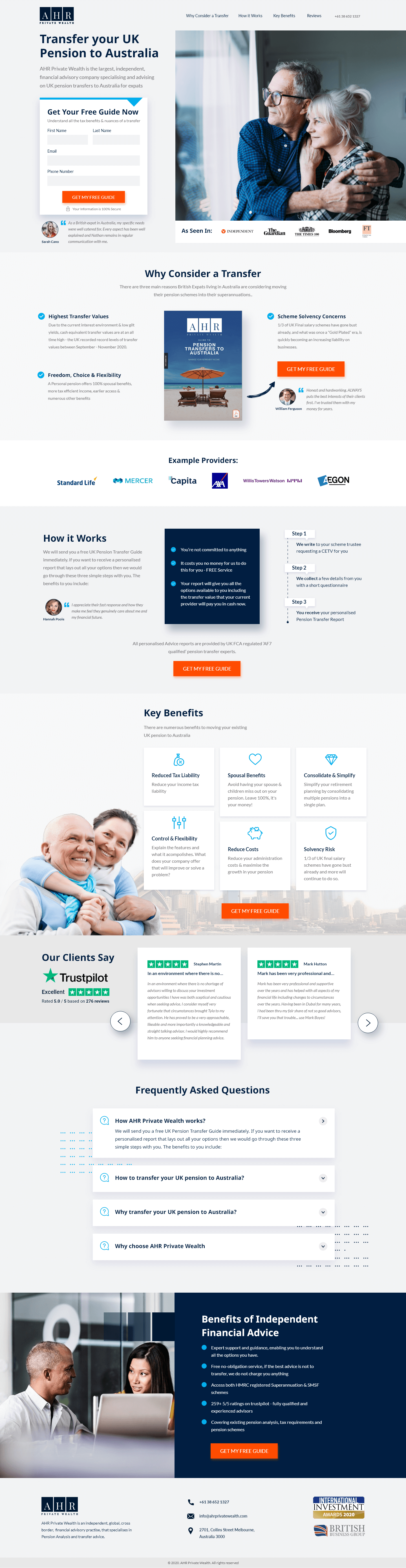
A 4-field form (First Name, Last Name, Email, Phone Number) sits beside the headline with an orange “GET MY FREE GUIDE” CTA. The form appears before any testimonials, benefits, or process explanation.
This aggressive placement works because the CTA is a guide download, not a consultation booking. The visitor gives four details and receives an educational resource. That exchange feels fair. If the CTA were “Book a Consultation,” the same placement would feel pushy. The guide reframes the form from “give us your details” to “get your guide.”
The hero photo shows an elderly couple, relaxed and smiling. The visitor sees a version of their future: calm, secure, sorted. Not champagne on a yacht. Just a couple who handled their pension and feel good about it.
“As Seen In” logos include the Financial Times. For a UK expat, the FT is the most credible business publication in their world. Trustpilot “Excellent” with 64 reviews appears near the hero and in a dedicated section below. 64 reviews is enough to feel genuine without being suspiciously large.
Standard Life, Mercer, Capita, Halifax, AEGON. A visitor with a Standard Life pension sees their provider and thinks: AHR has transferred pensions from my exact scheme before. That specific match eliminates one of the biggest friction points, the fear that their particular pension is too complex.
Four steps walking through the process: initial enquiry, guide delivery, consultation, transfer execution. For a financial procedure most people have never done, process transparency converts. A visitor who does not understand what happens will not start.
Reduced Tax Liability, Special Benefits, Consolidate & Simplify, Control & Flexibility, Reduce Costs, Solvency Risk. Not prioritised by importance, displayed so each visitor type finds their concern quickly. A tax-conscious visitor sees tax liability first. A risk-averse visitor sees solvency risk.
The "Solvency Risk" benefit does something the others do not, it introduces a fear the visitor may not have considered. Most visitors are thinking about tax and flexibility. Solvency risk says: your UK pension scheme could have financial problems while you are in Australia with no easy way to monitor it. That new concern strengthens the case for transferring, and the visitor learns about it on a page that also offers the solution.
“Benefits of Independent Financial Advice” with checkmarks: qualified advisors, FCA regulated, AFSL licensed, personalised advice. Investment & Financial Services and British Australian Chamber of Commerce logos in the footer.
An FCA-regulated firm provides UK-side compliance. An AFSL-licensed firm provides Australian-side compliance. Together, these badges answer: “Is this legal? Is this regulated? Will my money be protected?”

"The regulatory badges on this page are not marketing. They are permission to compete. A pension transfer firm without FCA and AFSL credentials will not get a single lead from a financially literate UK expat. We placed them in the hero area and in the closing section, seen twice, once to get past the initial trust gate and again to reassure before the form submission."
Pension transfer trust is built in layers of escalating institutional credibility.
Financial Times logo and Trustpilot “Excellent” signal that AHR exists in the legitimate financial advisory ecosystem.
Standard Life, Mercer, Capita, Halifax, AEGON confirm AHR handles transfers from the major UK schemes. The visitor sees their own provider and relaxes.
FCA regulated, AFSL licensed, British Australian Chamber of Commerce member. Not differentiators, the minimum standard the visitor expects. But displaying them prominently signals transparency.
The Melbourne address in the footer (270 Little Bourke Street) does important work. It confirms AHR is physically present in Australia, not operating remotely from the UK. A UK expat wants an advisor they could theoretically visit in person. Even if they never walk into the office, knowing it exists in their city provides comfort that a PO box never would.
The page drives toward one action: “GET MY FREE GUIDE.” The lead magnet appears as an above-fold form, then as orange CTAs after each major section. Six touchpoints total.
The guide-based model matches the visitor’s readiness. Someone Googling “transfer UK pension to Australia” is researching, not buying. The guide meets them there. AHR’s team follows up after download, converting educated leads into consultations.
"'Get My Free Guide' converts 3-5x better than 'Book a Consultation' on financial services pages. The visitor does not trust you yet. They found you on Google 10 seconds ago. They are not ready to discuss their life savings. They are ready to read a guide. The guide earns the trust that leads to the consultation."
Unbounce was chosen because AHR runs provider-specific campaigns and needs variant pages (Standard Life-specific, AEGON-specific) with customised messaging.
UK expats browse on their phones during evenings and weekends, often after a conversation about retirement or receiving a pension statement. The above-fold form stacks cleanly on mobile. The orange CTAs are prominent against white and grey backgrounds.
A slow-loading financial services page triggers the same anxiety as a slow-loading banking app. The visitor questions technical competence, and by extension, competence with money. The page uses minimal imagery and no video, keeping load times under 2 seconds.
Hypothesis 1: Add a pension transfer calculator. “How much could your pension be worth in an Australian super fund?” with currency conversion, tax implications, and projected values would personalise the value proposition. Once the visitor sees “their” projected number, downloading the guide becomes obvious. Expected impact: high.
Hypothesis 2: Add a video of the lead advisor. A 90-second video walking through the transfer process in plain English would humanise the firm. Pension transfers sound complex. A calm advisor on camera makes them feel manageable. Expected impact: medium-high.
Hypothesis 3: Add a provider-specific dropdown before the form. A selector that routes to provider-specific information would make the page feel personalised. Expected impact: medium.
"The pension calculator is what would move this page from strong to exceptional. Right now the page says 'you could benefit from a transfer.' A calculator that says 'your £180,000 Standard Life pension could be worth AUD $342,000 in your Australian super fund' makes the benefit personal. Personal numbers drive action."
This page executes the financial services playbook near-perfectly: lead magnet conversion, above-fold form, Financial Times credibility, Trustpilot reviews, provider-specific logos, regulatory badges, process transparency, and FAQ objection handling.
What holds it back slightly: no personalised calculator, no video content, and no provider-specific routing. The page treats all pension transfers the same, a Standard Life visitor gets the same experience as an AEGON visitor.
For a financial services pension transfer landing page, 85 shows near-complete trust architecture for a high-stakes financial decision.
Browse our full collection of landing page examples to see how we apply these principles across industries. For more on financial services conversion, read our financial services landing page guide.
Giving something valuable first (free guide, tool, audit) creates an obligation to reciprocate.
People trust credible experts. Certifications, awards, media mentions, and expert endorsements boost credibility.
People follow the actions of others. Testimonials, reviews, and client logos build trust and reduce hesitation.
People feel losses more strongly than gains. Framing around what they will miss motivates action.
The first piece of information shapes all subsequent judgements. Price comparisons and headline stats set expectations.
This principle influences visitor behaviour and supports the page's conversion goal.
Pension transfers are high-stakes financial decisions. Nobody books a consultation with a financial advisor they found 30 seconds ago. A free guide gives the visitor useful information without asking them to commit to a conversation. AHR captures the lead through the guide download, then nurtures them until they are ready for a consultation. The guide converts at a much higher rate because the perceived commitment is lower: reading a guide vs talking to a salesperson.
The visitor's current pension is held with one of these providers. When they see their provider's logo, they confirm AHR handles transfers from their specific scheme (relevance) and see that AHR has experience with major pension schemes (competence). A visitor with a Standard Life pension who sees the Standard Life logo thinks 'these people have done this before with pensions like mine.' That recognition converts better than a generic 'we handle all UK pensions' claim.
For pension transfers, regulatory compliance is the baseline trust requirement. AHR displays FCA regulated status, AFSL credentials, and British Australian Chamber of Commerce membership. A visitor considering moving their life savings across continents needs to know the company is regulated in both countries. Without these badges, a significant percentage of visitors would not fill out the form. The badges do not differentiate, they give AHR permission to compete.
A financial services landing page takes 3-4 weeks because every claim must be compliance-checked. Financial promotion rules in the UK (FCA) and Australia (ASIC) dictate what can and cannot be stated. We work with the client's compliance team to verify every benefit claim, testimonial, and performance implication. The build follows our 7-step process with an additional compliance review.
Other CRO breakdowns from our lookbook
We design high-converting landing pages for B2B and B2C brands. Let's talk about yours.
Get a Free Consultation Or browse more examples →
Founder & CEO of Apexure, Waseem worked in London's Financial Industry. He has worked on trading floors in BNP Paribas and Trafigura, developing complex business systems. Waseem loves working with Startups and combines data and design to create improved User Experiences.
Get quality posts covering insights into Conversion Rate Optimisation, Landing Pages and great design


"Financial services pages cannot sell the way consumer products do. You cannot create urgency or use emotional manipulation when someone's retirement savings are at stake. The page has to feel calm, professional, and thorough. The form asks for a free guide, not a commitment. Every element signals: we will educate you first, advise you second, and only proceed if it is right for your situation."