CRO breakdown of AdMammoth's affiliate marketing management homepage. Design analysis covering B2B service positioning, enterprise logo trust, and calendar-based conversion by Apexure.
What is ConvertScore™? ConvertScore™ is Apexure's proprietary landing page performance metric. We evaluate every page across four dimensions — Copy & Messaging, Layout & Hierarchy, Trust & Social Proof, and CTA & Conversion Path — to produce a single score out of 100.
Every affiliate management agency offers the same three services: programme setup, publisher recruitment, and channel optimisation. The descriptions are interchangeable. What differentiates an agency is not what they do. It is who they have done it for.
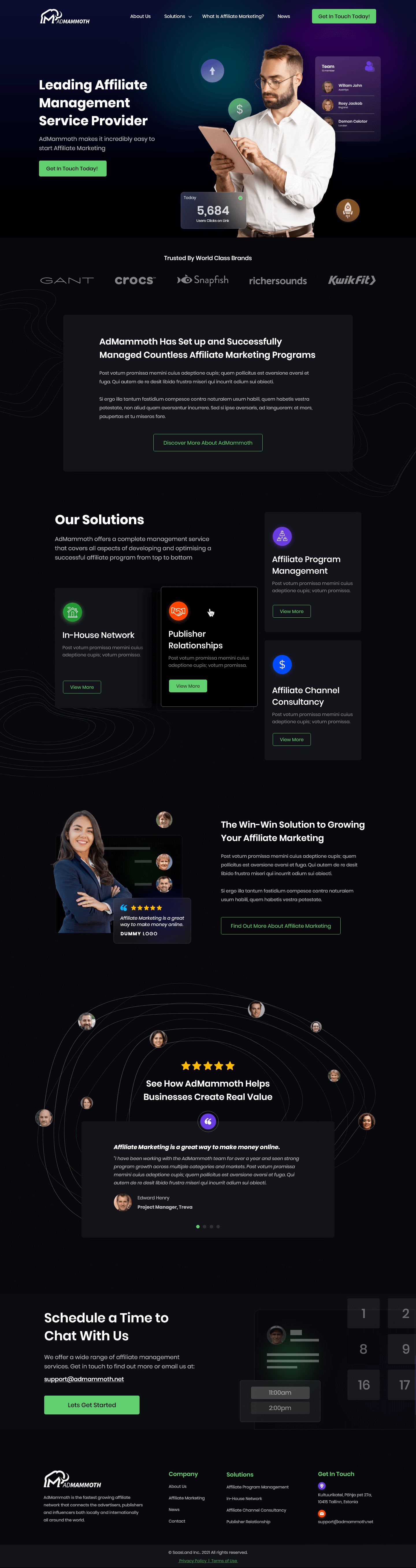
AdMammoth’s page leans heavily on this reality. The hero states a position: “Leading Affiliate Management Service Provider.” Then it proves that position with enterprise logos (GANT, Crocs, KwikFit) and a stats badge showing 5,684 sales. The visitor sees the claim, sees the proof, and decides whether to keep scrolling, all within 5 seconds.
The challenge for affiliate management pages is that the service is invisible. There is no product to photograph, no interface to screenshot, no physical outcome to display. Client logos, testimonials, and scheduling access carry more weight than service descriptions.
The entire page uses a dark/black background with green CTAs, purple gradient accents, and floating UI elements showing stats and user avatars. This is not a standard agency website. It looks like a SaaS dashboard or a trading platform.
That visual positioning is deliberate. Affiliate marketing is a technical discipline involving tracking pixels, attribution models, commission structures, and publisher networks. A dark theme signals “we are a technology company that manages affiliate programmes” rather than “we are a marketing agency that also does affiliates.” For a marketing director evaluating partners, that distinction matters.
“Trusted By World Class Brands”, GANT, Crocs, Snapfish, Richersounds, KwikFit. Five recognisable consumer brands positioned immediately below the hero.
A marketing director evaluating affiliate agencies does not want to read case studies during their first visit. They want to see names they recognise. If GANT trusts this agency, the implicit logic is: their affiliate programme is at least as complex as mine, and these people handled it.
“Our Solutions”, In-House Network, Publisher Relationships, Affiliate Channel Consultancy. Each with a green “View More” CTA. A brand that already runs an affiliate programme but needs better publisher relationships clicks one card. A brand starting from scratch clicks another. Self-selection reduces the cognitive load of evaluating multiple offerings simultaneously.
Five gold stars, a video embed, and a quote from Elleana Harry, Project Manager, describing how affiliate marketing helped her business. On a dark, tech-heavy page, the video is the human element. Everything else is institutional. The video lets a prospect assess authenticity through tone and delivery.
“Schedule a Time to Chat With Us” with available time slots and a green “Let’s Get Started” CTA. Calendar widgets convert better than contact forms for B2B services because they eliminate response-time uncertainty. A prospect who books a slot knows exactly when the conversation happens. The calendar also implies a structured sales process.
The calendar widget sits at the bottom after a deliberate trust escalation: logo proof → service overview → win-win positioning → video testimonial → schedule a call. Each section builds on the last. By the time the prospect reaches the calendar. They have absorbed enough proof to feel comfortable booking. Moving the calendar higher would reduce effectiveness because the trust foundation would not yet be built.

"Calendar widgets outperform contact forms on B2B services pages for one reason: certainty. A contact form is a hope, 'maybe they will respond tomorrow.' A calendar booking is a commitment from both sides, 'we will talk at 2pm on Thursday.' That certainty converts prospects who would otherwise submit a form, wait 48 hours, and move on."
GANT, Crocs, Snapfish, Richersounds, KwikFit. Recognisable brands that signal enterprise-level operation.
“5,684 Sales” with user avatars. Specific enough to feel real, large enough to imply scale.
A named project manager describing results adds human credibility to the institutional proof above.
The Dublin, Ireland address in the footer establishes a physical presence. For B2B services, a real office address signals permanence and accountability. An agency with no address could be a freelancer with a website.
Two paths: “Get In Touch Today!” (green CTA throughout) and the calendar scheduling widget at the bottom. The dual model catches early interest and considered interest separately.
The page has full navigation (About Us, Solutions, What is Affiliate Marketing?, News). The “What is Affiliate Marketing?” link targets earlier-stage prospects evaluating whether to start an affiliate programme, not just which agency to hire. That educational entry point positions AdMammoth as the expert the prospect learned from.
"The 'What is Affiliate Marketing?' nav link catches prospects who are evaluating whether to start an affiliate programme at all. That educational entry point positions AdMammoth as the expert they learned from, which creates a natural path to hiring them. Teach first, sell second."
WordPress was chosen for a multi-page B2B services site with blog/news content. The dark theme is a custom build allowing full design control over the gradient accents and floating UI elements.
B2B decision-makers browse between meetings on their phones. The dark theme maintains its premium feel on mobile. Green CTAs pop against the dark background on any screen size. The calendar widget must work smoothly on mobile for tap-to-book conversion.
Dark backgrounds make compression artefacts and colour banding more noticeable. The hero photo, floating UI elements, and video thumbnail all need careful optimisation. The gradient accents use CSS, keeping page weight manageable.
Hypothesis 1: Replace the lorem ipsum placeholder text immediately. The “About” section contains visible placeholder copy. This needs real content about AdMammoth’s team, years in affiliate marketing, and number of programmes managed. Expected impact: high, placeholder text on a live page is a credibility problem that needs fixing before anything else.
Hypothesis 2: Add case study metrics alongside the logo bar. The page has logos but no numbers. “Grew GANT’s affiliate revenue by X% in 6 months” would convert prospects who need more than logo proof. Expected impact: high.
Hypothesis 3: Add a process section. Prospects want to know what happens after they sign. A 3-step process (Audit → Strategy → Launch) would reduce the “what am I actually buying?” uncertainty. Expected impact: medium.
"The lorem ipsum needs to go before anything else. A prospect who scrolls past enterprise logos and then reads placeholder Latin text will question whether this company is real. One paragraph of genuine copy about AdMammoth's team and their track record would replace the weakest section with one of the strongest."
Strong design foundations, dark tech-forward theme, enterprise logos, three-card solutions, video testimonial, calendar widget, green CTAs with good contrast. The structure is right.
What holds it back: lorem ipsum placeholder text in the About section is an unfinished element that undermines the page’s credibility. No specific case study metrics (just logos). No process section. Full navigation creates exit paths. The page has the right architecture but needs content completion and results data.
For a B2B affiliate management homepage, 71 shows strong design held back by incomplete content.
Browse our full collection of landing page examples to see how we apply these principles across industries. For more on B2B conversion, read our B2B landing page examples guide.
People trust credible experts. Certifications, awards, media mentions, and expert endorsements boost credibility.
People follow the actions of others. Testimonials, reviews, and client logos build trust and reduce hesitation.
The first piece of information shapes all subsequent judgements. Price comparisons and headline stats set expectations.
This principle influences visitor behaviour and supports the page's conversion goal.
Affiliate marketing is a technical, data-driven industry. Dark themes signal sophistication and tech competence, the same reason trading platforms, analytics dashboards, and developer tools use dark interfaces. A white background with stock photos of handshakes would signal a generic agency. The dark design with floating UI elements, gradient accents, and stats badges signals a company that lives in data and dashboards. The target audience (e-commerce marketing directors at brands like GANT and Crocs) expects this visual language from their technology partners.
A contact form says 'fill this out and someone will get back to you eventually.' A calendar widget says 'pick a time that works for you and we will be ready.' For B2B services, the calendar removes two friction points: uncertainty about response time, and the back-and-forth of scheduling. The prospect books a slot, gets a calendar invite, and shows up. The calendar also signals that AdMammoth values the prospect's time.
For affiliate management, enterprise logos are the single most important trust signal. A marketing director at a mid-size e-commerce brand sees GANT, Crocs, Snapfish, Richersounds, and KwikFit and thinks: if these brands trust AdMammoth with their affiliate programme, the company can handle mine. The logos do the work of a case study in 2 seconds.
A B2B services homepage like this takes 3-4 weeks because it involves multiple sections (solutions, about, testimonials, scheduling) and a navigation structure. The dark theme requires extra attention to contrast ratios, readability, and CTA visibility. The build follows our 7-step process with additional design iteration on the dark colour palette.
Other CRO breakdowns from our lookbook
We design high-converting landing pages for B2B and B2C brands. Let's talk about yours.
Get a Free Consultation Or browse more examples →
Founder & CEO of Apexure, Waseem worked in London's Financial Industry. He has worked on trading floors in BNP Paribas and Trafigura, developing complex business systems. Waseem loves working with Startups and combines data and design to create improved User Experiences.
Get quality posts covering insights into Conversion Rate Optimisation, Landing Pages and great design


"B2B services pages have a content problem: there is nothing to show. No product, no dashboard, no physical deliverable. The page has to sell trust in people you have never met. That is why the logo bar appears before any service description. GANT and Crocs say more about AdMammoth's capability than three paragraphs of agency copy ever could."