
Where the form should sit, tested.
Hutch, a marketing agency for home service businesses, had a roofing landing page that was already performing and one question about it: does the lead form convert better above the fold or below it. We built both variants, added a click-to-call button, social proof, an FAQ and a process section, and ran the test. The layout decision came from the test rather than opinion; the study reports better lead quality but gives no figure.
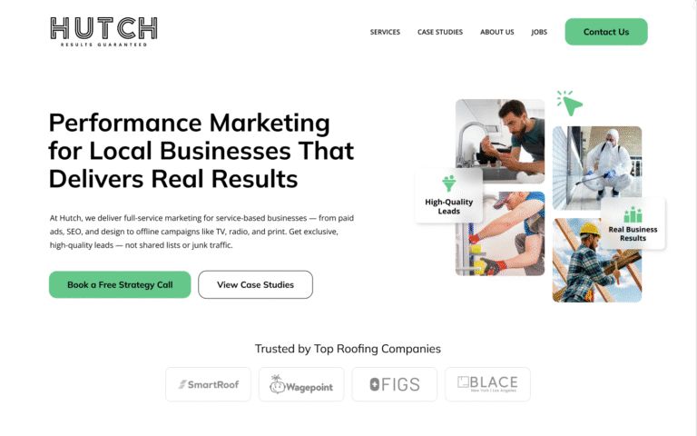
- TestTwo variantsform above the fold against below it
- CallsClick-to-calla button for visitors who would rather ring
- ProofSpreadtestimonials, star ratings and trust signals
- AnswersFAQand a breakdown of how the service works
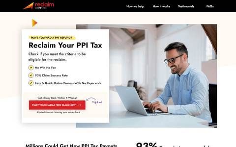
- The page as tested, and what went in around the form.As published April 2025.
- Client
- HutchMarketing for home service businesses
- Sector
- Marketing agencyB2B · Marketing
- Published
- April 2025Conversion rate optimisation
- Services
- Conversion rate optimisationCase study · April 2025
A page that worked, and a question about it
Hutch's roofing page was already performing well. The question was not whether to rebuild it but where one element should go, and what else the page needed around it.
Above the fold or below it, untested
The lead form is the point of the page, and there are two schools on where it goes: first thing on screen, or after the messaging and trust signals have done their work. Hutch wanted an answer from data rather than a preference.
More roofing leads, but only the qualified ones
The objective was qualified roofing leads, not a bigger count. Any change to the layout had to be judged on who came through the form as well as how many, which is harder to test and the reason the hypothesis had to be clear.
No way to call, and questions left unanswered
Some visitors would rather phone than fill in a form, and the page gave them no button. Others wanted to know what happens after they enquire and how the service works, and the page did not say. Both are friction a test alone cannot fix.
Run an A/B test on the roofing landing page to find the most effective placement for the lead capture form, above the fold or below it, and use that insight to lift conversion rates.The request, as Hutch made it
What we tested, and what we added around it
A structured CRO process: the two variants first, then the elements that make a page easier to trust and act on, whichever variant wins.
Two variants, one difference between them
Variant A puts the form above the fold, visible the moment the page loads. Variant B holds it back until the key messaging and trust-building elements have been seen. Everything else, the brand's visual language and the order of the messaging, stayed the same, so whatever the numbers said could be pinned on the placement.
A button for visitors who would rather ring
Not everyone wants to type. A click-to-call button, the phone number at the top right of the hero, gives a visitor on a phone a way to make the call in one tap, the shortest path from interest to a conversation. Where the button sat was treated as a hypothesis in its own right, tested rather than assumed.
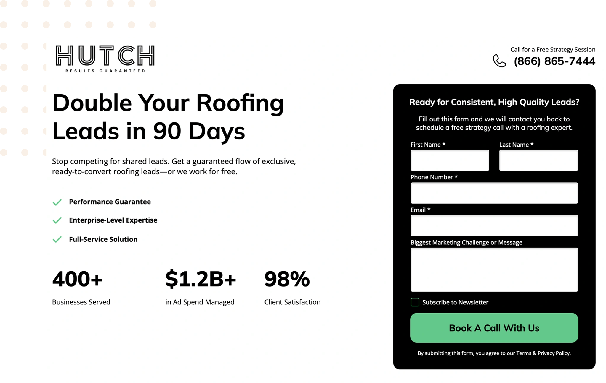
Testimonials and star ratings, spread through the page
Customer testimonials, star ratings and recognisable trust signals were placed throughout the page rather than gathered in one section, so that wherever a visitor pauses there is something nearby that says other people have done this and were glad they did. On a page selling reliability, that is most of the argument.
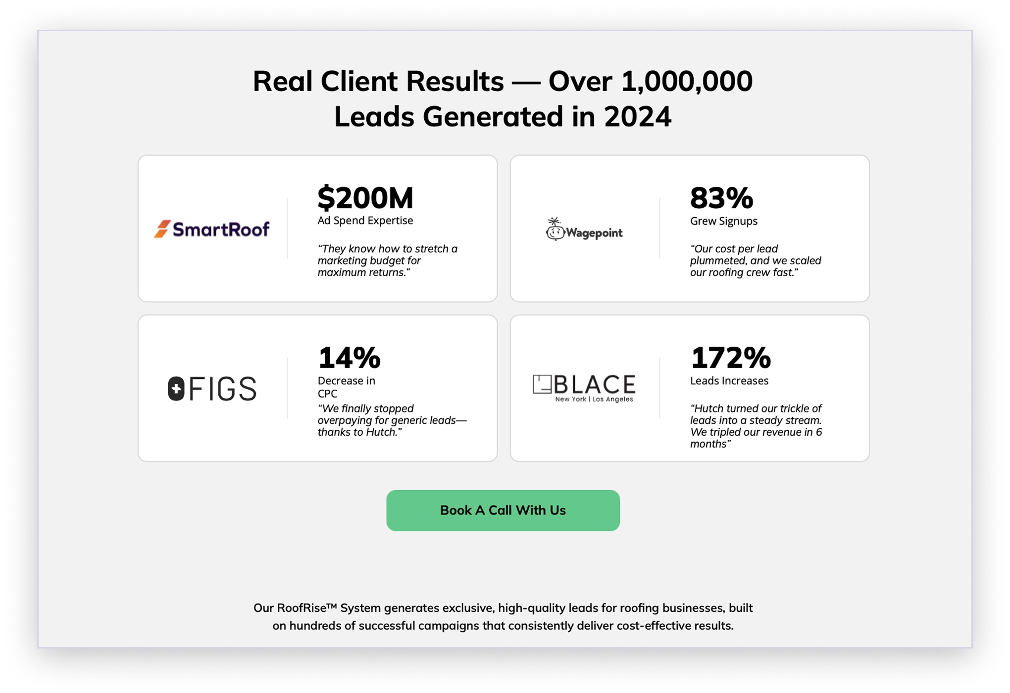
An FAQ for the questions that stall an enquiry
An FAQ section was added to answer the common questions a visitor has before they commit: whether the leads are any good, whether there is a long contract, how long results take. The study credits it, with the process section, with improving transparency and giving people the confidence to move forward.
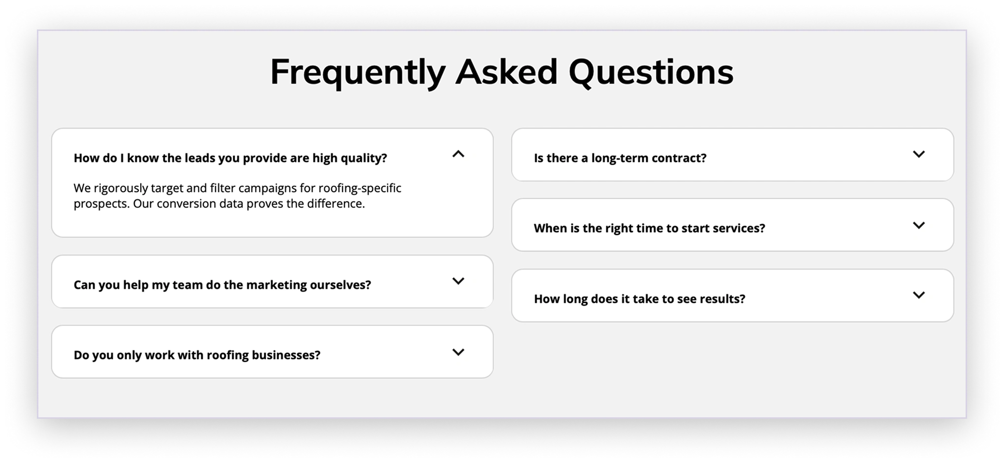
How the service works, in three steps
Alongside the FAQ, a section walks the visitor through how the roofing service works, so they know what to expect after they get in touch. It removes the uncertainty that stops people enquiring, and it does that work whichever variant of the form they saw.

What the test told Hutch
The study, published in April 2025, reports the outcome in words: better decisions, a better experience and better lead quality.
The form above the fold against below it, with everything else on the page held the same.
A one-tap call for visitors on a phone, placed where the test said it should be rather than where it was assumed.
The study does not say which variant won, and gives no conversion rate, lead count or test length. What it reports is that the test and the added elements improved user experience and lead quality.
"a breath of fresh air"

I found Apexure through Upwork and had them design a landing page for me. It exceeded my expectations! So much so that I quickly had them do some other landing pages for my clients, and I'm consistently impressed with their work. The designs are strong, the copywriting is strong, and their proactive communications are a breath of fresh air.
Four people on the test and the page
The team on this project
- Project managerSajad
- DesignerVinay
- DeveloperTajamul
- QAWefiya
A named account manager and a shared channel for the whole engagement. UK hours, which is the East Coast morning.
Three more pages improved by testing


Have a page with traffic and a number that should be higher?
Send us the page and where its traffic comes from. You get a written read of what we would test first, with the reason for each hypothesis, and a monthly price. No contract, and the losses get reported too.