Since its inception, Flare.io has expanded with a range of products to address cybersecurity challenges. Using data from both the dark web and the regular web, the platform offers user-friendly real-time monitoring and boasts a 96% customer renewal rate.
Here are the four main problems Apexure discovered on its landing page.
Content Distraction: Extensive content diverted attention from the primary call-to-action, leading to fewer completed bookings.
Information Overload: Multiple sections, such as “What we will cover,” “Testimonials,” and FAQs, overwhelmed visitors and hindered their focus on booking a demo.
Redundant Details: Excessive information diluted the urgency and clarity of the call-to-action for those ready to book a demo.
User Experience Issues: The long scroll and navigation difficulties, especially on mobile devices, added friction and made it hard to find the demo booking form quickly.
The new, concise version focused on the following key elements:
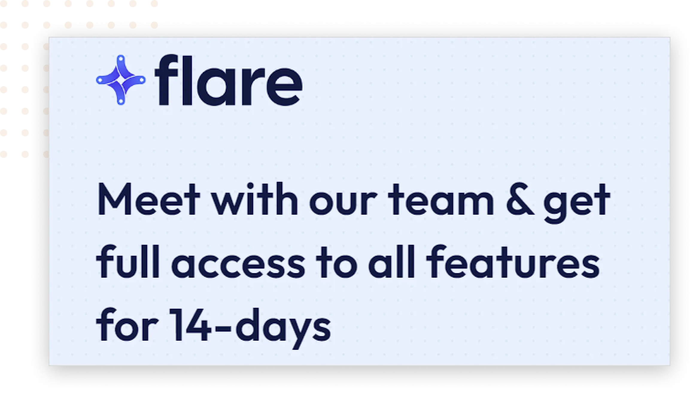
1. Headline Copy:
We crafted a clear and compelling headline designed to immediately capture visitors’ attention. The headline communicated the value of booking a demo with Flare.io, ensuring that potential customers understood the benefits right away.
The headline grabbed attention quickly, aiming to engage visitors and encourage them to proceed further down the page.
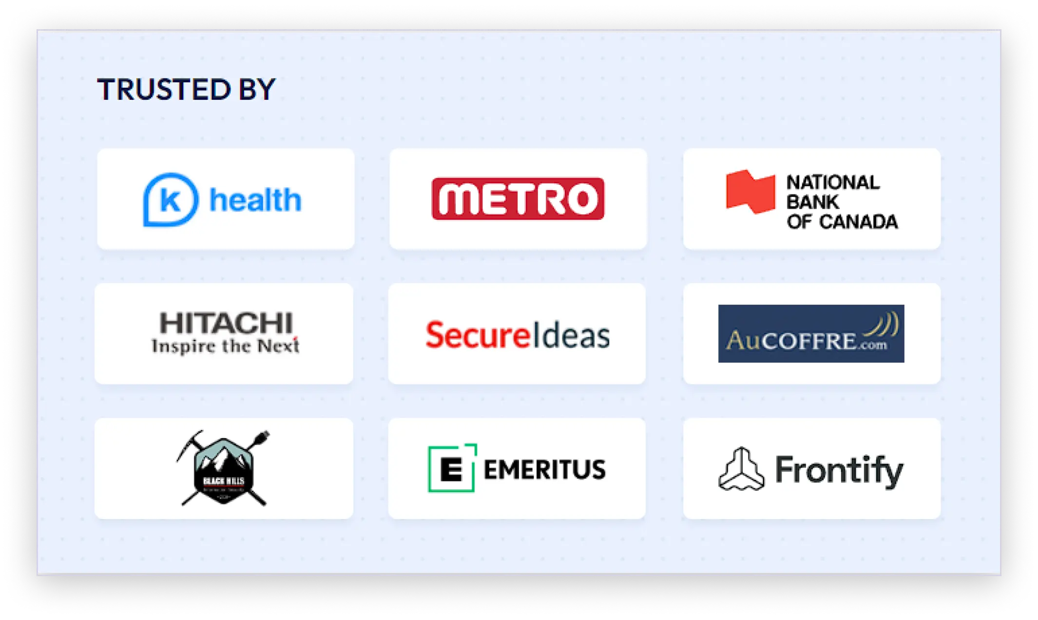
2. Trusted By Logos:
We displayed logos of well-known companies that trust Flare.io prominently on the page. This visual element served to build credibility and trust with potential customers by showcasing the established and reputable organizations that rely on Flare.io’s services.
The logos acted as social proof, reassuring visitors that other respected entities found value in Flare.io’s platform.
3. Form:
We designed a simple and straightforward form to capture leads. The form was prominently placed and easy to complete, minimizing any potential friction that might deter visitors from filling it out.
By keeping the form focused, we aimed to make the process of booking a demo as quick and hassle-free as possible.
The form was clearly highlighted to draw attention to the call-to-action, ensuring that visitors knew exactly what steps to take to book a demo.
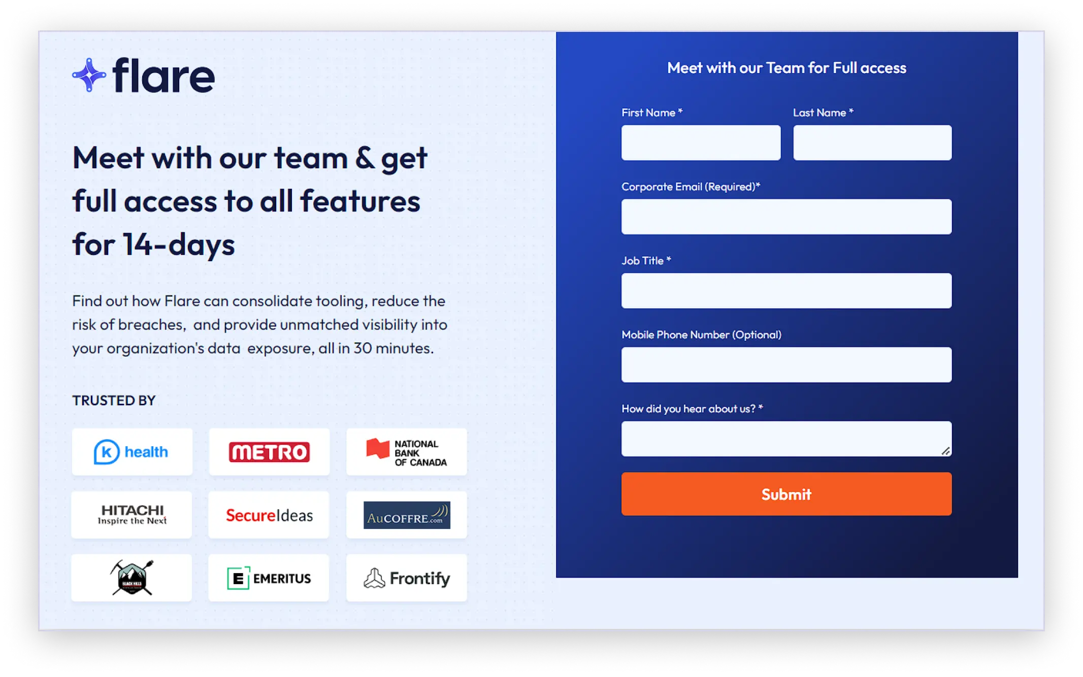
This streamlined approach aimed to reduce friction and enhance user experience by focusing on essential information and eliminating unnecessary distractions. The goal was to make it easier and more appealing for potential customers to book a demo with Flare.io, ultimately leading to higher conversion rates.
After completing all the on-page improvements, it was time for testing. The older, longer version of the page was pitted against the new short version. After analyzing the conversions produced by both pages, we got a winner.
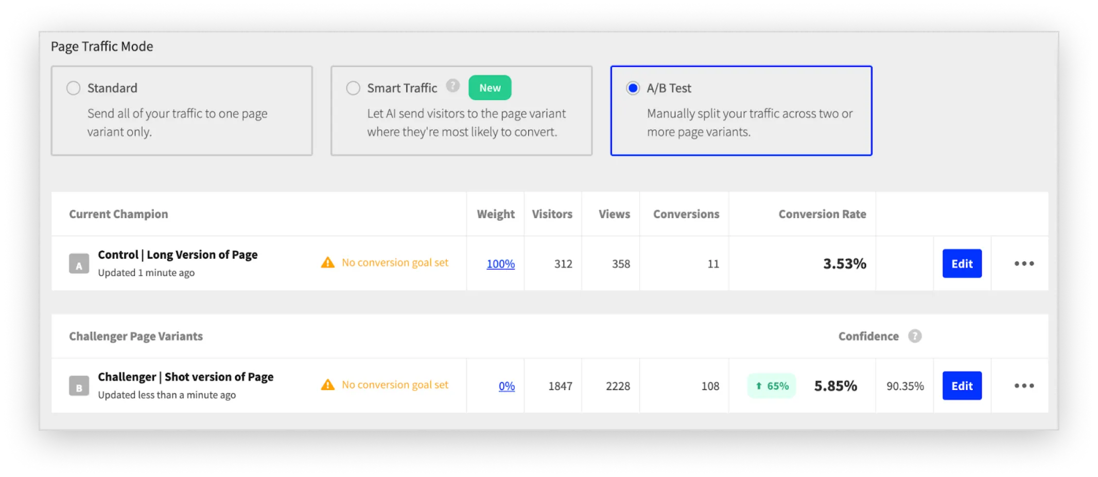
Flare.io’s short version of the page performed much better than the long version. The optimized “Book a Demo” page proved to be highly effective, delivering remarkable results within just one week.
 65% increase in conversions
The significant lift in conversions indicated that the concise and focused approach resonated well with visitors, making them more likely to book a demo. A clear headline, trusted by logos, and a straightforward form worked together to create a compelling user experience that drove more visitors to complete the desired action.
The number of conversions doubled compared to the original long-form page. Such dramatic improvement demonstrated that reducing the length and complexity of the page could lead to substantial increases in conversion rates.
By simplifying the page and focusing on key elements, we made it easier for potential customers to take action, resulting in a higher overall conversion rate.


"Every month we need to create new landing pages for campaigns, events, or influencers and edit the previous ones. Apexure's team is always on time, and they always answer to all of our needs. Their team is very reactive, proactive, and friendly."