CRO breakdown of Wethm's sleep wellness app pricing page. Design analysis and conversion insights by Apexure.
What is ConvertScore™? ConvertScore™ is Apexure's proprietary landing page performance metric. We evaluate every page across four dimensions — Copy & Messaging, Layout & Hierarchy, Trust & Social Proof, and CTA & Conversion Path — to produce a single score out of 100.

Wethm isn’t selling a feature set. It’s selling rest. The visitor arriving on this page has probably already tried and failed to fix their sleep through other means: earlier bedtimes, sleep hygiene guides, maybe even another app. They’re not curious about sleep tracking. They’re desperate for a solution that actually works.
That’s the emotional context the page needs to meet them in. Before features, before pricing, before social proof, the page’s first job is to say “we understand what you’re going through.”
The deep navy-to-midnight-blue gradient is the page’s most important brand decision. It creates an immediate sensory association with night-time, rest, and calm before a single word is read. Competitor sleep apps on white backgrounds feel clinical. Wethm’s dark palette feels like the solution it’s selling. The gradient also gives CTA buttons (in a warm contrasting orange) natural visual prominence without needing oversized sizing.
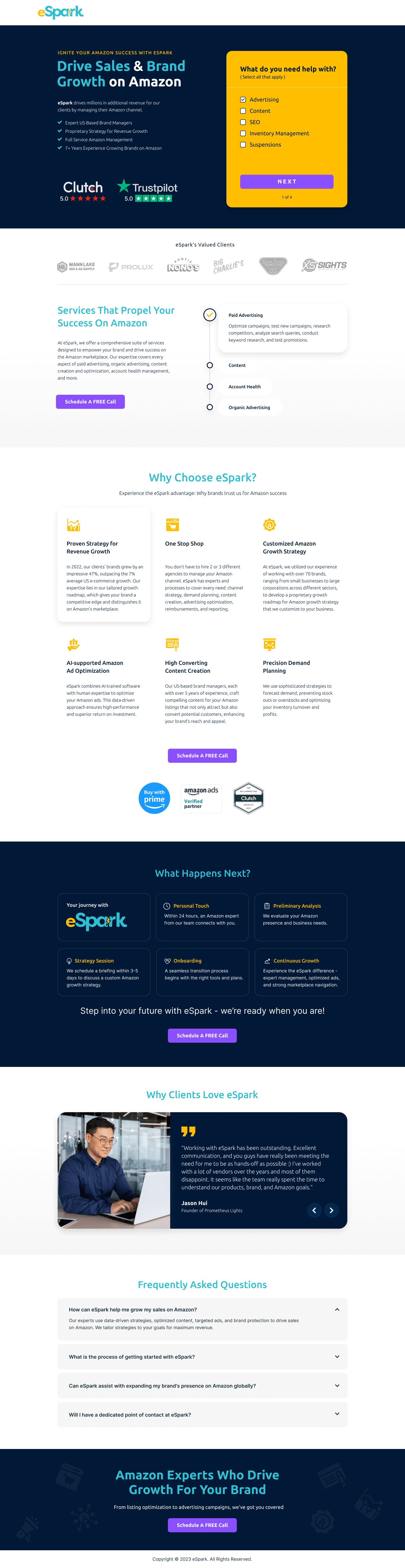
The mockups show the app’s actual UI alongside the value proposition. The visitor sees what they’re getting before they decide whether to get it. We positioned the mockup at an angle rather than flat-on. The angled presentation creates depth and makes the phone feel three-dimensional, which improves the “this is a real product” perception over a flat screenshot.
The embedded video, likely showing a user’s journey or the founder explaining the approach, does the emotional work that static images can’t. A person talking about struggling with sleep and finding relief is more persuasive than any feature comparison. We configured the video with a custom thumbnail showing a sleeping face in warm light rather than a generic play button screenshot.
The animation on scroll for the feature icons uses a staggered entrance. Each icon and its label fades in sequentially as the visitor scrolls into that section. That prevents information overwhelm (the visitor isn’t confronted with eight features at once) and creates a sense of progressive reveal that feels intentional rather than accidental.
The testimonials slider pulls in sleep outcome stories, not product feature endorsements. “I went from waking up three times a night to sleeping through” is the kind of specific outcome that makes the page’s promise credible. Generic “great app” reviews are not used.
The "Improve your sleep with" positioning, followed by three pillars (tracking, improvement, recovery), gives the app category definition. Many users don't know whether a sleep app is a tracker, a coach, or a tool. Defining the three modes of value gives the visitor a mental model for what they're buying. A well-understood product converts better than a mysterious one.
Wellness apps face a specific trust challenge. The market is crowded with apps that make bold promises and underdeliver. Wethm builds credibility through specificity in outcome claims (not “sleep better” but “reduce nighttime waking”), named press mentions if available, and star ratings with review counts from the App Store and Google Play. Third-party platform ratings carry more weight than brand claims because they can’t be fabricated.

"For app pages, we always recommend pulling App Store or Play Store ratings into the landing page rather than only using testimonials you've hand-picked yourself. Platform ratings are independently verified. A visitor who sees '4.8 on the App Store (12,000+ reviews)' knows that number is real in a way that a handpicked quote can never be."
Read more about social proof in our guide to Ways To Increase Landing Page Social Proof.
The CTA copy "Start Sleeping Better Tonight" addresses the visitor's timeline directly. Most people with sleep problems want a solution that starts immediately, not a tool to review for three weeks. "Tonight" activates the reward system. The visitor can picture the relief starting this evening. Temporal specificity in CTAs consistently outperforms generic urgency.
The page drives to two parallel conversion paths: direct app store download (lower friction, lower data capture) and email sign-up for a trial (higher friction, higher customer data value). The CTA hierarchy presents the app store buttons as primary, because they convert better from mobile, with the email sign-up as secondary for desktop visitors or those who want to try before committing to a download.
"'Click Here' and 'Sign Up' are invisible to a distracted brain. They require the visitor to mentally complete the sentence: 'Sign up for... what exactly?' We use copy that names the outcome: 'Start Sleeping Better Tonight,' 'Track Your First Night Free.' The visitor should be able to read the CTA and know exactly what happens next and why they want it."
WordPress with a custom page builder gives the Wethm team control over seasonal campaign updates: new testimonials, updated feature accents, sale pricing. All updatable without developer involvement. The gradient animations are built with CSS custom properties, so colour adjustments for campaigns are a single-variable change.
Over 40% of Wethm’s visitors arrive on mobile, and mobile is the actual usage context for a sleep app. On mobile, the app mockups display at full-width and are tappable to expand, so visitors can explore the UI before downloading. The App Store and Google Play buttons sit prominently above the fold on mobile, because the friction of switching between browser and app store is where the most conversion loss occurs.
We run speed tests on every page we build because a slow landing page is a leaking bucket. You can spend thousands driving traffic, but every additional second of load time costs conversions. We treat PageSpeed results as a to-do list, not just a score.
Three improvements for the next iteration.
A “What’s your sleep score?” tool in the hero (three questions, instant result) creates engagement and pre-qualifies visitors. High-scorers are told they can maintain; low-scorers are told Wethm can help. Personalised outcomes convert better than generic ones.
Before-and-after sleep charts showing aggregate anonymised data (“Users who completed the 30-day programme averaged 23% improvement in deep sleep”) give the promise scientific credibility without overpromising to any individual.
A physician or sleep scientist endorsement. A quote from a named sleep professional gives Wethm authority in a category that’s easy to dismiss as pseudoscience.
Wethm scores 82 on our ConvertScore framework. The visual system is exceptionally well-matched to the product’s promise, and the dark palette creates a distinctive brand impression. Points are left on the table through the absence of outcome-specific testimonials in early sections and the missed opportunity for a brief interactive element that personalises the experience for the visitor.
Browse our full collection of landing page examples or read our guide to B2B Landing Page Examples.
People trust credible experts. Certifications, awards, media mentions, and expert endorsements boost credibility.
People follow the actions of others. Testimonials, reviews, and client logos build trust and reduce hesitation.
This principle influences visitor behaviour and supports the page's conversion goal.
Simpler pages convert better. Reducing visual noise, breaking forms into steps, and clear copy lower mental effort.
The most effective wellness app pages lead with the problem, not the product. Someone downloading a sleep app is not primarily motivated by features, they're motivated by being exhausted, unproductive, or unhealthy because of poor sleep. The hero copy should name that pain specifically. Features come later; the emotional connection to the problem comes first.
App mockups are a preview of commitment, they show the visitor what they're signing up for before they sign up. The key is showing the app in use rather than just the icon. A screenshot of the sleep tracking dashboard with real-looking data communicates 'this app has depth' faster than a paragraph about features. Position mockups alongside the specific feature they represent.
Colour psychology is context-dependent. Dark backgrounds for a sleep app serve two purposes: they mirror the actual usage context (people use sleep apps in low-light environments) and they create a premium, calm aesthetic that fits the product's promise. A bright white page for a sleep app would create cognitive dissonance. The design should feel like the experience it's selling.
A wellness app landing page typically takes 2–3 weeks, with significant time invested in the app mockup creation and the video production or curation. The visual quality bar is higher in wellness because competitors invest heavily in photography and motion. A page that looks cheap signals that the app will be cheap, and wellness buyers are willing to pay for quality.
Other CRO breakdowns from our lookbook
We design high-converting landing pages for B2B and B2C brands. Let's talk about yours.
Get a Free Consultation Or browse more examples →
Founder & CEO of Apexure, Waseem worked in London's Financial Industry. He has worked on trading floors in BNP Paribas and Trafigura, developing complex business systems. Waseem loves working with Startups and combines data and design to create improved User Experiences.
Get quality posts covering insights into Conversion Rate Optimisation, Landing Pages and great design


"Wellness app pages that lead with feature lists are selling to the wrong part of the brain. The purchase decision for a sleep app happens emotionally ('I need this') and then gets rationalised logically ('these features justify the price'). Lead with the emotion, then give people the logic they need to feel good about their decision."