
Priced per day, backed by a money-back guarantee.
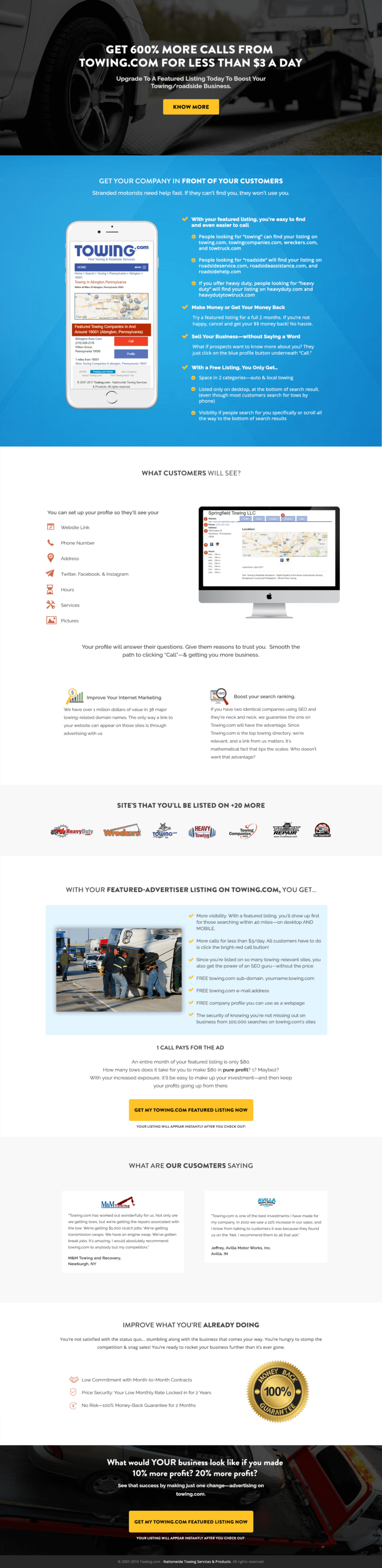
Towing.com's custom-built page selling featured directory listings to towing operators burned by marketing before. How the phone mockup, partner logos and named testimonials work, and the proof the headline still needs.
- Primary CTAGet My Towing.com Featured Listing Nowthe button the page is built around
- GoalLead Generationwhat counts as a conversion
- PlatformCustomlead generation page
- Built forB2BHome Services
- The page as built, not a mockup.Analysed by Apexure, not by Towing.
- Client
- TowingHome Services
- Industry
- Home Services20 examples
- Audience
- B2BLead Generation
- Platform
- Custom38 examples
- Page type
- Lead generationLead Generation
- Analysed by
- Waseem BashirMarch 2026
What the page does, and why
Why this page targets a sceptical audience
Towing business owners have almost certainly been pitched ineffective digital marketing before. SEO packages that delivered nothing. Social media management that got no calls. The person reading this page arrives with earned scepticism about marketing claims and a very simple test: will this get me more jobs?
The Towing.com page was built to meet that scepticism head-on. The headline claim, “Get 600% More Calls From Towing.com For Less Than $3 a Day,” is specific, time-bounded, and cost-contextualised. It doesn’t say “significantly more leads.” It says 600%, and it makes the daily cost feel trivial by framing it against coffee money.
Design decisions
The mobile app mockup
The mockup shows exactly how a featured Towing.com listing appears in search results, and it’s the most important single visual element on the page. A towing operator needs to answer the question “what will my customers actually see?” before they commit. The mockup answers it without requiring a demo call.
The “what customers will see” section
A desktop screenshot of the full listing profile (website link, social media icons, photos, service categories) extends the product demo further. The more completely a small business owner can visualise their presence on the platform, the lower their uncertainty about the purchase.
The partner network logo bar
The logo bar (RepairPal, WheelsAndDeals, Hunt, Nationwide, CarFax, and others) demonstrates distribution reach. A listing isn’t just on Towing.com. It appears across a network of related sites. That multiplier effect is one of the strongest value arguments on the page.
The money-back guarantee badge
The guarantee badge near the final CTA is correctly placed. It addresses the highest-anxiety moment, the point of financial commitment, with the clearest possible risk-reduction signal.
Customer testimonials with business names
Non-anonymous testimonials provide the peer validation towing operators trust most. A quote from “Jeffrey, Jupiter Towing and Recovery” carries more weight than “J.T., Towing Business Owner” because it’s verifiable.
The monthly earnings claim ("An extra weekly visit of $130/month turned into $8,160/month profits") uses the customer's own language. It isn't positioned as "our platform generates revenue" but as "here's what one operator made." Framing proof through a customer story rather than a platform stat is more persuasive because it's relatable.
Trust architecture
Trust for a directory listing product requires proof of platform scale alongside proof of business results. The partner network establishes scale. The ROI claims from named operators establish results. The money-back guarantee removes financial risk. The “Improve Your Internet Advertising” section addresses the search ranking mechanism. Explaining how the listing actually works removes the “black box” concern that makes small businesses wary of online advertising.

"Small business marketing pages need to explain the mechanism, not just the outcome. A towing operator who understands exactly how a featured listing shows up in Google search is more likely to buy than one who's told it 'increases visibility.' Transparency about the mechanism reduces fear of the unknown."
Read more about how we approach local business page design in our guide to Landing Page Call to Action Tips.
The "What Would YOUR Business Look Like If You Made 10% More Profit? 20% More Profit?" closing section reframes the pitch as a financial question, not a marketing question. Towing business owners think in profit margins, not impressions. Meeting them in their language (profit, calls, jobs) rather than marketing language (reach, clicks, awareness) is a necessary alignment.
Conversion strategy
The page uses a bottom-up persuasion structure: claim → proof mechanism → customer evidence → expanded listing value → ROI reframe → CTA. The call to action is long and specific: “Get My Towing.com Featured Listing Now.” That works because it mirrors the exact language a motivated buyer would use internally.
"The CTA on this page is intentionally verbose: 'Get My Towing.com Featured Listing Now.' Long CTAs often outperform short ones in small business contexts because they confirm exactly what will happen. 'Submit' or 'Get Started' leaves too much ambiguity. The specific CTA text acts as a final commitment device."
</div>
Mobile experience
Towing operators often check their phones between jobs. The page collapses cleanly to mobile with all major proof elements (the mockup, testimonials, CTA) accessible within the first three scrolls. The clickable phone number in the header lets operators who prefer to call do so without converting through the form.
Framing the listing cost as "less than $3 a day" rather than "$89/month" is a standard but reliably effective anchoring technique. The daily frame makes the cost feel negligible. The monthly frame makes it feel like a bill. For a small business owner who's already paying for fuel, insurance, and staff, $3 a day is easy to justify against a 600% call increase claim.
What we’d evolve today
Three priority improvements.
A before/after case study showing a real operator’s monthly call volume before and after the listing would validate the 600% claim with visible evidence.
A live job counter (“12,847 towing jobs booked through Towing.com this month”) would add real-time social proof that the platform is actively generating business.
Pricing transparency: showing the actual monthly cost rather than the “less than $3 a day” framing would reduce post-click disappointment and improve lead quality.
Browse our full collection of landing page examples to see how we apply these principles across industries.
Waseem founded Apexure in 2015 and has led its work on 3,000+ pages for 300+ clients since. He writes about what the team sees after the click, which is pages, forms, tracking and the systems behind them.
What the page leans on
The principles at work on this page, each named in the analysis above.
Social proof
People follow the actions of others. Testimonials, reviews, and client logos build trust and reduce hesitation.
Anchoring effect
The first piece of information shapes all subsequent judgements. Price comparisons and headline stats set expectations.
Loss aversion
People feel losses more strongly than gains. Framing around what they will miss motivates action.
Authority
This principle influences visitor behaviour and supports the page's conversion goal.
What people ask about pages like this
Towing business owners don't want a listing, they want more calls. Leading with the outcome (600% more calls) rather than the feature (a featured advertiser listing) speaks directly to the metric that matters. A towing operator evaluating marketing options is asking one question: will this get my phone ringing more? Answering that question in the headline eliminates the need to explain the product before establishing why it matters.
The phone mockup showing a Towing.com search result prominently displaying a featured listing does the work of a live demo. Towing business owners need to visualise exactly how their listing will appear to a stranded driver searching on their phone. Seeing their category of listing in context, above organic results, with a prominent call button, makes the value proposition concrete rather than abstract.
Showing the sites your listing will appear on, RepairPal, WheelsAndDeals, Hunt, Nationwide, establishes distribution breadth immediately. A towing operator comparing options wants to know where their listing will reach. A single directory is less persuasive than a network of 10+. The logo row of partner sites signals reach that a paragraph description never could, and it borrows credibility from brands the visitor may already know.
A money-back guarantee on a directory listing is powerful because it reframes the decision from 'is this worth trying?' to 'what do I have to lose?' For small business owners who've been burned by ineffective marketing before, removing the financial risk is often the final objection to overcome. The guarantee badge near the CTA, where purchase anxiety peaks, is the right placement to address that final hesitation.
Three more, taken apart the same way


Want one like this?
Tell us what the page has to do and where the traffic comes from. Within 48 hours you get a written quote from the people who wrote this breakdown. Already have a page that is not converting? Send it for a free audit instead.
UK hours, which is the East Coast morning.
"Small business owners are among the most sceptical audiences in marketing because they see bad pitches constantly. The way to break through isn't enthusiasm. It's specificity. '600% more calls' and 'less than $3 a day' are specific claims that force engagement. Vague claims get ignored. Specific ones get scrutinised, and scrutiny is the beginning of conversion."