CRO breakdown of Tax Network USA's IRS tax resolution lead generation. Design analysis and expert conversion insights by Apexure.
What is ConvertScore™? ConvertScore™ is Apexure's proprietary landing page performance metric. We evaluate every page across four dimensions — Copy & Messaging, Layout & Hierarchy, Trust & Social Proof, and CTA & Conversion Path — to produce a single score out of 100.
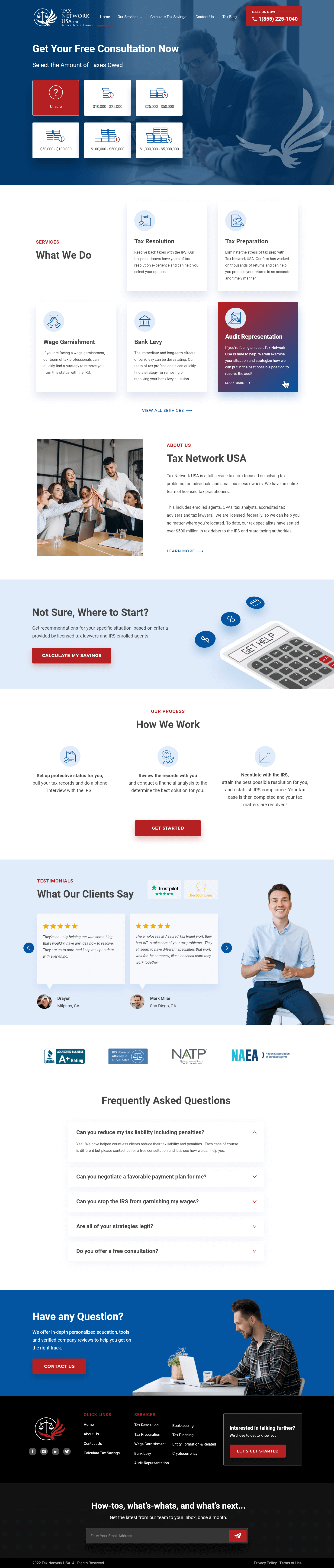
Tax Network USA serves the full spectrum of individual and business tax debt: from personal underpayments to six-figure corporate liabilities. That breadth is a competitive advantage, but it creates a positioning challenge. A page that addresses every segment at once risks feeling generic to every visitor. We structured this page around the visitor’s specific situation rather than the company’s general capabilities.
The visual tax-amount selector at the hero is the design expression of that philosophy. Rather than opening with “we help people with tax problems,” the page opens with “how much do you owe?”, which immediately makes the visitor the subject of the page rather than the audience. The seven illustrated amount-range tiles do the segmentation that would otherwise require a lengthy qualification call.
The second design challenge was differentiating Tax Network USA from the crowded IRS relief market. The full-service firm angle (licensed enrolled agents, CPAs, tax analysts, accredited tax advisors, and tax lawyers all on staff) is genuinely differentiating and needed prominent page real estate.
The dark blue colour choice signals institutional seriousness. This isn’t a consumer app. It’s a financial services firm. The illustrated tiles (each showing a different amount range with a visual representation) create visual interest while functioning as the primary segmentation tool. The call-to-action at the hero level (“Get Your Free Consultation Now”) is less prominent than the tile interaction, which is intentional. The tiles earn engagement before the CTA is presented.
Six service cards sit in a responsive grid. The Audit Representation card has a marked treatment that draws the eye. That’s a deliberate choice based on service-page behaviour data. Visitors scanning a service grid need a visual focal point or they read everything and remember nothing. Marking the most complex service (audit representation) signals depth of capability. If they handle this, they handle everything.
Rather than a CEO photo and a founding story, the About section focuses on the team’s collective credential range: enrolled agents, CPAs, tax analysts, accredited tax advisors, tax lawyers. In a category where credibility is the primary buying factor, listing specific licensure types is more persuasive than a personality narrative.
Between the services grid and the how-we-work process, the savings calculator CTA invites the visitor to get a personalised number before providing contact information. That’s a reciprocity-based conversion pattern. Offer something of value before asking for something of value. Visitors who engage with a calculator demonstrate intent and provide segmentation data at the same time.
The process simplification serves a specific anxiety: “Is this complicated? Will I have to manage it myself?” Three clearly named steps show the firm doing the work while the client provides records. The IRS negotiation step being listed as something the firm handles (not the client) is reassuring to someone who has no idea how to talk to the IRS.
The Trustpilot section sits after the process explanation rather than at the top of the page. That's a conversion sequence decision. Process first establishes how the firm works. Then testimonials confirm real clients experienced it positively. Reversing this order (testimonials before process) often creates trust without comprehension, which can leave visitors feeling good about the firm but unclear on what actually happens.
Listing enrolled agents, CPAs, accredited tax advisors, and tax lawyers by credential type handles the “are these real professionals?” question IRS debt clients carry. Each credential type implies a different regulatory body’s oversight. The collective credential range signals a firm that operates within multiple professional accountability frameworks.
The testimonials section shows Dwayne from Milpitas, CA and Mark Miller from San Diego, CA with Trustpilot branding. Geographic attribution matters in tax relief because IRS cases are federally administered but have state-level nuances. A California resident reading a California reviewer’s positive experience feels more confident their situation will be handled correctly.
“How We Work” with three named steps reduces the unknown-process anxiety that prevents many qualified visitors from submitting. The final CTA (“Get Started”) sits immediately after the process section, capitalising on the moment when the visitor has understood exactly what happens after they click.

"The full-service firm positioning is Tax Network USA's strongest differentiator and it needed the most prominent placement in the About section. A firm with enrolled agents, CPAs, and tax lawyers on staff is structurally different from a 'tax resolution consultant' with a phone and a form. Visitors who understand that distinction are far more likely to call."
“We’ve resolved over $500 million in IRS debt” or “Average client saves 60% of their tax liability” (specific outcome numbers a full-service firm with a long track record should be able to substantiate) would anchor the value proposition before the visitor engages with the segmentation tiles. Our testing on comparable tax relief pages shows outcome statistics above the fold reduce bounce rate meaningfully for visitors arriving from high-intent search terms.
The visual selector covers a wide debt range. Visitors with $500,000+ in IRS liability have a very different evaluation process from those with $15,000. They need to see corporate-level references, a direct line to a senior attorney, and compliance process depth. A separate landing page for high-value cases, linked from the hero selector tile, would convert this segment more effectively than a general page.
The current sequence is: services → about → calculator → process → testimonials. Testing testimonials immediately after the about section (before the process explanation) would give visitors peer validation earlier in the evaluation journey, when they’re still deciding whether to read further.
Browse our full collection of landing page examples to see how we design tax and financial services pages across verticals.
Controlling what visitors see first, second, and third guides them toward the conversion goal.
People follow the actions of others. Testimonials, reviews, and client logos build trust and reduce hesitation.
Simpler pages convert better. Reducing visual noise, breaking forms into steps, and clear copy lower mental effort.
People feel losses more strongly than gains. Framing around what they will miss motivates action.
People searching for IRS tax resolution have an immediate, specific problem. They don't need a service description, they need to know if Tax Network USA can help their particular situation. The seven visual amount-range tiles, from 'Under $10,000' to '$1,000,000+' with representative imagery for each, do two things simultaneously: they let the visitor self-identify their situation immediately, and they signal that Tax Network USA handles the full spectrum of tax debt, from small personal debts to corporate liabilities. The visual tiles are faster to process than text options and convey scale more effectively.
Visitors searching for IRS help often arrive with a specific problem: they have a wage garnishment notice, or they've received an audit letter, or they need to file three years of unfiled returns. A broad 'we solve tax problems' page makes them wonder whether the firm handles their specific issue. Listing five named services with individual descriptions gives the visitor a reason to believe their particular problem is within scope. The Audit Representation card is marked on the screenshot, clicking it reveals a specific capability statement, which reduces the research burden for someone with that specific need.
Trustpilot has broad enough consumer recognition that its presence signals the company welcomes public accountability. In the tax relief sector, where bad actors don't invite public reviews, the presence of a Trustpilot widget, and the stated score, functions as an openness signal. The specific reviews shown feature named individuals from named cities: Dwayne from Milpitas, CA and Mark Miller from San Diego, CA. Geographic specificity makes reviews feel real rather than manufactured. A visitor from California reading a California-based reviewer's experience applies peer identification more strongly.
The 'Calculate My Savings' button sits in a dedicated section between the services grid and the process explanation. This is a reciprocity mechanism, before asking for contact information, the page offers a value exchange. The calculator gives the visitor a personalised savings estimate, which both justifies the consultation and creates a specific number to anchor the value of the service. Visitors who have engaged with the calculator have higher intent than those who haven't because they've invested time and received a personalised output. That investment reduces abandonment at the subsequent lead form.
Other CRO breakdowns from our lookbook
We design high-converting landing pages for B2B and B2C brands. Let's talk about yours.
Get a Free Consultation Or browse more examples →
Founder & CEO of Apexure, Waseem worked in London's Financial Industry. He has worked on trading floors in BNP Paribas and Trafigura, developing complex business systems. Waseem loves working with Startups and combines data and design to create improved User Experiences.
Get quality posts covering insights into Conversion Rate Optimisation, Landing Pages and great design


"Tax resolution pages face a unique conversion problem. The visitor is already in pain, but they've probably been burned by at least one company claiming to help. Every element has to signal legitimacy. The Trustpilot widget, the named staff credentials, the specific service breakdowns; they're all answering the same question: 'Are you different from the others?'"