CRO breakdown of Sutherland Black's Edinburgh accountancy lead generation. Design analysis and expert conversion insights by Apexure.
What is ConvertScore™? ConvertScore™ is Apexure's proprietary landing page performance metric. We evaluate every page across four dimensions — Copy & Messaging, Layout & Hierarchy, Trust & Social Proof, and CTA & Conversion Path — to produce a single score out of 100.
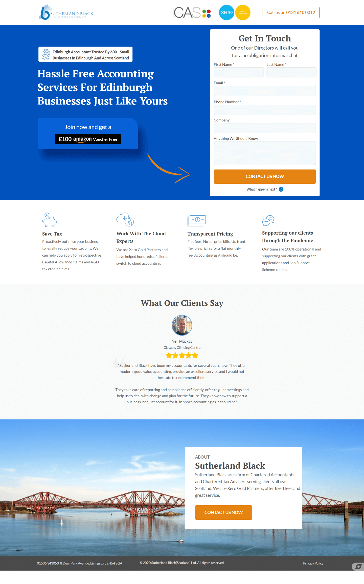
Small business accountancy is a high-trust, low-urgency category. The business owner knows they need an accountant. The question is why to switch now and why to choose this firm. That combination, delayed urgency, high trust requirement, creates a specific conversion challenge: the page needs to overcome inertia and build confidence simultaneously.
Sutherland Black serves small businesses in Edinburgh and across Scotland. The geographic specificity is not a limitation. It is a positioning advantage. National accountancy chains offer scale; regional firms offer local knowledge, personal relationships, and a director who actually calls you back. We built the page to own that positioning clearly and use the Edinburgh business community as both the target audience and the social proof mechanism.
The £100 Amazon voucher as a lead incentive is a deliberate inertia-breaker. Small business owners researching accountants are typically mid-cycle, they’ve been meaning to switch or start for months but haven’t taken the step. A tangible, immediate reward for making that first contact converts the procrastinating researcher into an active enquirer.
Accountancy pages default to white, grey, and corporate navy. The vivid cobalt blue on Sutherland Black’s hero is immediately visually distinctive in a sea of identical professional services pages. The white form card on the right side of the split hero provides maximum contrast against the blue, the form is the page’s visual anchor, and the blue background directs attention toward it through contrast.
This placement is a trust architecture decision. A business owner scanning the page for credibility markers reads the header before the hero copy. By the time their eye reaches the headline, they’ve already absorbed two professional credentials. The Xero logo is particularly valuable for Edinburgh’s SME market, many small businesses already use Xero and are specifically seeking an accountant with certified expertise in their platform.
The hero has two visual focal points: the incentive callout box on the left and the form on the right. The orange curved arrow bridges them, it directs the visitor’s eye from the incentive (reason to act) to the form (mechanism for acting). This is a visual CTA that works below conscious awareness. Remove it and the form completion rate drops because the eye has no directional guide from the value statement to the action.
Save Tax, Work With Cloud Experts, Transparent Pricing, Supporting Clients During the Pandemic. Each icon block is kept deliberately brief. In accountancy, the decision is rarely made on service detail. It’s made on trust and match. The icons signal competence across four relevant dimensions without requiring the visitor to read paragraphs.
It is a geographic identity marker. A business owner in Edinburgh recognises it immediately. The overlay “About Sutherland Black” card positions them as local, established, and personally accessible. “One of our Directors will call you”, in the form subheadline, and the Forth Bridge image together create a sense of regional identity that national firms cannot replicate.
The form includes a free-text "Anything We Should Know" field that most accountancy lead forms omit. This field serves a dual purpose: it lets visitors with specific circumstances (VAT complications, late filing, unusual business structure) indicate their situation without it becoming a barrier, and it gives the Sutherland Black director valuable context before making the call, turning a cold call into an informed conversation.
ICAS and Xero Gold Partner badges signal regulated professional standing before the visitor has read a word of copy. The phone number in the top-right corner adds a human accessibility layer, some business owners call directly rather than filling forms, and making that easy captures a segment that form-only pages lose.
The Neil Mackus testimonial in the mid-section carries location context implicit in the review copy. “They take care of reporting and compliance brilliantly, offer regular meetings and help us to deal with change and plan for the future.” This is not a generic satisfaction quote, it describes specific accounting activities. A business owner reading this recognises their own needs in the described experience.
“One of our Directors will call you for a no obligation informal chat.” This line handles the commitment anxiety of submitting personal contact information to a firm you don’t know. A director calling, not a salesperson, signals that Sutherland Black values new clients enough to allocate senior time. That distinction matters enormously to a small business owner who is evaluating whether they’ll receive personal attention.

"Regional professional services firms consistently underestimate how much their geography is a conversion advantage. In a world of remote everything, a business owner who can walk into their accountant's office in Edinburgh still values that option. We build that local identity explicitly into every touchpoint (logo, imagery, testimonial origin) address visibility."
Our testing on accountancy pages since this build shows that the single biggest unconverted visitor segment is people who want to switch but don’t know the process. A three-step “switching process” mini-section, “1. We contact your current accountant. 2. We collect your records. 3. You’re fully transferred within two weeks.”, removes the perceived complexity of switching and converts fence-sitters. Medium effort, high intent-unlock potential.
The “Transparent Pricing” icon currently links to a page rather than revealing a price. For small business owners, a visible starting price, “Accountancy from £95/month”, reduces comparison-shopping bounce. Many accountancy leads are lost to competitors who show pricing. Showing a starting anchor on the landing page while keeping the full quote process converts visitors who would otherwise leave to find a competitor with visible rates.
The social proof headline currently lives in a badge box above the fold copy. Moving it to a active-looking counter element next to the form CTA, within visual range of “Contact Us Now”, turns a page-level claim into a point-of-conversion trust signal.
Browse our full collection of landing page examples to see how we approach professional services and accountancy pages across verticals. Also see our guide to Ways To Increase Landing Page Social Proof.
"The best thing about this relationship was the enthusiasm and flexibility."
People trust credible experts. Certifications, awards, media mentions, and expert endorsements boost credibility.
People follow the actions of others. Testimonials, reviews, and client logos build trust and reduce hesitation.
Eye-tracking shows people scan pages in an F-shape. Placing key content along this path increases engagement.
People feel losses more strongly than gains. Framing around what they will miss motivates action.
Chartered accountancy services have a long sales cycle, the business owner researches, compares, and then typically stays with the same firm for years. The incentive lowers the barrier to the first contact by making the enquiry feel immediately rewarding, not purely functional. It also signals a firm that is actively competing for new clients rather than relying on referrals, which reassures a small business owner that they'll be treated as a valued new client rather than an afterthought. The voucher value is modest enough to feel genuine rather than desperate.
Star ratings are ubiquitous and increasingly ignored. A specific geographic and demographic count, 600+ small businesses in Edinburgh, creates peer identification. The small business owner reading this page thinks: that's my type of client, in my city. They've chosen Sutherland Black. The geographic specificity also signals local knowledge, which matters enormously in accountancy, tax relief schemes, Scottish business rates, and council grants require local expertise that a national firm may not provide.
Accountancy leads are higher intent than most service verticals. A business owner filling out a form for a new accountant has typically been unhappy with their current situation for months before acting. The friction of six fields, First Name, Last Name, Email, Phone, Company, and a free-text 'Anything We Should Know' field, is appropriate for a service where the firm needs qualifying information before calling. The 'What happens next?' info icon beneath the button reduces commitment anxiety by previewing the next step without cluttering the form. High-intent visitors tolerate more fields than low-intent ones.
ICAS, the Institute of Chartered Accountants of Scotland, is the regulatory body that certifies Scottish chartered accountants. For a business owner in Edinburgh comparing accountants, seeing the ICAS badge in the header immediately filters Sutherland Black into the 'qualified professional' category, not the 'bookkeeper with a laptop' category. The Xero Gold Partner badge alongside it adds software competency credibility. These are not decorative logos, they are category signals that tell the visitor what standard of service to expect before reading a single word.
Other CRO breakdowns from our lookbook
We design high-converting landing pages for B2B and B2C brands. Let's talk about yours.
Get a Free Consultation Or browse more examples →
Founder & CEO of Apexure, Waseem worked in London's Financial Industry. He has worked on trading floors in BNP Paribas and Trafigura, developing complex business systems. Waseem loves working with Startups and combines data and design to create improved User Experiences.
Get quality posts covering insights into Conversion Rate Optimisation, Landing Pages and great design


"Professional services pages often resist incentives because the firm worries it makes them look desperate. We've found the opposite is true for regional accountancy firms competing against national chains. A local firm willing to actively recruit small business clients reads as hungry and attentive, exactly what a business owner who felt ignored by their last accountant is looking for."