CRO breakdown of Sponsored Dishes' restaurant dish sponsorship SaaS page. App onboarding design, restaurant buyer psychology, and conversion strategy by Apexure.
What is ConvertScore™? ConvertScore™ is Apexure's proprietary landing page performance metric. We evaluate every page across four dimensions — Copy & Messaging, Layout & Hierarchy, Trust & Social Proof, and CTA & Conversion Path — to produce a single score out of 100.
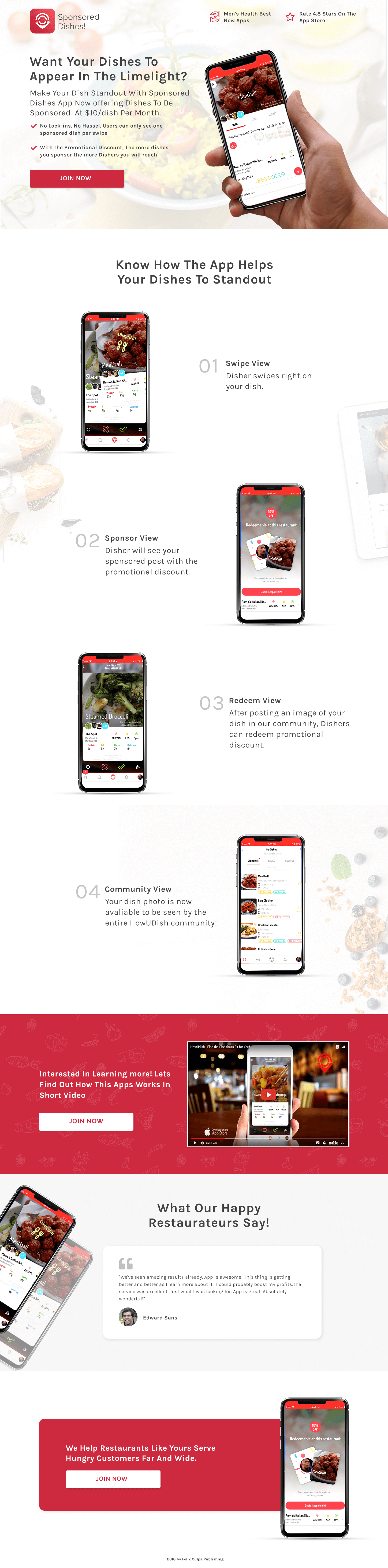
Restaurant marketing apps face a specific chicken-and-egg credibility problem. Restaurants won’t list on a platform with no diners. Diners won’t use a platform with no restaurants. Sponsored Dishes had built the diner side (4.8 stars on the App Store, Men’s Health Best New Apps recognition) and was now converting the restaurant side. The page needed to lead with the diner-side proof to resolve the “does anyone use this?” concern before asking restaurants to commit.
The conversion challenge was dual-audience communication on a single page. Restaurant owners are evaluating a platform they’ll pay for. Diners are the audience the restaurant is paying to reach. The page needed to show the restaurateur what the diner experiences (the swipe mechanic, the sponsored dish visibility, the redemption flow) while making the business case for why that diner experience generates value for the restaurant.
We also had to respect the time constraints of the target audience. Restaurant owners don’t sit at desks evaluating software. They check their phones between service rushes. The page needed to be digestible in a mobile context with a fast evaluation time, making visual demonstrations more valuable than long-form copy.
The framing speaks directly to a restaurant owner’s promotional aspiration. Restaurants invest heavily in food photography and social content to make their dishes visible. The app offers a new distribution channel for that visibility. By framing the value as dishes appearing in the limelight (not platform advertising, not promotional campaigns) the headline connects to a desire the restaurant owner already has rather than introducing a new concept they need to evaluate.
The price is stated in the hero alongside “No Lock-Ins, No Hassle.” For a low price point with no commitment, showing the price early removes the “what’s the catch?” anxiety before it develops. Visitors who know the price upfront and see it’s low are pre-qualified for the next sections. They’ve already done the cost evaluation and found it acceptable. Hiding price on a low-cost product delays the easiest conversion argument available.
Swipe View, Sponsor View, Redeem View, Community View uses actual app interface screenshots rather than illustrated mockups. Real screenshots confirm the product exists and works. Each step shows a different phase of the diner-restaurant interaction, building the complete picture of what a restaurant’s money actually buys. The numbered sequence creates a mental walkthrough that’s more memorable than a feature list.
“Interested in Learning More? Let’s Find Out How This App Works in Short Video” offers a longer-form demonstration for visitors who want to see the app in motion rather than static screenshots. Placed mid-page, this is the deepest content available for the most interested evaluators. We deliberately kept it optional (a play button rather than auto-playing video) because restaurant operators evaluating on mobile in a loud environment may not be in a position to watch a video with sound.
The testimonial describes “amazing results” and “could probably boost my profits” and is the only social proof from a restaurant operator on the page. One specific, named testimonial outperforms three anonymous ones. The key is specificity: Edward didn’t say “great platform,” he described business impact language (“boost my profits”) that speaks directly to what other restaurant operators care about. We would normally want more testimonials, but a single credible one is categorically better than multiple generic ones.
The Men’s Health award and App Store rating in the header establish that the diner side of the platform is real and actively used. For a restaurant operator, this is the most important trust signal on the page. It resolves the core question of whether the platform has the user base to make sponsoring dishes worthwhile.
The “No Lock-Ins, No Hassle” statement paired with the $10/month price creates a risk-free framing for the sign-up decision. Low price plus no commitment removes the two primary barriers to trying a new marketing platform: financial risk and contractual entrapment. Any restaurant that’s ever been locked into a delivery platform contract is particularly receptive to this combination.
The testimonial from Edward Sans (real name, identified as a restaurant operator) provides the peer validation that completes the trust stack. An app with consumer awards, a low price, and a restaurant operator endorsement has answered the three trust questions: is it real, is it risky, and does it work?

"The Community View step in the app demonstration is more important than it looks. It shows the dish appearing in a community feed, visible to all app users, not just those who specifically search for it. That passive discovery mechanic is what restaurant owners are paying for: exposure to diners who weren't already looking for their restaurant. Making that mechanic visible in the product walkthrough converts the operator who was wondering 'but will anyone see my dish if they're not looking for us?'"
Our data from restaurant technology and marketplace SaaS pages since this build points to three specific improvements:
The most common question a restaurant operator has after seeing the price is “how many people will actually see my dish?” A specific, honest number (“Join 28,000 diners actively browsing Sponsored Dishes in your city” or “Available in 12 cities across the US”) would answer this before it becomes an objection. Even a modest number, stated honestly, is more persuasive than no number because it makes the platform feel real and populated. High impact.
A restaurant in Chicago evaluating a food discovery app has different concerns than one in New York. A page variant showing “Join 4,200 diners using Sponsored Dishes in Chicago” with Chicago-area restaurant testimonials would increase conversion significantly through geographic relevance. Most food tech platforms serve multiple cities with one generic page. City-specific variants are a low-complexity, high-impact improvement.
A simple tool (“Enter your dish price and estimated monthly covers” outputting “your sponsored dish could reach X additional diners per month”) would personalise the $10/month value proposition. For a restaurant evaluating whether $10 is worth spending, a concrete reach estimate is more persuasive than a general platform description. Medium impact; particularly useful for operators who think in terms of covers per week rather than abstract reach metrics.
"The footer CTA ('We Help Restaurants Like Yours Serve Hungry Customers Far and Wide') works because it's specific to the restaurant owner's goal: more covers, more customers, broader reach. It doesn't say 'grow your social media presence' or 'build your brand'. It says serve more customers. That outcome-first language in the closing CTA mirrors the decision the restaurant owner is actually making, which is whether to spend $10/dish to serve more customers. The match is clean."
Want a two-sided marketplace page that converts both supply-side and demand-side audiences from the same design? Talk to our team.
This principle influences visitor behaviour and supports the page's conversion goal.
People follow the actions of others. Testimonials, reviews, and client logos build trust and reduce hesitation.
Giving something valuable first (free guide, tool, audit) creates an obligation to reciprocate.
The first piece of information shapes all subsequent judgements. Price comparisons and headline stats set expectations.
This principle influences visitor behaviour and supports the page's conversion goal.
Restaurant owners think in dishes, not subscriptions. A monthly platform fee feels like overhead: another recurring cost added to an already tight margin operation. Per-dish sponsorship at $10/dish feels like direct marketing spend with a visible return: this specific dish gets promoted to a specific audience. The pricing model matches cost with the outcome the restaurateur actually cares about. We always recommend outcome-aligned pricing presentation for restaurant technology. 'Sponsor your best-performing dish' is a menu decision, not a technology subscription decision.
Restaurant operators have been approached by dozens of platforms promising delivery volume, marketing reach, and discovery. Most have disappointingly small user bases or require prohibitive commissions. Scepticism is high and justified. The key conversion obstacle is not price ($10/dish is objectively low). It's 'will anyone actually see my dish on this platform?' The Men's Health 'Best New Apps' badge and the App Store 4.8-star rating address this directly. They signal consumer adoption: if the app is that well-reviewed, there are real diners using it. That consumer credibility is what opens restaurateur confidence.
A restaurant owner evaluating Sponsored Dishes needs to understand the experience from the diner's perspective: how visible is my sponsored dish, what does the promotion look like, what happens when a diner engages? The four-step app demonstration (Swipe View, Sponsor View, Redeem View, Community View) walks the restaurateur through the exact diner journey. Understanding the diner experience answers the question 'does this actually work?' better than any statistics about reach can. Showing the product being used by the audience it's supposed to attract is the most persuasive demonstration structure for marketplace apps.
Restaurant operator sign-up pages should be short enough to match their decision speed (they're busy people who decide quickly) but long enough to answer the core evaluation questions: what is this, how does it work, why should I trust it, what does it cost, and how do I start? Sponsored Dishes' page covers all five in a linear flow without requiring extensive reading. The step-by-step demonstration section answers 'how does it work' visually. The testimonial from a successful restaurant answers 'does it work in practice.' The $10 pricing answers 'what does it cost.' The Join Now CTA closes the loop.
Other CRO breakdowns from our lookbook
We design high-converting landing pages for B2B and B2C brands. Let's talk about yours.
Get a Free Consultation Or browse more examples →
Founder & CEO of Apexure, Waseem worked in London's Financial Industry. He has worked on trading floors in BNP Paribas and Trafigura, developing complex business systems. Waseem loves working with Startups and combines data and design to create improved User Experiences.
Get quality posts covering insights into Conversion Rate Optimisation, Landing Pages and great design

"The Men's Health 'Best New Apps' badge and the 4.8-star App Store rating in the header are placed there specifically for the restaurant operator who is evaluating consumer adoption before deciding whether to pay. They don't care about platform features. They care about whether real diners are using this. A credible consumer review badge says 'yes, diners are here' more efficiently than any user count statistic, because it implies editorial review rather than just signed-up accounts."