
Dark red where most agencies go blue.
Socialhackr's Unbounce click-through page for a social media advertising agency, aimed at sceptical B2B buyers. How the stats bar, analytics screenshot and a testimonial prove results, and the case studies we would test.
- Primary CTASchedule a Phone Callthe button the page is built around
- GoalLead Generationwhat counts as a conversion
- PlatformUnbounceclick-through page
- Built forB2BTechnology Consulting
- The page as built, not a mockup.Analysed by Apexure, not by Socialhackr.
- Client
- SocialhackrTechnology Consulting
- Industry
- Technology Consulting12 examples
- Audience
- B2BLead Generation
- Platform
- Unbounce132 examples
- Page type
- Click-throughLead Generation
- Analysed by
- Waseem BashirMarch 2026
What the page does, and why
Why we built this technology consulting click-through
Social media agencies face a specific credibility paradox: the category is saturated with operators at every quality level, and the buyers who most need a professional agency are also the most sceptical of finding one. A business owner who has paid for social media management that produced no measurable results isn’t browsing agency pages with an open mind. They’re looking for reasons to rule out each agency they encounter, not reasons to rule them in.
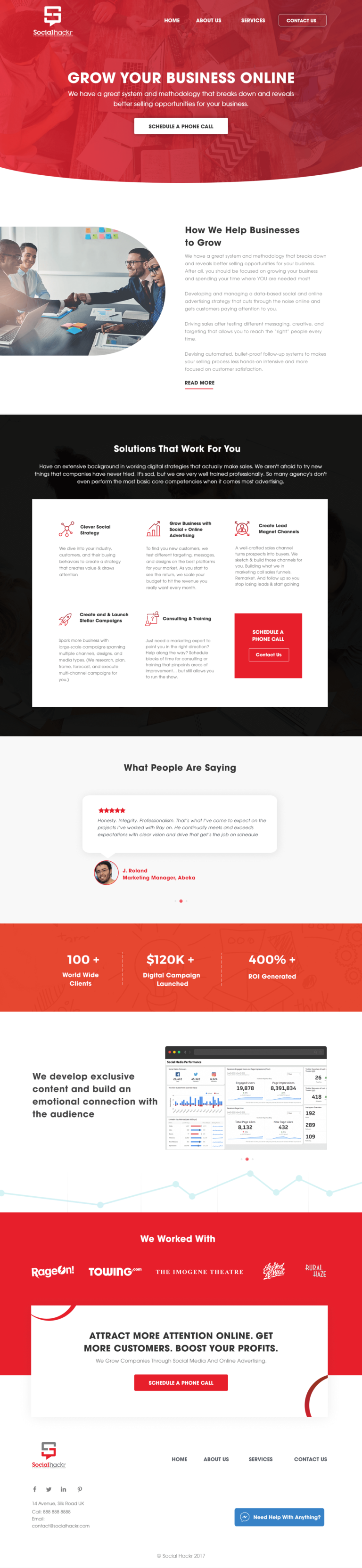
Socialhackr’s conversion challenge was differentiation in exactly that environment. Not differentiation through bigger claims (“we’re the best” competes with everyone else saying the same thing) but differentiation through how the claims were made and supported. Specific metrics, a distinctive visual identity, named client logos, and an analytics screenshot that shows real work rather than rendered mockups.
We designed the page for a B2B buyer who will spend about 45 seconds evaluating whether Socialhackr is worth a further conversation. That evaluation is not sequential; it happens in parallel across multiple visual zones. The hero, the stat bar, the client logos, and the feature grid are all processed simultaneously by a scanning visitor. Each zone needs to point toward the same conclusion: “these people are legitimate and results-oriented.”
Design decisions
“Grow Your Business Online” as the hero headline
The headline is deliberately broad. Unlike niche agency pages that lead with a specific service type, Socialhackr positions as a full-stack digital growth partner: social strategy, content, advertising, lead channels. The broad positioning serves a specific audience: business owners who haven’t yet defined exactly what kind of digital help they need, and who are evaluating partners before they’ve committed to a service scope. The subhead “we have a great system and methodology that breaks down and reveals better selling opportunities for your business” adds substance without narrowing prematurely.
The feature grid organises capabilities into six named service areas
Clever Social Strategy, Grow Business with Social + Online Advertising, Create Lead Generation Channels, Create and Launch Stellar Campaigns, Consulting and Training, and the implied multi-channel integration. Each card has enough copy to distinguish it from the other five without creating text overload. The grid structure lets a scanning visitor find their specific need (“I need lead generation channels”) and self-qualify without reading the full page.
The metric stats bar
100+ World Wide Clients, $120K+ Digital Campaign Launched, 400% ROI Generated: these appear in a high-contrast red section between the testimonial and the analytics screenshot. The placement is deliberate: it separates two proof elements (peer testimonial and dashboard data) and functions as a quantitative bridge between qualitative evidence (testimonial) and operational evidence (analytics). The metrics are ordered by what the buyer cares most about: client count first (are you established?), campaign spend second (are you experienced at scale?), ROI third (does it actually work?).
The social analytics performance dashboard screenshot
The screenshot shows actual engagement and reach figures in a recognisable social media management interface. This screenshot is the most specific proof element on the page because it cannot be fabricated credibly without considerable effort. Experienced buyers can evaluate the authenticity of dashboard data through the interface UI, the data patterns, and the realistic engagement ratios. Including this screenshot signals that Socialhackr is confident enough in their actual results to show them.
The client logos section
RageOn!, Towing.com, The Imogene Theatre, and others: a mix of B2C and B2B companies across multiple industries. The diversity signals broad capability rather than a single vertical specialty. For a visitor who is evaluating whether the agency understands their specific industry, recognising even one client logo creates an immediate relevance signal.
Trust architecture
Layer 1: visual brand signal
The dark red hero with professional typography creates an immediate “established, confident agency” impression. Design quality is a direct trust proxy for a social media agency. Visitors assume the agency’s client work looks at least as good as their own website.
Layer 2: outcome metrics
The three stats (100+ clients, $120K+ campaigns, 400% ROI) appear above the analytics screenshot, sequencing from volume (we’re established) to outcome (we deliver results). Volume without outcomes is just activity. Outcomes without volume could be luck. Together they frame a credible performance story.
Layer 3: peer endorsement
The single testimonial (from J. Roland, Marketing Manager at Abeka, describing consistent expectation-exceeding performance) sits between the feature grid and the stats bar. One strong, specific testimonial from a named professional at a named company outperforms three generic five-star quotes from anonymous reviewers. The full name and title make verification possible; that verifiability makes the endorsement credible.

"The footer CTA ('Attract More Attention Online, Get More Customers, Boost Your Profits') restates the value proposition at the bottom of the page for visitors who've read everything and need a final nudge. This is the serial position effect at work: the last thing the visitor reads before deciding whether to schedule a call should restate the core benefit clearly. Many agency pages end with generic contact information. This page ends with a value promise, which is the right final impression."
What we would test today
Our data from social media and digital agency pages since this build points to three specific improvements:
Test 1: industry-specific case studies replacing the client logo grid
The current logos section shows company names without outcomes. A section showing “For RageOn!: 340% increase in social-driven revenue in 6 months” with the logo would carry significantly more conversion weight than logos alone. Named companies with named outcomes are the strongest mid-page proof available to any marketing agency. Medium-high impact; particularly important for a buyer who is evaluating ROI before they commit.
Test 2: a “what type of growth do you need?” interactive selector
Three options (“More brand awareness,” “More leads,” “More sales”) each linking to a page variant or section that shows specific Socialhackr work in that outcome category would personalise the page for visitors at different growth stages. Visitors in different modes have different proof requirements. An awareness-focused visitor needs different case studies than a lead-generation-focused visitor. Message matching at this level typically produces 20-35% conversion improvement over generic pages.
Test 3: a results calculator
“Enter your current monthly ad spend” with an output of “based on our average 400% ROI, similar clients generate $X from that spend” would make the ROI claim personal. Aggregate statistics feel external; personalised projections feel applicable. For a service where the buyer’s primary question is “will it work for my business specifically,” a personalised ROI projection is the most direct answer available.
"The 'We develop exclusive content and build an emotional connection with the audience' claim on this page is the right thing to say but needs proof behind it. A claim about emotional connection is very hard to evaluate from copy alone. You need to show it, not say it. Our evolution of pages like this always includes a content sample section: actual posts, actual results, actual audience response. The claim becomes credible when it's evidenced, not when it's asserted."
Need a social media or digital agency page that converts sceptical B2B buyers on their first visit? Talk to our team.
Waseem founded Apexure in 2015 and has led its work on 3,000+ pages for 300+ clients since. He writes about what the team sees after the click, which is pages, forms, tracking and the systems behind them.
What the page leans on
The principles at work on this page, each named in the analysis above.
Visual hierarchy
Controlling what visitors see first, second, and third guides them toward the conversion goal.
Social proof
People follow the actions of others. Testimonials, reviews, and client logos build trust and reduce hesitation.
Authority bias
People trust credible experts. Certifications, awards, media mentions, and expert endorsements boost credibility.
Processing fluency
This principle influences visitor behaviour and supports the page's conversion goal.
Von restorff effect
This principle influences visitor behaviour and supports the page's conversion goal.
What people ask about pages like this
B2B buyers evaluating social media agencies have almost universally had at least one disappointing agency experience. The most credible pages acknowledge this implicitly by showing specific, verifiable metrics (client count, ad spend managed, ROI percentage) rather than making vague quality claims. A metric like '400% ROI Generated' with supporting client logos is more credible than 'exceptional results' because it's falsifiable. Buyers who suspect exaggeration can ask for the methodology behind the number, which shows the agency's willingness to be held accountable.
A social media agency's own landing page is their most visible proof of craft. If the page looks generic, uses stock-imagery heroes, and makes the same claims as every other agency, the visitor reasonably concludes: 'if this is the quality they apply to their own marketing, this is the quality they'll apply to mine.' Socialhackr's red and dark palette, the live social media analytics screenshot, and the distinctive brand identity all signal that this agency understands differentiation, which is what they're being hired to achieve for their clients.
The metrics that convert high-value clients in social media agency selection are: client retention rate (the best agencies don't churn clients constantly), revenue or ROAS figures from actual campaigns (not ad spend managed, which is a proxy for size, not for results), and the number of campaigns successfully launched (which implies operational scale). '100+ clients, $120K+ in digital campaigns launched, 400% ROI generated' tells a B2B buyer that the agency has the volume to have learned from mistakes and the results to justify continued investment.
Showing a live analytics dashboard screenshot (with real engagement numbers, reach figures, and audience data) turns an abstract claim about social media performance into a visible artefact of actual work. The key is using real data from real campaigns, not a staged screenshot with impressive-looking numbers. Experienced buyers can tell the difference: real campaign data has the imperfection of authentic performance curves, realistic engagement ratios, and recognisable platform interface. Fabricated data looks too uniform. Authentic screenshots build trust precisely because they're imperfect.
Three more, taken apart the same way


Want one like this?
Tell us what the page has to do and where the traffic comes from. Within 48 hours you get a written quote from the people who wrote this breakdown. Already have a page that is not converting? Send it for a free audit instead.
UK hours, which is the East Coast morning.
"The dark red hero on Socialhackr is a branding decision with conversion logic behind it. In a category where nearly every competitor uses blue or teal ('trust colours' that ironically signal nothing distinctive) a confident dark red says 'we're not trying to look trustworthy. We are trustworthy.' The colour works because it's backed up by the content: real metrics, real logos, real analytics data. Without that substance, the bold colour would feel like bluster. With it, the colour signals confidence that's earned."