CRO breakdown of Smartphone Key's keyless entry pre-launch page. Hardware product design, comparison table strategy, and conversion analysis by Apexure.
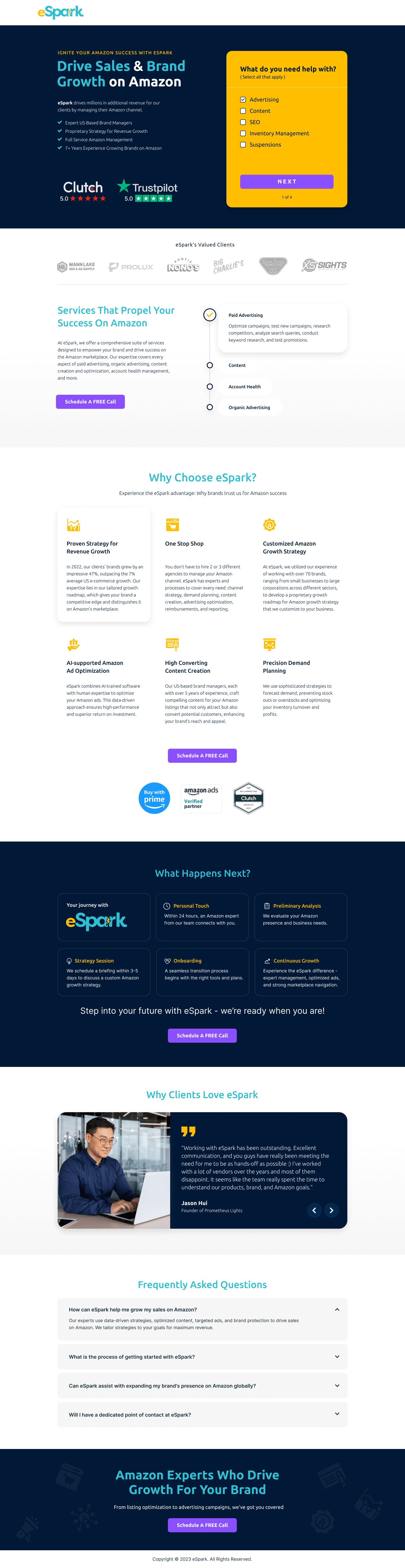
What is ConvertScore™? ConvertScore™ is Apexure's proprietary landing page performance metric. We evaluate every page across four dimensions — Copy & Messaging, Layout & Hierarchy, Trust & Social Proof, and CTA & Conversion Path — to produce a single score out of 100.

Smart lock adoption has trailed analyst forecasts for years. The technology works. The problem is everything around it: fiddly installation, every device insisting on its own app, a setup experience that feels more like homework than convenience. Smartphone Key was building a keyless entry system to strip both friction points out: no complex installation, no app required, works with existing lock hardware.
That positioning is genuinely differentiated in a crowded category. The page had to communicate that in seconds, to visitors who had likely already considered and rejected at least one other smart lock brand. “Another smart lock” was never going to convert this audience. “A smart lock that actually works the way you think it should,” backed by specific feature proof, had a chance.
The page also had to do this job for three distinct audience segments: homeowners frustrated with traditional keys, short-term rental hosts managing guest access, and small businesses handling employee access without an IT department. Each audience has a different pain hierarchy. The page structure needed to serve all three without going so generic that it failed all three.
The hero shows the physical device against a dark, matte background. We chose this look over the white-background consumer gadget style because it reads as serious security hardware, not smart home accessory. That distinction matters for rental hosts and small businesses who are evaluating this as access control, not novelty.
The heading uses loss framing in reverse. Instead of promising what visitors will gain, it names what they’re leaving behind. Handing a physical key to a cleaner, a contractor, or a new employee, then wondering afterwards whether it’s been copied, is a real frustration that homeowners and hosts have already lived through. Visitors who recognise that pain convert before they read a single feature.
The “Smooth Setup in Seconds” section tackles the single biggest objection to smart lock adoption: installation difficulty. The steps show no drilling, no wiring, no professional installation required. We kept the section visual and very short. A wall of installation text would have undermined the promise of quick setup. Show, don’t describe.
The chart places Smartphone Key next to both traditional keys and existing smart locks on specific dimensions: app requirement, installation complexity, multi-user management, remote access, battery life, compatibility with existing hardware. Every row corresponds to a known objection. The chart doesn’t just show Smartphone Key winning every row. It shows how and why, which makes the comparison credible rather than self-serving.
The spec section covers wireless protocol, battery life, lock compatibility, and environmental ratings. It appears after the marketing sections, not before, because it serves a different stage of the visit. Early in the page, visitors need persuasion. At the bottom, they need confirmation that what was promised holds up under scrutiny.
The dark hero photography shows the physical device clearly. It’s not a 3D render or a stock photograph. Real product photography is a trust signal for hardware pre-launches because it proves the thing has been manufactured and shot, not just designed. Visitors who can see a physical prototype believe the product is real in a way that CAD renders cannot replicate.
The comparison chart names specific competitor categories (traditional keys, existing smart locks), which shows Smartphone Key has been benchmarked against real alternatives rather than evaluated in isolation. A company willing to run a direct comparison usually has confidence in how the comparison will turn out, and visitors pick up on that.
The specifications section publishes actual numbers. Not “long battery life” but specific hours or days of operation. Vague hardware claims are a red flag for informed buyers. Published specs signal a product that has been measured and can be held to those numbers.

"Short-term rental hosts are the most conversion-ready segment on this page, and the page doesn't specifically call them out until the headline audience list. If we were building this page fresh today with post-launch data, we'd test a hero variant specifically for rental hosts, 'Manage Guest Access Without Spare Keys', on traffic from Airbnb host forums or property management ad campaigns. Audience-specific message matching is the single highest-ROI optimisation we make on multi-audience hardware pages."
Since this build, our work on hardware pre-launch and smart home product pages has pointed to three specific improvements.
The current page serves three audiences from one hero. Driving traffic from rental host communities to a variant with “Manage Airbnb Guest Access Without Spare Keys” as the headline, and from business owner channels to “Give Employees Keyless Access, Control Who Enters and When,” would increase message match for each segment. We typically see 20-35% improvement in email capture rates when the landing page headline matches the specific channel copy that brought the visitor.
For the Airbnb segment specifically, a calculator showing “If you manage X properties and have Y turnovers per week. You’re spending Z hours per month on key handoffs” would quantify the problem Smartphone Key solves. Time-cost calculators convert this segment at meaningfully higher rates because they reframe a convenience argument as a number of hours the host is currently losing, which justifies the purchase price in a concrete way.
The current setup steps section uses a visual step diagram. A 60-second video of an actual installation, someone literally attaching the device to an existing lock in under two minutes, would kill the lingering doubt that the quick-setup promise is marketing rather than reality. Hardware you can watch being installed in real time converts better than hardware that only claims easy installation.
"The FAQ section on a pre-launch hardware page is your refund policy, your warranty, your compatibility guarantee, and your installation support all in one place. Visitors who read FAQs on pre-launch pages are your most qualified prospects, they've already decided they're interested and are now stress-testing the purchase decision. A full FAQ that answers the hard questions honestly converts this segment better than any above-the-fold marketing copy."
Want a hardware pre-launch page that turns curious visitors into committed early adopters? Talk to our team.
People trust credible experts. Certifications, awards, media mentions, and expert endorsements boost credibility.
Simpler pages convert better. Reducing visual noise, breaking forms into steps, and clear copy lower mental effort.
People feel losses more strongly than gains. Framing around what they will miss motivates action.
This principle influences visitor behaviour and supports the page's conversion goal.
People follow the actions of others. Testimonials, reviews, and client logos build trust and reduce hesitation.
A pre-launch page converts visitors into committed early adopters who will wait, tell others, and ultimately purchase, without yet having a product in hand. The challenge is building enough confidence in the product concept, the company's ability to deliver, and the differentiation from existing smart locks to make that commitment feel worthwhile. For a physical security product, that requires specific technical proof (not just 'smart lock') and enough product photography to make the device feel real, not rendered.
Smart locks compete against both traditional keys and existing smart lock brands (August, Schlage, Yale). The comparison table needs to address both simultaneously. Against traditional keys, the argument is convenience and access management. Against existing smart locks, the argument is specifically what Smartphone Key does differently, the comparison chart on this page shows specific features: no app required, works with existing locks, multi-user management, smooth setup. Each row in the table is a known frustration with either traditional keys or existing smart lock competitors.
Technical specifications on a hardware product page serve a dual purpose. For technically minded visitors, they answer specific compatibility questions. For non-technical visitors, they signal that the product is real and engineered, not a concept render. A smart lock with published battery life, wireless protocol, and compatibility specifications feels categorically more credible than one with only marketing copy. The specifications section acts as proof-of-engineering that increases purchase confidence across the full visitor spectrum.
The email sequence after signup is where most hardware pre-launches succeed or fail. Visitors who sign up are expressing conditional intent, they'll actually buy if the product delivers on its promises and the launch experience is smooth. The post-signup sequence should include: a confirmation of what they'll receive and when, a product update cadence that builds anticipation, a founder story that creates emotional investment, and a launch-day email with a frictionless purchase path. Pre-launch pages that don't plan this sequence see their signup list convert at under 5% on launch day. Well-managed sequences routinely hit 20-35%.
Other CRO breakdowns from our lookbook
We design high-converting landing pages for B2B and B2C brands. Let's talk about yours.
Get a Free Consultation Or browse more examples →
Founder & CEO of Apexure, Waseem worked in London's Financial Industry. He has worked on trading floors in BNP Paribas and Trafigura, developing complex business systems. Waseem loves working with Startups and combines data and design to create improved User Experiences.
Get quality posts covering insights into Conversion Rate Optimisation, Landing Pages and great design


"The headline 'Smarter Entry for Homes, Rentals, and Businesses' is doing audience segmentation work in six words. It tells homeowners they're in the right place. It tells Airbnb hosts they're in the right place. It tells business owners they're in the right place. All in the headline, without a dropdown menu or tab system. For a product with multiple buyer types, naming your audiences in the headline is one of the highest-ROI copy decisions you can make."