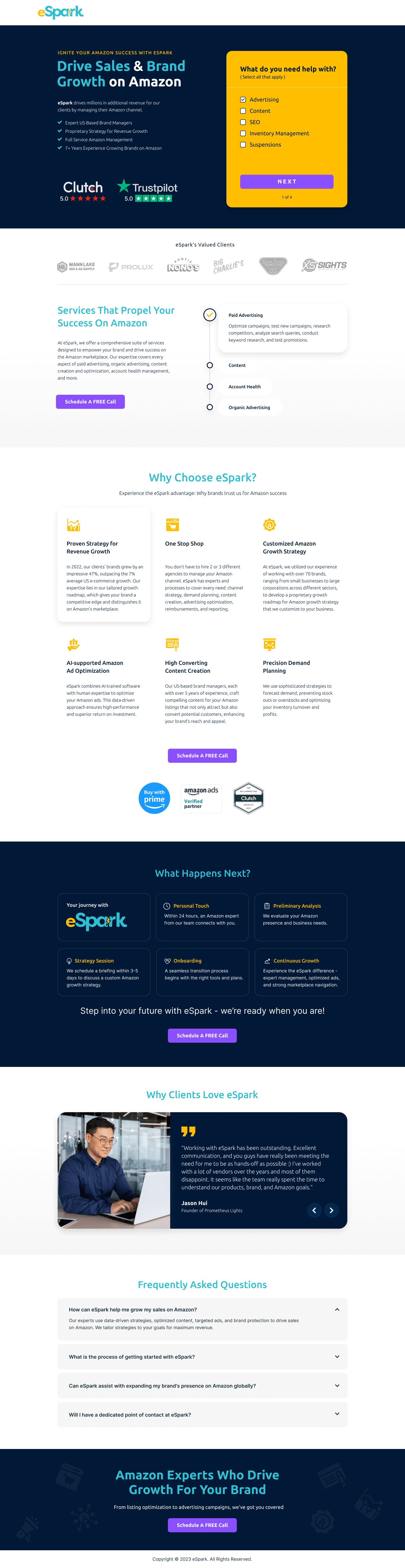
CRO breakdown of Shield SOS's dark-design home security pre-launch page. Expert conversion analysis by Apexure.
What is ConvertScore™? ConvertScore™ is Apexure's proprietary landing page performance metric. We evaluate every page across four dimensions — Copy & Messaging, Layout & Hierarchy, Trust & Social Proof, and CTA & Conversion Path — to produce a single score out of 100.

The home security market is crowded with established brands (Ring, Nest, SimpliSafe) and a new hardware entrant faces an immediate credibility gap. Shield SOS was building a 2-in-1 system that went beyond passive notification (the model those brands rely on) to active response. The device doesn’t just tell you someone’s at your door. It takes autonomous protective action.
That differentiation is compelling but hard to communicate quickly. The conversion challenge was getting visitors past their existing reference point (“we already have Ring, why do we need another camera?”) and into the specific value proposition of an active protection system. The page couldn’t afford to spend paragraphs on category education. It had to land the distinction in the first screen and then spend the rest of the page validating it.
We also had to handle the inherent risk anxiety that home security products trigger. Visitors are evaluating something they’ll install in their home to protect their family. Novelty is a liability in that emotional context. “New and unproven” is the worst possible positioning for a security product. Every design decision was calibrated to make Shield SOS feel like a trusted, tested, capable system, despite being a pre-launch proposition.
“Doorbell Cams Can Only Notify, ShieldSOS Takes Action.” That’s positioning work done in eight words. Rather than listing features or describing the product, the headline defines the category above the existing market leader and invites the visitor to see themselves upgrading from notification to protection. We chose that framing over product-description headlines because it works on visitors who already own a doorbell cam (positioning it as an upgrade) and visitors who don’t (positioning it as the better alternative to consider first).
The hero uses the physical device as the primary visual. For hardware pre-launches, the product visual carries significant conversion weight. It makes the proposition tangible before the visitor has read any copy. We lit the device photography against a dark background to create the premium technology aesthetic the category demands, and photographed the device at an angle that shows its physical distinction from a standard doorbell camera.
The motion assets demonstrate the active response mechanism in a way static images cannot. That matters particularly for a product whose key differentiator is behavioural (what it does when triggered) rather than aesthetic. A short looping animation showing an intruder detection event and the system’s response gives visitors the “aha” moment copy alone rarely achieves. We used autoplaying, muted loops rather than click-to-play video because pre-launch visitors are in evaluation mode, not committed enough to choose to press play.
Each card addresses a specific homeowner anxiety: detection range, false alarm rate, response capability, connectivity independence. We ordered them by the anxieties we identified through competitive research as most common in smart security reviews. “Does it work reliably?” comes before “What does it do when triggered?” because reliability doubt kills conversions before capability questions even arise.
“Doorbell cams can only notify you. Intruders know this.” That uses a specific rhetorical technique. It introduces a piece of information the visitor didn’t have and creates a new anxiety to resolve. Most home security marketing focuses on what their product does. This page also focuses on what existing solutions don’t do and what that gap costs the visitor. Loss aversion is a more powerful motivator than feature gain for a protection category.
The hero establishes product sophistication through design quality and photography before any claim is made. Dark palette, precise typography, professional device photography: each signals investment and seriousness. For a pre-launch product with no reviews, design quality is the primary available trust signal and we treated it accordingly.
The feature detail sections demonstrate product knowledge and specificity. Vague security products make vague claims. Specific products make specific claims: detection range in metres, response time in seconds, connectivity specifications. That specificity signals engineering investment rather than marketing promise.
The page addresses the “intruder knows doorbell cams just notify” concern with enough detail and directness that it functions as both educational content and implied competitive proof. We kept the early-access signup friction low (email only) because for a pre-launch where the product isn’t yet shipping, asking for more than an email creates commitment anxiety that no amount of copy can overcome.

"Pre-launch pages in hardware categories should do one specific thing really well: make the visitor feel like they're getting in before everyone else on something genuinely better. That means the copy tone can't be uncertain or hedging. You're not 'hoping to ship.' You're 'launching in Q3, early backers get priority fulfilment.' Certainty of language builds confidence in the product even when the product doesn't exist yet."
Since this build, our work on hardware pre-launch pages has identified three specific improvements.
A live or near-live count of “X people have already requested early access” creates social proof from zero in a way that doesn’t require reviews or testimonials. It also activates FOMO. If hundreds of people have already signed up, the visitor wants to understand why before they miss out. High impact for a pre-launch page where traditional social proof doesn’t exist yet.
A professionally produced, narrated video showing the exact detection-to-response sequence would carry more weight than a looping animation. The key is keeping it under 90 seconds and front-loading the key differentiator (active response) in the first 15 seconds. Our data on hardware pre-launch pages shows video testimonials or product demos in the top quarter of the page raise signup rates by 20-35%.
Pre-launch hardware products with visible founding teams convert better than anonymous company pages. A brief section showing the founders’ backgrounds (previous hardware experience, security industry credentials, notable advisors) would address the “is this real” scepticism that pre-launch pages always face. Medium impact overall, but high impact for the specific visitor segment that’s interested but not yet convinced the company is credible enough to back early.
"The single biggest mistake on pre-launch hardware pages is treating 'early access' as a waiting list rather than a privilege. Visitors don't want to join a queue. They want to secure an advantage. 'Join the early access programme, first 500 backers get priority shipping' converts at a essentially different rate than 'sign up to be notified when we launch.' The framing changes the visitor's self-concept from passive waiter to active participant."
Building a pre-launch page that converts curious visitors into committed early backers? Talk to our team.
People trust credible experts. Certifications, awards, media mentions, and expert endorsements boost credibility.
People follow the actions of others. Testimonials, reviews, and client logos build trust and reduce hesitation.
Simpler pages convert better. Reducing visual noise, breaking forms into steps, and clear copy lower mental effort.
Controlling what visitors see first, second, and third guides them toward the conversion goal.
People feel losses more strongly than gains. Framing around what they will miss motivates action.
Dark design for home security isn't just an aesthetic choice, it's a psychological signal. The category is about protection, night-time safety, and technology that works invisibly. A dark palette reinforces those associations before a word is read. It also creates the contrast needed to make product photography of security cameras and smart devices pop against the background, which matters for a hardware product where the physical object itself needs to look premium.
Pre-launch pages for physical security products face a specific credibility problem: the product doesn't exist yet in the hands of real users. Visitors can't read reviews, can't test it, and can't see it in their home. The page has to bridge that gap with clear product photography, a compelling demonstration of the problem it solves, and enough social proof from early supporters or beta testers to signal that other credible people have already bet on it. Doorbell-cam comparison callouts work particularly well because they ground an abstract proposition in a product category the visitor already understands.
The most effective approach is direct comparison to the category leader the visitor already knows. 'Doorbell cams can only notify you, ShieldSOS takes action' is conversion-optimised copy because it positions the product's superiority relative to a specific limitation the prospect has probably already experienced. Don't compare to competitors by name, compare to the generic version of the category, which the visitor mentally maps to the market leader without any legal risk.
The post-signup experience is where most pre-launch campaigns lose momentum. The confirmation page should immediately quantify what early access means, position number in the queue, estimated delivery window, and any early-backer benefit. An automated email sequence starting within minutes of signup should build anticipation with product updates, social proof from other early backers, and concrete launch milestone communications. The goal is to prevent signup regret and turn passive early-access holders into active advocates.
Other CRO breakdowns from our lookbook
We design high-converting landing pages for B2B and B2C brands. Let's talk about yours.
Get a Free Consultation Or browse more examples →
Founder & CEO of Apexure, Waseem worked in London's Financial Industry. He has worked on trading floors in BNP Paribas and Trafigura, developing complex business systems. Waseem loves working with Startups and combines data and design to create improved User Experiences.
Get quality posts covering insights into Conversion Rate Optimisation, Landing Pages and great design


"The dark layout here is earning its keep in a way that wouldn't work for most categories. Home security activates a specific emotional register: protection, vigilance, control at night. A clean white layout with rounded corners communicates 'friendly consumer app.' A dark, technically precise design communicates 'serious protection technology.' The aesthetic needs to match the emotional job the product is hired to do."