CRO breakdown of Secure My Loan's FCA-authorised secured loan quote landing page. Expert analysis of the multi-field form architecture, BBC/Telegraph media logos, and 99% satisfaction anchor by Apexure.
What is ConvertScore™? ConvertScore™ is Apexure's proprietary landing page performance metric. We evaluate every page across four dimensions — Copy & Messaging, Layout & Hierarchy, Trust & Social Proof, and CTA & Conversion Path — to produce a single score out of 100.
Secure My Loan is a trading style of Fluent Money Ltd, an FCA-authorised loan broker. The page operates in a regulated environment with specific requirements for clear disclosure of broker status, representative APR, risk warnings, and payment consequences. Rather than treating these disclosures as compliance burdens, the page design folds them in as trust signals. The regulatory framework is presented as evidence of legitimacy, not just legal obligation.
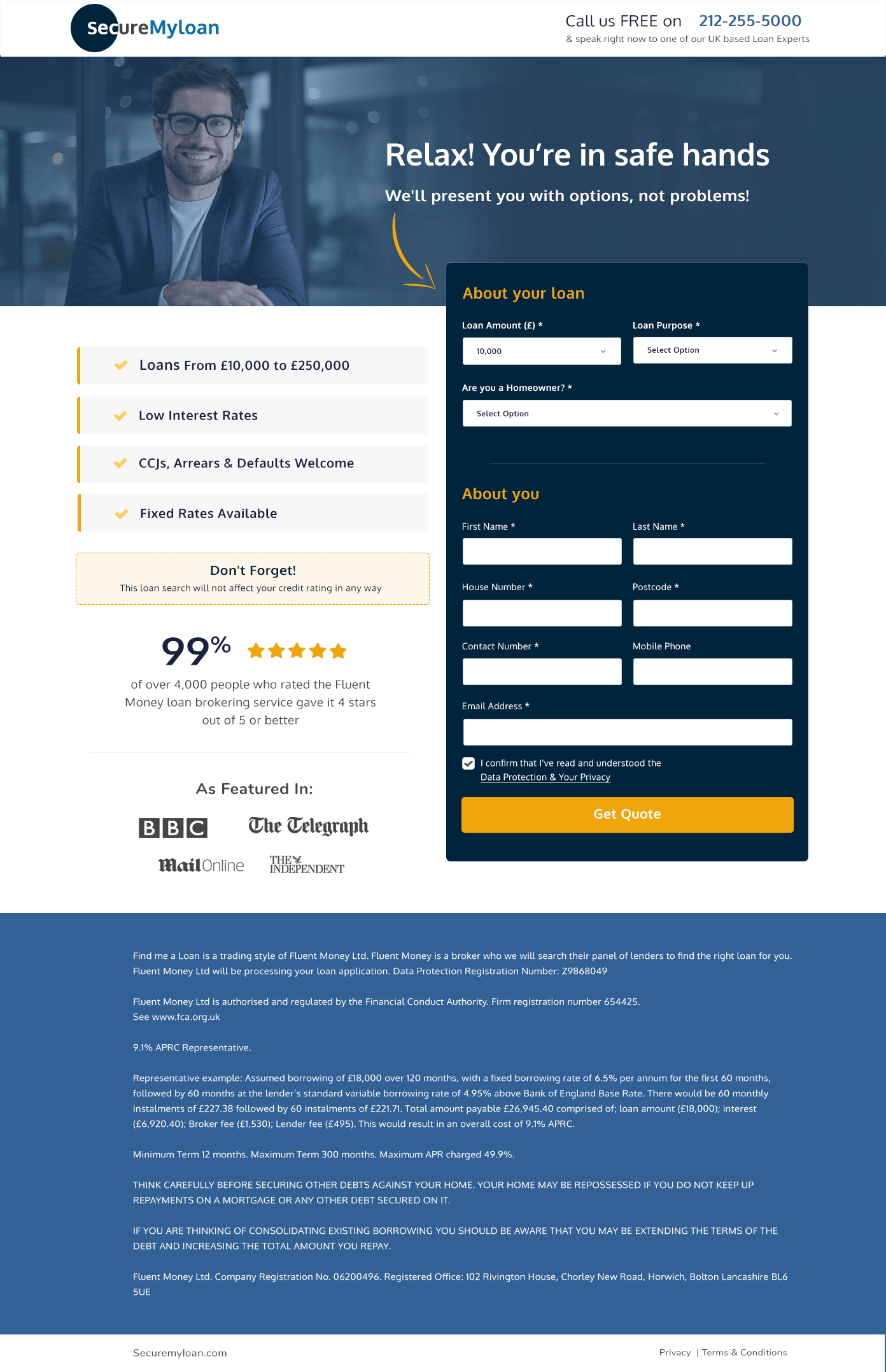
Key product features on the left, the quote form on the right: the right structure for a lead generation page where the form is the conversion action. The left column makes the case for action (loans from £10,000 to £250,000, low interest rates, CCJs and arrears welcome, fixed rates available) while the right column provides the mechanism for action. Both elements are visible above the fold without requiring any scroll, meaning a ready-to-convert visitor can complete the form without reading a single word of the left column.
This framing immediately self-qualifies visitors who need a specific loan amount. The wide range signals that the product serves both relatively modest home improvement needs and substantial debt consolidation requirements. The ‘CCJs, Arrears & Defaults Welcome’ bullet is a particularly important inclusion. It explicitly invites the segment of borrowers who most need a broker’s help but who most expect to be turned away.
“of over 4,000 people who rated the Fluent Money loan brokering service gave it 4 stars or better”: this is anchored above the form and sits directly before the credit score reassurance. The specific framing (‘over 4,000 people’, ‘4 stars or better’) gives the figure enough granularity to feel credible. A round number (e.g. ‘99% satisfied’) alone would feel imprecise; the supporting volume and rating threshold detail makes it feel like a real measurement.
The form's 'About You' section (First Name, Last Name, House Number, Postcode, Contact Number, Mobile Phone, Email Address, plus the homeowner status qualifier and data protection checkbox) is a high-field-count form for a first-touch lead generation page. The page compensates for this friction with the 'no credit impact' reassurance and the media logo trust signals. Whether the friction is worth bearing depends on the quality of leads that a shorter form would generate. A test worth running.
BBC, The Telegraph, Mail Online, The Independent: these appear beneath the 99% satisfaction figure, forming a trust band between the social proof and the form. Their placement is precise: they validate the brand credibility at the exact moment the visitor is deciding whether to provide personal and financial information. For financial fraud-conscious consumers, seeing BBC and Telegraph logos reduces the ‘is this legitimate?’ hesitation that abandons more loan quote forms than any UX friction does.
The footer is extensive and transparent: it explains Fluent Money’s broker status, the representative APR (9.1% APRC for a specific example), the total repayable amount, the FCA registration number, and a full risk disclosure about home repossession. This level of transparency is required by regulation but also functions as trust signal for financially literate consumers who value brokers that are forthright about terms rather than hiding them in fine print.
Secure My Loan’s trust architecture is specifically calibrated for financial fraud-sceptical consumers who are both apprehensive about the loan product (can I get approved? What’s the real cost?) and about the digital experience (is this company legitimate? Will they sell my data?). Media logos address legitimacy. The 99% satisfaction metric addresses service quality. The credit score non-impact statement addresses application risk. FCA registration and representative APR address financial transparency. ‘No policy numbers needed’ addresses process simplicity. Each layer addresses a different fear in the financial consumer’s evaluation.

"The credit score reassurance on this page ('this loan search will not affect your credit rating in any way') is doing more conversion work than any design element. It directly neutralises the most common reason UK consumers abandon loan comparison forms. If I had to pick the one element to test removing. It would be that line, just to prove how much conversion drops without it. I'm confident the drop would be significant."
The 'Don't Forget!' reminder box (styled with a dashed border and a warm yellow-beige tone) stands out visually from the white form background and blue form fields. Its styling signals a 'helpful note' rather than a legal disclaimer, which means visitors read it rather than skipping it. The content ('this loan search will not affect your credit rating in any way') is the most important reassurance on the page, and the design makes sure it gets read.
The two-column above-fold structure keeps the form always visible without requiring a scroll for desktop visitors. The ‘Get Quote’ button uses a high-contrast orange colour against the dark navy form background, making the CTA the highest-visibility element in the form section. The form design uses light input fields on a dark background, which creates a focused, contained visual environment that draws attention inward toward the form fields rather than outward to surrounding content.
The current single-step form with seven personal fields is a high-commitment first interaction. A two-step form (step one captures loan amount and homeowner status only, step two reveals a provisional rate range and requests personal details) would likely increase completion rates by giving visitors a tangible value (a rate indication) before requiring them to provide personal data. This model trades lead volume for lead quality, but the self-qualifying nature of step one also pre-filters for genuine intent.
Testing a step one that captures loan amount and homeowner status only, then delivers a provisional rate range before asking for personal details, would increase form start rates and make the personal data request feel more justified. The visitor has received value before they give information.
Showing a teaser of indicative rates (‘Based on your loan size, rates from 4.8% are available subject to status’) before the form fields would increase the motivation to complete, by giving the visitor a concrete goal to achieve through form completion.
A ‘CCJs and defaults welcome’ audience has a specific fear of being judged or rejected. A testimonial from a borrower who had credit issues and was still successfully placed (‘I had two CCJs and still got a rate of X%’) would convert this specific segment far more effectively than a generic satisfaction score.
This page scores 80 out of 100. The credit score non-impact reassurance is among the most effective single trust elements we’ve seen on a financial lead gen page, the media logos are well-placed, and the inclusive borrower language (‘CCJs and defaults welcome’) opens the conversion to a high-value underserved segment. What holds the score back is the high field-count form at first interaction, the absence of indicative rate previews, and testimonials that would be more persuasive from borrowers in comparable situations. A two-step form test would be the single highest-impact optimisation available.
Browse our full collection of landing page examples or contact us to discuss conversion optimisation for your financial services lead gen page.
The first piece of information shapes all subsequent judgements. Price comparisons and headline stats set expectations.
People follow the actions of others. Testimonials, reviews, and client logos build trust and reduce hesitation.
People trust credible experts. Certifications, awards, media mentions, and expert endorsements boost credibility.
People feel losses more strongly than gains. Framing around what they will miss motivates action.
This principle influences visitor behaviour and supports the page's conversion goal.
For UK consumers considering a loan, credit score protection is a major barrier to beginning a quote search. The widespread awareness that 'hard searches' damage credit scores means many people delay or avoid comparison shopping for financial products. By prominently stating that the search won't affect the credit rating, directly under the 99% satisfaction figure and before the form fields, the page removes the most feared consequence of the first step. This single line is potentially the highest-conversion element on the page.
These four media logos perform a specific function in a financial context: they signal that Fluent Money (the parent brand) has been independently covered by credible journalism, not just paid advertising. For a consumer about to enter sensitive personal and financial details into a form, seeing BBC and Telegraph logos provides the editorial endorsement that 'this is a real, established company that has been reported on by journalists who checked.' It reduces the primary fear of financial fraud at the exact moment the visitor is about to provide personal data.
Homeowner status is the primary eligibility criterion for a secured loan, the security is the property. Asking this question early in the form sequence serves a dual qualification purpose: it confirms eligibility for the specific product, and it signals to the homeowner that this product is designed for them specifically. Homeowners who see their status acknowledged as a relevant factor feel more correctly placed than visitors who don't know if the product applies to them.
The multi-field form is the primary conversion barrier, every additional field reduces completion rate. We'd test a two-step form: step one captures loan amount and homeowner status only, then step two requests personal details after the visitor has seen a provisional rate range. This 'progressive disclosure' approach converts at higher rates because the visitor receives a tangible value (a rate indication) before they've committed their full personal data. [Contact us](/contact-us/) to discuss your finance lead gen form architecture.
Other CRO breakdowns from our lookbook
We design high-converting landing pages for B2B and B2C brands. Let's talk about yours.
Get a Free Consultation Or browse more examples →
Founder & CEO of Apexure, Waseem worked in London's Financial Industry. He has worked on trading floors in BNP Paribas and Trafigura, developing complex business systems. Waseem loves working with Startups and combines data and design to create improved User Experiences.
Get quality posts covering insights into Conversion Rate Optimisation, Landing Pages and great design


"Financial services pages that treat FCA regulation as a trust signal rather than a disclaimer convert better. A visible FCA registration number near the form ('FCA Firm Reference 654425') tells a consumer that someone they can verify has assessed and approved this business. That's a more powerful trust statement than any testimonial, because it's backed by regulatory accountability rather than commercial incentive."