CRO breakdown of Return My Money's financial compensation claims landing page. Expert analysis of the £50M proof stat, no-win-no-fee architecture, and urgency CTA by Apexure.
What is ConvertScore™? ConvertScore™ is Apexure's proprietary landing page performance metric. We evaluate every page across four dimensions — Copy & Messaging, Layout & Hierarchy, Trust & Social Proof, and CTA & Conversion Path — to produce a single score out of 100.
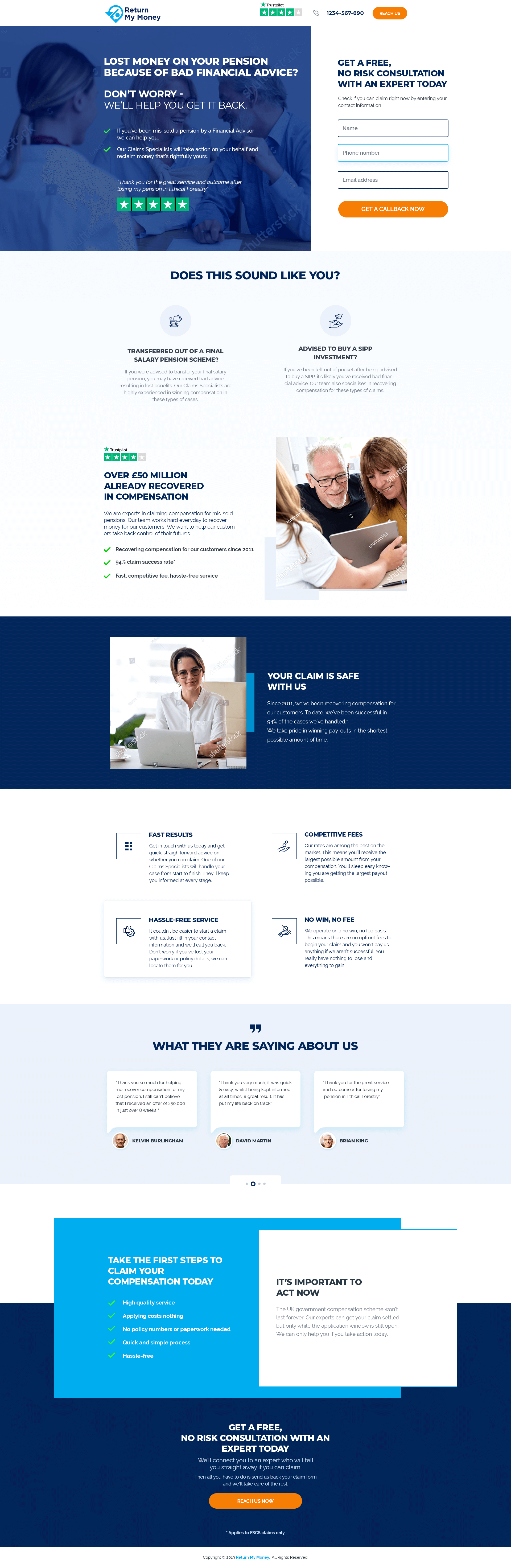
Return My Money operates in a space where visitors arrive with natural and well-founded scepticism. They’ve already been mis-sold a financial product once. Asking them to trust another financial company with their claim requires a significant credibility investment up front. This page makes that investment immediately (with a £50M recovery figure, a 94% claim success rate, and service-since-2011 social proof) before a single sentence of features appears.
The £50M figure, a Trustpilot four-star rating bar, and a “94% claim success rate” badge. None of these credentials lives alone. They’re grouped at the first visual anchor point so even a visitor who reads nothing else absorbs three credibility signals before deciding whether to scroll.
“YOUR CLAIM IS SAFE WITH US” uses colour psychology precisely. Green carries associations of safety, clearance, and go-ahead. On a page about financial recovery, it reads as both visual and emotional reassurance. The section text reinforces this: “we’ve been successful in 94% of the cases we’ve handled” and “We take pride in winning pay-outs in the shortest possible amount of time.”
Fast Results, Competitive Fees, Hassle-Free Service, No Win No Fee. The four address the four most common concerns about engaging a claims firm: speed, cost, effort required, financial risk. Placing them together in a grid creates the impression of a full solution rather than a single strong argument. Visitors can scan all four in under ten seconds.
"No Win, No Fee" is more than a pricing model. It's a psychological commitment signal. When a firm takes on a case on a contingency basis. They're aligning their financial incentive with the client's outcome. The page makes this alignment explicit: "You really have nothing to lose and everything to gain." That statement is doing heavy conversion work because it removes the one objection that stops most valid claimants from seeking help.
Kelvin Burlingham, David Martin, and Brian King. The quotes are specific and personal. “I can’t believe I received an offer of £10,000 in just over 9 weeks” names an amount and a timeline. That specificity transforms testimonials from decorative social proof into credible case precedents.
A dark navy card listing the benefits of acting (high quality service, applies costs nothing, no policy numbers needed, quick and simple process, hassle-free) sits alongside a white card explaining the time sensitivity. The layout creates visual tension between comfort (the benefit list) and urgency (the deadline). That combination of reassurance plus action pressure is what drives claims enquiries.
The page front-loads all of its heaviest trust signals within the first scroll. That’s intentional. Mis-sold pension victims have a high distrust threshold. Burying the proof signals deeper in the page would mean a significant percentage of visitors bounce before reaching them. By placing £50M, 94% success rate, Trustpilot, and ‘since 2011’ above the first fold, the page bets on credibility before anything else.

"For any page where the visitor has been wronged before, the trust architecture needs to work twice as hard. The visitor is already defensive. Leading with your largest proof stat (not a reassuring headline, not a 'we care about you' message, but a hard number) meets that defensiveness with evidence rather than warmth."
Read more about how we approach trust signals at Ways To Increase Landing Page Social Proof.
The bottom CTA section pairs "GET A FREE, NO RISK CONSULTATION WITH AN EXPERT TODAY" with "We'll connect you to an expert who will tell you straight away if you can claim." The specificity about what happens next (a real expert, an immediate answer) removes the fear of being passed to a call centre or receiving an automated response. It makes the enquiry feel personal before it happens.
The free, no-risk consultation is the ideal soft conversion for this audience. Visitors don’t need to commit to anything, pay anything, or gather documents. All they need to do is submit a claim form and a specialist calls them. The CTA language (“Reach Us Now”) is direct and active without being aggressive, and the sub-copy explains exactly what happens: “send us back your claim form and we’ll take care of the rest.”
The page uses a genuine regulatory deadline (the FSCS compensation scheme window) as its urgency mechanism. That's more credible and more durable than artificial countdown timers because it's verifiable. Visitors who check and confirm the deadline is real become more motivated to act, not less.
A visible claim value estimator. Adding a simple interactive tool (“Mis-sold pension amount × years × interest rate = potential compensation”) would give visitors a personal stake in the claim before they submit the form. Personalisation at the calculation level converts meaningfully better than a static page.
Case study depth. The testimonials reference specific outcomes but don’t explain the claim type. A brief case study format (“Mis-sold SIPP in 2015, recovered £14,000 in 11 weeks”) would help visitors categorise their own situation and confirm eligibility before calling.
Trust badge placement near the form. Adding the Trustpilot rating and 94% success figure directly adjacent to the form fields, not just in the hero, would reinforce confidence at the exact moment of highest commitment anxiety.
This page scores 83 out of 100. The proof architecture is strong, the no-win-no-fee risk reversal is deployed correctly, and the urgency framing is genuine rather than manufactured. What holds it back is the absence of a personalisation mechanism (a claim estimator or eligibility checker), reliance on three testimonials without deeper case studies, and a contact form that could be made shorter and lower-friction. Strong page overall. With those three adjustments, it would be in the top tier of claims pages we analyse.
Browse our full collection of landing page examples or reach out to us to discuss how we’d improve your financial claims conversion rate.
People follow the actions of others. Testimonials, reviews, and client logos build trust and reduce hesitation.
People feel losses more strongly than gains. Framing around what they will miss motivates action.
This principle influences visitor behaviour and supports the page's conversion goal.
People trust credible experts. Certifications, awards, media mentions, and expert endorsements boost credibility.
Giving something valuable first (free guide, tool, audit) creates an obligation to reciprocate.
The £50M figure is the most powerful trust signal on the page because it makes an abstract capability concrete. Any claims firm can say they're experienced, only a firm that has genuinely recovered £50M can put that number above the fold. For visitors who've been mis-sold a pension and are wondering whether they have a viable claim, this figure answers the credibility question before they've asked it. Large recovery figures also prime visitors to think about what their own claim might be worth.
No-win-no-fee removes the primary financial risk that prevents people with valid claims from seeking help: the fear of paying legal fees and losing. The page makes this the central risk-reversal promise, 'you have nothing to lose and everything to gain.' For an audience that has already been financially wronged, this framing is particularly powerful because it inverts the risk active they experienced when they were mis-sold in the first place.
The urgency section states that the UK government compensation scheme won't be open forever, and that while the window is still open, visitors should act. This creates genuine urgency without being manipulative, because the deadline is real: FSCS compensation claims are time-limited. Using a real constraint rather than a manufactured countdown is more credible and more persuasive.
Claims pages need to do two things simultaneously: build enough trust that a financially wary visitor will share their contact details, and create enough urgency that they act today rather than 'coming back later.' We use a combination of specific proof statistics, no-risk language, and real deadline framing to close that gap. [Contact us](/contact-us/) to discuss how we'd approach your claims page.
Other CRO breakdowns from our lookbook
We design high-converting landing pages for B2B and B2C brands. Let's talk about yours.
Get a Free Consultation Or browse more examples →
Founder & CEO of Apexure, Waseem worked in London's Financial Industry. He has worked on trading floors in BNP Paribas and Trafigura, developing complex business systems. Waseem loves working with Startups and combines data and design to create improved User Experiences.
Get quality posts covering insights into Conversion Rate Optimisation, Landing Pages and great design


"Claims pages sit at the intersection of finance and legal. Two categories where trust is the entire purchase decision. A visitor who's been wronged financially is evaluating: will these people fight for me the way no one did before? The page's job is to answer that question with evidence, not assurances."