CRO breakdown of RetirementInvestments' free guide lead generation page. Expert analysis of the annuity guide offer, split-layout design, and low-friction download CTA by Apexure.
What is ConvertScore™? ConvertScore™ is Apexure's proprietary landing page performance metric. We evaluate every page across four dimensions — Copy & Messaging, Layout & Hierarchy, Trust & Social Proof, and CTA & Conversion Path — to produce a single score out of 100.
RetirementInvestments’ guide download page is built around a deceptively simple insight: people who are approaching retirement are information-seeking, not sales-ready. They want to understand their options before talking to anyone. The page meets them exactly where they are (offering education with zero sales pressure) and captures their contact details in exchange.
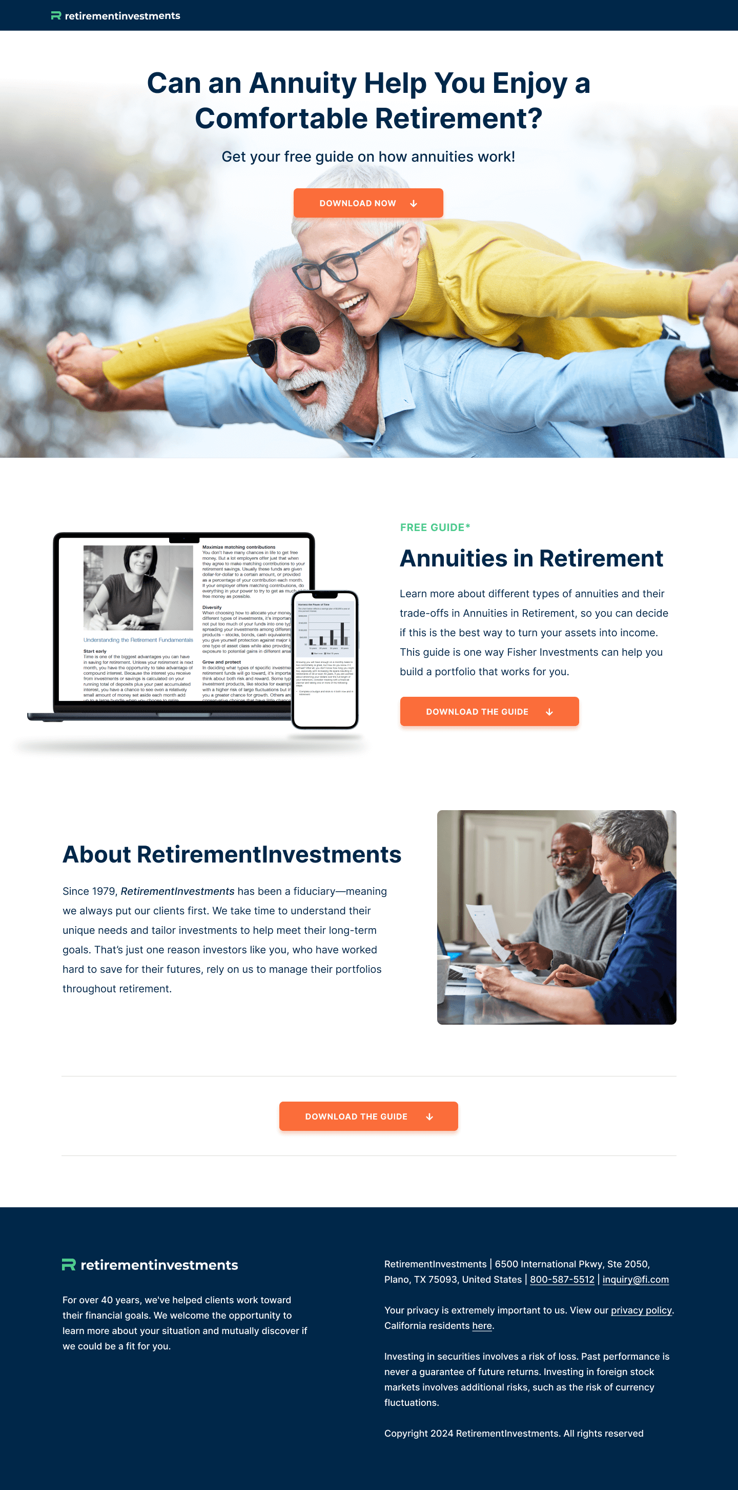
This dual-device display serves two purposes. It reinforces that the guide is immediately accessible on any device, and it makes the download feel like a real, substantial resource rather than a PDF that might contain three bullet points. The visual weight of a laptop and phone together implies depth.
The headline works because it asks a genuine question the visitor is already holding. It doesn’t assert that annuities are the answer. It invites the visitor to investigate whether they might be. For a financially cautious audience evaluating complex products, an inquisitive headline feels more trustworthy than a confident claim.
Guide content on the left, download CTA on the right. The layout creates a natural Z-pattern reading flow. The eye enters at the headline, moves across to the orange CTA button, then drops to the ‘About RetirementInvestments’ section below. This layout makes sure the download opportunity is visible before the visitor has to scroll.
The page includes a specific disclaimer: "Your privacy is extremely important to us." For financial services lead gen, this isn't a legal formality. It's an active conversion element. Visitors handing over an email address to a financial firm have a specific fear: being inundated with sales calls. Addressing that fear explicitly at the form removes a real objection.
The founding year combined with the fiduciary status does two things at once. The date establishes longevity and institutional stability. The fiduciary status establishes ethical match with the visitor’s interests. Together they create a trust signal that is both emotional (they’ve been doing this for decades) and rational (they’re legally obligated to serve me, not their commission targets).
Navy text on white with orange CTAs. Conservative and deliberate. Financial services visitors bring a specific set of associations: grey, navy, and white signal seriousness and stability. The orange CTA is the only departure from this palette, making sure it draws the eye precisely because it breaks the pattern.
The page’s trust architecture is compact but well-chosen. At the top: the FREE GUIDE label in bright green signals no-cost access without burying it in fine print. In the mid-section: the fiduciary declaration backed by 40+ years of operation. At the bottom: a privacy assurance that addresses the email-capture hesitation directly. The regulatory disclaimer at the footer (“Investing in securities involves a risk of loss”) adds credibility by being honest about risk. A counterintuitive trust signal that only confident, transparent firms use.

"Financial services pages that include regulatory risk disclaimers actually convert better than those that hide them. It sounds counterintuitive, but the visitors who read 'past performance is never a guarantee of future returns' and still click download are higher-quality leads. They understand the terrain and are making an informed choice."
The 'Download Now' CTA repeats three times across the page's short scroll depth. That frequency is appropriate for a page this compact. The visitor never scrolls more than two screenheights without encountering the conversion action, which means ready-to-act visitors are never more than a click away from completing the goal.
This is a soft-conversion page. The visitor isn’t being asked to commit money, sign a contract, or book a call. They’re being asked to accept something free. That dramatically lowers the conversion barrier, which is exactly right for a high-consideration financial product. The strategy is to exchange a high-quality resource for contact information, then nurture the lead with follow-up content before introducing a harder conversion ask.
Guide downloads convert at 3–5x the rate of direct consultation booking pages for financial services audiences. The visitor doesn't feel sold to. They feel helped. That positive first interaction creates the relationship foundation that makes the eventual follow-up call feel like a natural continuation rather than a cold pitch.
Table of contents preview. Showing three to four specific chapter headings from the guide directly on the page would raise perceived value and give visitors a concrete preview of what they’re downloading. Curiosity about a specific chapter title (“Chapter 3: The Annuity Types That Actually Outperform in Low-Rate Environments”) creates a pull that a generic ‘free guide’ label cannot.
A testimonial near the form. A single quote from someone who downloaded the guide and found it genuinely useful, placed directly alongside the download form, would provide social proof at the precise moment of commitment anxiety.
Clearer guide scope. The current description is short. Adding a single-line summary of who the guide is for (“Written for people 55+ evaluating income options for the next 20 years”) would pre-qualify visitors and raise the quality of leads captured.
This page scores 71 out of 100. The fiduciary positioning is excellent, the guide mockup is well-executed, and the privacy messaging directly addresses the email-capture hesitation. What brings the score down is a short, vague guide description that limits perceived value, no social proof near the conversion form, and a page that is so compact it may feel thin to visitors who arrived expecting more depth. Adding a table of contents and one testimonial would push this meaningfully higher.
Browse our full collection of landing page examples or contact us to discuss lead gen strategy for your financial services brand.
Giving something valuable first (free guide, tool, audit) creates an obligation to reciprocate.
People trust credible experts. Certifications, awards, media mentions, and expert endorsements boost credibility.
People feel losses more strongly than gains. Framing around what they will miss motivates action.
This principle influences visitor behaviour and supports the page's conversion goal.
The first piece of information shapes all subsequent judgements. Price comparisons and headline stats set expectations.
A free guide offer works well in high-stakes financial decisions because it lowers the commitment threshold dramatically. Asking someone to book a consultation with a financial advisor puts them in 'sales meeting' mode, which triggers resistance. Offering a free educational resource positions the brand as helpful rather than pushy, and qualifies leads who are genuinely researching annuities rather than visitors who arrived accidentally.
The word 'fiduciary' is one of the most powerful trust signals available to a financial services firm. It means the advisor is legally required to act in the client's best interest rather than maximise commission. Most consumers don't fully understand what fiduciary means, but they respond positively to it because it signals transparency and protection. RetirementInvestments places it in the 'About' section where it's visible during the consideration phase.
Showing a physical mockup of the guide, a laptop and mobile displaying the cover, transforms an abstract digital download into something that feels tangible. This is a well-established principle in digital product marketing: the guide mockup creates the impression that there's a real, substantial resource waiting, which increases perceived value and reduces the hesitation to hand over an email address.
We'd test adding a brief list of what's inside the guide directly on the page, three or four specific chapter headings that demonstrate the guide's depth. We'd also look at adding a visible testimonial from a past reader alongside the download form to provide social proof at the precise moment of conversion. [Speak to our team](/contact-us/) to discuss how we'd approach your financial services lead gen page.
Other CRO breakdowns from our lookbook
We design high-converting landing pages for B2B and B2C brands. Let's talk about yours.
Get a Free Consultation Or browse more examples →
Founder & CEO of Apexure, Waseem worked in London's Financial Industry. He has worked on trading floors in BNP Paribas and Trafigura, developing complex business systems. Waseem loves working with Startups and combines data and design to create improved User Experiences.
Get quality posts covering insights into Conversion Rate Optimisation, Landing Pages and great design


"In financial services, the best lead gen pages don't ask for commitment. They offer value first. A free guide that genuinely answers the visitor's question builds more trust in three pages than a 30-minute sales call would. And when a person reads your guide and finds it useful, they arrive at the follow-up call already believing you know your subject."