CRO breakdown of Private Mortgage's equity-based lending lead generation page. Design decisions and finance conversion strategy for private mortgage pages by Apexure.
What is ConvertScore™? ConvertScore™ is Apexure's proprietary landing page performance metric. We evaluate every page across four dimensions — Copy & Messaging, Layout & Hierarchy, Trust & Social Proof, and CTA & Conversion Path — to produce a single score out of 100.
Private mortgage borrowers come to this page in a specific state: they have a real property goal. They may have been declined elsewhere, and they need a lender who makes decisions based on asset value rather than income history or credit score. That context shapes everything about how this page had to communicate.
The conventional mortgage market has trained borrowers to expect a difficult, opaque process: applications that take weeks, documentation requirements that exclude self-employed buyers, credit thresholds that rule out people with one missed payment in their history. Private lending’s genuine advantage over the banks is speed (funds available within 24 hours), flexibility (equity-based, not income-based), and accessibility (no credit score threshold). Those three advantages had to be in the hero, not in a FAQ at the bottom.
The challenge was doing this while keeping the credibility a financial product demands. Private mortgage lending occupies a regulatory grey area in the public perception. Legitimate alternative lending exists alongside predatory products, and visitors arrive with some wariness. The page had to communicate “this is a professional, legitimate financial service” through every design decision, from the property photography to the LTV rate table to the recently funded deals present.
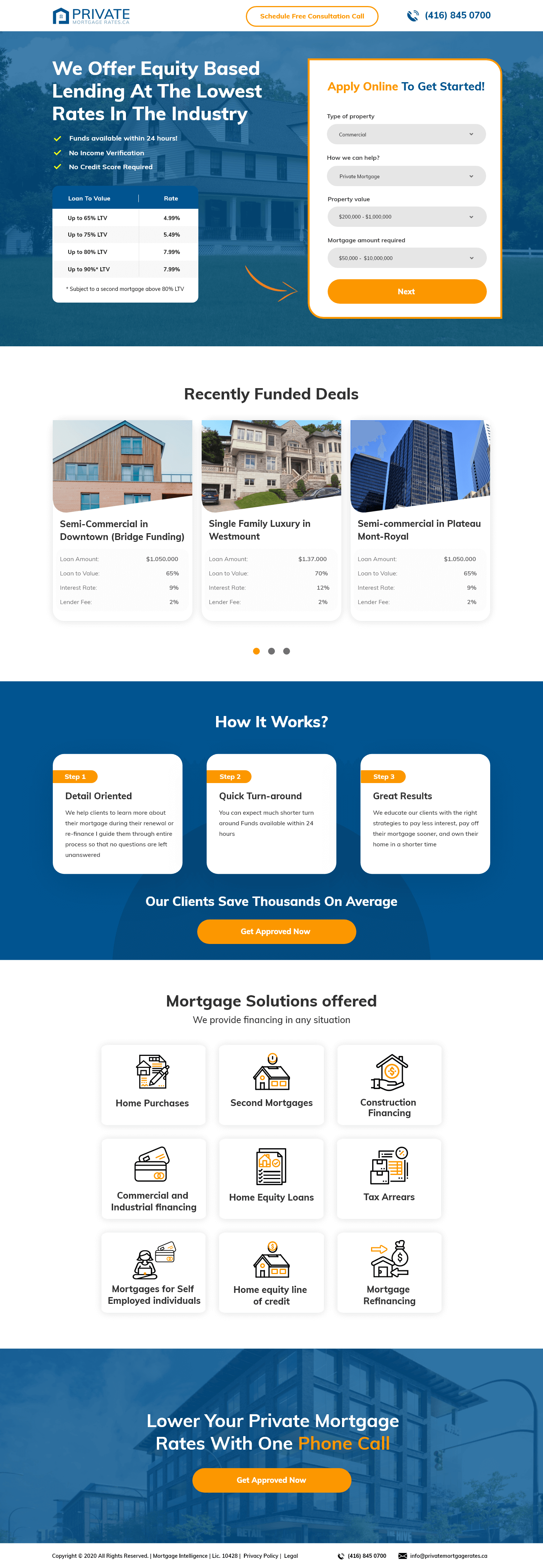
The split layout communicates the page’s context immediately: property-secured lending. The dark overlay with the commercial building photograph creates the professional, real-estate-sector tonality appropriate for a lender whose clients are property owners. The white form panel with the “Apply Online To Get Started!” heading provides clear visual contrast and makes the form invitation feel separated from the marketing content.
The form itself presents four qualifying fields: Type of Property (dropdown), How We Can Help (dropdown for product type), Property Value (range selector), Mortgage Amount Required (range). That’s a smart qualifying structure. Rather than asking for personal information immediately, the form asks about the property and the need. That reduces privacy anxiety (I’m describing my property, not giving away personal data) while qualifying the lead for the sales team.
The rate table sits in the hero next to the property checkmarks. Showing four LTV bands (Up to 65%, Up to 75%, Up to 80%, Up to 90%) with corresponding rates creates a precise anchor for the financially literate buyer. It also demonstrates the key differentiator: lending up to 90% LTV for some products, which is higher than most institutional lenders. Numerical specificity cannot be matched by a generic claim.
The carousel runs three cards with real deal details: property type, location, loan amount, LTV, interest rate, lender fee. It does what no testimonial can. It proves deal completion with verifiable financial specifics. A visitor who sees “Semi-Commercial in Downtown (Bridge Funding), $3,050,000 at 60% LTV” knows exactly the calibre and type of deal this lender closes.
Detail Oriented, Quick Turn-Around, Great Results. That addresses the process anxiety that stops private mortgage enquiries before they start. “Funds available within 24 hours” is a specific operational claim that carries enormous weight for a borrower who needs speed. The three steps explain what the borrower can expect from the engagement, not just the outcome.
The mortgage solutions grid at the bottom shows nine service types (Home Purchases, Second Mortgages, Commercial Financing, Tax Arrears, Mortgages for Self-Employed Individuals, and more) as a visual service menu. Each tile is an objection removal. It tells the visitor who previously thought they wouldn't qualify because of their property type or employment situation that this lender specifically handles their scenario.
“Aprobación expresa en menos de 48 horas” (express approval in under 48 hours) as a marked secondary claim beneath the rate table answers the speed question immediately. The phone number in the header navigation offers an instant exit to a human if the form feels too committing.
The funded deals carousel shows real transactions. These aren’t fictional case studies or anonymised scenarios. They include specific deal parameters. For a financial product, that level of specificity in showing completed transactions is the strongest form of proof available.
The nine-category service grid covers the full spectrum of non-traditional borrowing scenarios: self-employed individuals, home equity lines, construction financing, tax arrears. A visitor in any of these categories sees their specific situation named. That explicit recognition (“they lend to people in my situation”) is the final objection removal before form submission.

"The nine-category service grid at the bottom of this page is one of the hardest-working sections on the page. Every category (mortgages for self-employed, tax arrears, home equity loans) is a specific type of person who has been turned away elsewhere. When they see their scenario named on a lender's page, the entire trust barrier dissolves. They're not a risky borrower on this page. They're a target customer."
This page converts in two stages. High-intent visitors (those who already know they need private lending) will convert directly via the hero form, driven by the rate table anchor and the qualifying dropdowns that make the form feel like a step toward an outcome rather than a sales handoff. Lower-intent visitors (those comparing options or still evaluating whether private lending suits their situation) will scroll through the funded deals, the three-step process explanation, and the service grid before converting on the “Get Approved Now” CTA at the bottom.
The dual-language design choice (English content with some Spanish elements) in the hero, “Aprobación expresa,” shows the target geographic market and language demographics, adding a localisation layer that signals the lender understands their specific customer base.
"The form fields on this page ask about the property, not the person. That's a deliberate psychological ordering. 'What type of property do you have?' triggers zero defensiveness; it's an objective question about an asset. 'What's your credit score?' triggers defensiveness immediately. Get the asset information first, qualify the lead, then follow up with a human conversation where personal questions feel appropriate in context."
Our later finance builds show that entering a location as the first micro-action (before any personal information) lifts form starts substantially. It creates commitment through the Zeigarnik effect while collecting useful geographic qualification data.
A single-paragraph real deal narrative (“A self-employed contractor in Montreal needed $800k bridge financing within 10 days. We completed the assessment in 48 hours and funded within 5 business days”) would concretise the speed claim more effectively than the process steps alone.
The desktop rate table is a strong conversion element, but on mobile a static table with five columns requires horizontal scrolling. A tabbed interface where each LTV band is a swipeable card would improve mobile conversion substantially for a product category where a significant portion of enquiries come from mobile.
Browse our full collection of landing page examples for more finance and mortgage page breakdowns. Building a private lending lead generation page? Talk to our team.
The first piece of information shapes all subsequent judgements. Price comparisons and headline stats set expectations.
People trust credible experts. Certifications, awards, media mentions, and expert endorsements boost credibility.
People follow the actions of others. Testimonials, reviews, and client logos build trust and reduce hesitation.
People feel losses more strongly than gains. Framing around what they will miss motivates action.
This principle influences visitor behaviour and supports the page's conversion goal.
Mortgage borrowers in the private or alternative lending space arrive with a specific question: what rate can I get? They have already been declined by a bank or need speed that a bank cannot provide, the motivation is established before they land on the page. A benefit statement ('we help when banks won't') acknowledges a context they already know. A rate table, showing LTV bands from 60% to 90% LTV with corresponding rates from 4.99% to 7.99%, answers the financial question immediately and reduces the 'is this worth my time?' hesitation. For a financially literate audience, data is faster and more persuasive than copywriting.
Recently funded deals serve a specific function beyond social proof: they show the spectrum of what gets approved. A semi-commercial property, a single-family luxury home, and an apartment building in the same carousel tell the visitor three things: this lender is active (deals were recently funded, not years ago), they fund diverse property types, and the loan amounts shown are in a credible range. The borrower who sees their property type represented in the funded deals gallery has much lower 'will I qualify?' anxiety than one who only sees generic approval claims.
These qualifying statements in the hero, 'No Income Verification, No Private Mortgage, No Credit Score Required', are trust signals that also function as self-qualification prompts. A borrower who reads these three statements and identifies as someone who needs them (self-employed with variable income, prior credit events, unconventional property type) recognises this page is specifically for them. That self-identification creates significantly higher lead quality than a generic 'mortgage solutions' page, because the visitor has already matched themselves to the product before submitting the form.
The anchoring principle is key. By displaying the LTV-to-rate table prominently, the page sets a specific numerical anchor before the visitor compares elsewhere. More importantly, the table demonstrates transparency, a company willing to show its rate grid in the hero has nothing to hide. For borrowers who have been through opaque bank processes where rates are only revealed at the application stage, this transparency is itself a differentiating trust signal. The implied message is: 'we show you the rates upfront because we're confident in what we offer.'
Other CRO breakdowns from our lookbook
We design high-converting landing pages for B2B and B2C brands. Let's talk about yours.
Get a Free Consultation Or browse more examples →
Founder & CEO of Apexure, Waseem worked in London's Financial Industry. He has worked on trading floors in BNP Paribas and Trafigura, developing complex business systems. Waseem loves working with Startups and combines data and design to create improved User Experiences.
Get quality posts covering insights into Conversion Rate Optimisation, Landing Pages and great design


"Alternative lending pages need more transparency than bank pages, not less. The audience has usually been through an institutional process that felt opaque and arbitrary. Showing the rate table in the hero (exact LTV bands with exact rates) signals that this lender operates differently. Transparency in a financial page is a conversion strategy, not just a compliance requirement."