CRO breakdown of Peak Financial's 90-Day Retirement Roadmap sales page. See how 'Big 21 Questions' framing, transparent $8,000 pricing, and named-retiree video testimonials convert pre-retiree visitors to a six-figure planning engagement.
What is ConvertScore™? ConvertScore™ is Apexure's proprietary landing page performance metric. We evaluate every page across four dimensions — Copy & Messaging, Layout & Hierarchy, Trust & Social Proof, and CTA & Conversion Path — to produce a single score out of 100.
Peak Financial is a Certified Financial Planner firm offering a 90-day retirement-planning engagement priced at $8,000. The visitor on this page is typically a pre-retiree (50s to early 60s) with significant accumulated assets, evaluating whether to entrust their retirement transition to a planning firm rather than continue with their existing wirehouse advisor or DIY approach. The buyer is not new to the category, they have been pitched ‘financial plans’ by multiple advisors before reaching this page, and they have learned to discount the term.
The page solves the category-cynicism problem by structurally rejecting the term ‘financial plan’ in its headline (‘It’s not a “Financial Plan”, it’s a Roadmap to Retirement Certainty’) and replacing it with an education-first 90-day roadmap framework. The deliverable is structured as ‘The Big 21 Retirement Questions’, a numbered list the buyer can mentally check against their actual anxieties (When can I retire? How much do I actually need? What buckets do I spend from? How do I think about Social Security? When should I take it?). The list does the work that abstract category claims cannot: it converts a vague ‘planning service’ into a concrete, scannable, 21-point engagement.
The price reveal ($8,000) sits at the bottom of the page rather than the top, after the buyer has consumed the proof, the deliverable specifics, and seven distinct named-retiree testimonials. Transparent pricing in this category is a counterintuitive call (most CFP sales pages gate it entirely) but it is the right one for pre-retirees who have been burned by opaque percentage-of-AUM fee schedules and have learned to walk away from any advisor who will not state a number.
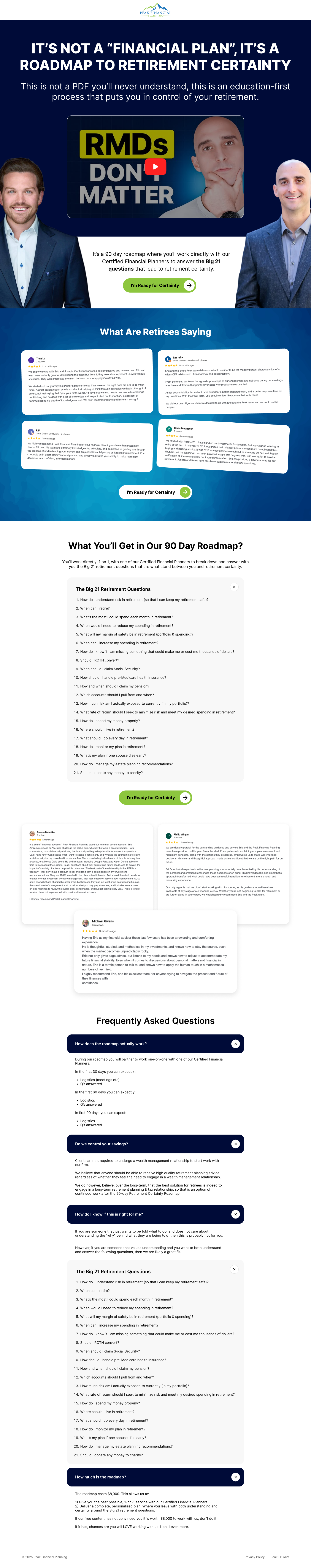
The dark navy hero with the embedded YouTube-style video thumbnail (‘RMDs DON’T MATTER’) is the page’s most distinctive design call. The thumbnail mimics the visual grammar of a high-engagement YouTube finance creator, with the older-presenter shocked-reaction face and the all-caps caption, which is exactly the visual register pre-retirees consume retirement education in on YouTube and Substack. By adopting that grammar on a CFP sales page, Peak Financial signals it is talking to the buyer in the buyer’s actual media diet rather than in the formal-corporate register most advisor pages default to.
The two named-presenter Certified Financial Planners flanking the video convert the firm credibility from abstract (‘our team of CFPs’) to specific (faces of the actual advisors who will be on the buyer’s planning calls). Pre-retirees buy advisors, not firms, and the page commits to showing the advisors in the hero rather than burying them in a ‘meet the team’ section.
The ‘What Are Retirees Saying’ four-up testimonial wall with star ratings and named individuals (Tony, John, Patti, Ginny) sits directly under the hero in the page’s first conviction-build moment. The five-star ratings are doing scan-able-credibility work; the substantial paragraph-length quotes underneath are doing narrative-credibility work. The combination is materially harder for a buyer to dismiss than either format alone.
The ‘What You’ll Get in Our 90 Day Roadmap?’ section listing the Big 21 Questions is the page’s structural spine. The questions are presented twice: once as the deliverable description (‘We sit down with you 1-on-1, with one of our Certified Financial Planners to break down and answer the Big 21 retirement questions’) and once as a fully-numbered enumerated list. The double placement is doing self-qualification work, the buyer who reads all 21 questions and says ‘yes, that’s exactly what I need to figure out’ has effectively pre-sold themselves.
The three deeper-page narrative testimonials (Kristin Brooke, Phillip Briggs, Michael Devens) sit between the FAQ accordion and the price reveal, providing the longer-form social proof that closes the buyer’s residual conviction gap. Where the upper four-up testimonials are scannable, these are read in full and produce the emotional commitment that justifies the $8,000 click.
The 'I'm Ready for Certainty' CTA copy is the page's most underrated asset. Pre-retirees clicking the button are not committing to a vendor meeting, they are declaring their internal readiness to themselves. That first-person framing converts the click from a transactional commitment into an emotional one, which is materially harder to abandon mid-flow than a generic 'Book a Consultation' would be. The CTA's repetition across five page sections is justified by the long-scroll structure: the buyer who is converted at the testimonials should be able to act there rather than scroll back to the hero.
CFP-grade financial planning trust requires three distinct proofs that this page assembles in sequence. The first is named-advisor visibility: the two Certified Financial Planners shown in the hero (with their faces) and named throughout the page convert the firm-level credibility into person-level trust. Pre-retirees do not entrust their retirement to firms; they entrust it to people, and the page commits to that pattern from the first viewport.
The second is layered named-retiree testimonials: four-up scannable testimonials with stars and brief quotes (Tony, John, Patti, Ginny) at the upper conviction-build moment, then three longer-form narrative testimonials (Kristin Brooke, Phillip Briggs, Michael Devens) at the price-proximity conviction moment. The two depths of social proof catch buyers at different scroll positions and conviction states.
The third is transparent pricing with deliverable specificity: the $8,000 figure sits at the bottom of the page with the breakdown ‘sit down with you 1-on-1, with one of our Certified Financial Planners to break down and answer the Big 21 retirement questions’. Stating both the price and what it buys, in the same band, converts the price from an objection-trigger into a value-defence the buyer can present to their spouse and family.

"In high-LTV professional services, the testimonial pattern that converts is two depths of social proof at two scroll positions. Quick-scan named testimonials with stars catch the high-conviction first-pass reader. Longer-form narrative testimonials catch the price-proximity second-pass reader. Peak Financial deploys both deliberately, which is rarer than it should be in advisor marketing."
Listing the Big 21 questions in full rather than gating them is the right call for this audience even though it appears to give away the deliverable. The questions are the easy part of the engagement; the personalised answers are what the firm sells. Publishing the questions converts the abstract 'we help you plan retirement' claim into a structured 21-point framework the buyer can mentally rehearse, which builds buyer-side ownership of the deliverable before the buyer has paid for it. The marginal risk of a competitor copying the framework is small; the conversion uplift from buyer-side commitment-and-consistency is large.
The ‘I’m Ready for Certainty’ CTA appears five times across the scroll: in the hero, after the testimonial wall, after the Big 21 list, after the longer narrative testimonials, and adjacent to the price reveal. The repetition is justified by the long-scroll page structure, conviction in financial planning purchases builds across multiple stages of proof, and the buyer who is converted at the testimonial wall should be able to act there rather than scroll back to the hero.
The single CTA copy is the page’s best asset and is held consistently across all five placements. ‘I’m Ready for Certainty’ is a first-person declarative that the buyer reads as their own statement, which converts the click from a vendor-meeting commitment into a personal-readiness one. The framing also closes the loop on the headline’s ‘Roadmap to Retirement Certainty’ promise, the page is internally coherent in a way that most advisor pages are not.
The supporting copy under each CTA varies by section to match the conviction state. The hero CTA carries the headline’s reframe; the post-testimonial CTAs carry social-proof reinforcement; the price-proximate CTA carries the deliverable-specificity language. The button stays predictable; the framing flexes to meet the visitor where they are.
"First-person CTA copy is one of the most underused conversion levers in B2C professional services. 'I'm Ready for Certainty' converts the click from a transactional vendor commitment into an emotional internal commitment. The buyer who clicks has just declared something to themselves, and that declaration is materially harder to retract than a generic 'Get Started' click would be. Peak Financial holds this discipline across all five CTA placements, which is what gives the page its tonal coherence."
Swipe Pages was the right platform for this build. The hero video embed, the four-up testimonial wall, the long Big 21 numbered list, the FAQ accordion, and the long-form narrative testimonials all benefit from Swipe Pages’ page-block flexibility, and the platform’s split-test capability lets the in-house team test variants of the headline category-rejection and the CTA copy without engineering involvement. The page weight is managed tightly: the hero video uses a thumbnail-first lazy-load pattern (the YouTube embed only initialises on click), the photographic testimonials are compressed to WebP with JPEG fallback, and the FAQ accordion is rendered server-side to avoid layout shift on initial paint.
Pre-retiree research happens on phones in higher proportion than other B2C financial verticals, often during late-evening browsing in the same window as YouTube finance content. The hero video stacks above the value proposition on mobile with the video thumbnail preserved at full visual weight (the YouTube-grammar reaction face must remain readable at mobile size to do its category-pattern-matching job). The four-up testimonial wall converts to a swipeable carousel rather than collapsing to a small-text grid, so the named-retiree faces and star ratings stay scannable. The Big 21 list collapses to a single-column numbered list with the question text at full size. The price reveal is rendered as a bold, isolated band rather than as inline copy, so the $8,000 figure remains the dominant element at the moment of price-proximity conviction.
The hero video is the page's most distinctive asset and also its largest potential payload. We deferred the YouTube embed initialisation until the visitor clicks the play button, so the hero renders with a thumbnail image rather than an active video player at first paint. This kept the hero CTA interactive within the first two seconds while preserving the video's category-pattern-matching function. The four-up testimonial photographs were compressed to WebP with JPEG fallback and lazy-loaded, and the longer narrative testimonial photographs deeper in the scroll were similarly deferred. The Big 21 numbered list is rendered as plain text rather than as a graphic, both for accessibility and for performance.
Three additions for the next iteration:
"The Peak Financial page is operating well for high-LTV B2C financial planning. The headline category-rejection, the Big 21 framework, the named-advisor visibility, the layered testimonials, the transparent $8,000 reveal, those are the moves that distinguish a CFP page that books $8K engagements from one that gets traffic and sells nothing. The path from 80 to 88 runs through video testimonials, an interactive readiness diagnostic, and credential verification. Those are the additions that move the page from a strong sales page to a category-defining one."
This page scores 80 because the strategic foundations are correct: the headline category-rejection differentiates the offering from every prior advisor pitch the buyer has heard, the Big 21 Questions framework converts an abstract planning service into a concrete deliverable, the named CFPs and layered named-retiree testimonials build advisor-level trust the buyer requires for a six-figure-LTV decision, the transparent $8,000 reveal builds integrity in a category where opacity is the default, and the first-person ‘I’m Ready for Certainty’ CTA closes the loop on the page’s central promise. The gap to 88+ is concentrated in three additions: video testimonials for the spousal-decision moment, an interactive readiness diagnostic for gap-visualisation, and inline CFP credential verification for the due-diligence step. Adding those three would convert the page from a strong sales page into a category-defining one.
Browse our full collection of landing page examples to see how these principles apply across industries. For more on financial-services page design, read our guide to Financial Services Landing Page Examples.
People trust credible experts. Certifications, awards, media mentions, and expert endorsements boost credibility.
People follow the actions of others. Testimonials, reviews, and client logos build trust and reduce hesitation.
People feel losses more strongly than gains. Framing around what they will miss motivates action.
Controlling what visitors see first, second, and third guides them toward the conversion goal.
This principle influences visitor behaviour and supports the page's conversion goal.
The category framing on this page is the most important strategic call. Pre-retirees evaluating financial planning services have already been pitched 'comprehensive financial plans' by every advisor they have met, the term has been hollowed out by a decade of indifferent execution, and the buyer has learned to discount it. By explicitly framing the deliverable as 'NOT a financial plan' and replacing it with 'roadmap to retirement certainty', the page does two things simultaneously. First, it differentiates the offering from every competitor the buyer has already evaluated, the headline is structurally a category rejection, not a product claim. Second, it shifts the buyer's mental model from 'a document I will not understand' (the buyer's prior experience with financial plans) to 'a process that puts me in control', which is the emotional outcome the buyer actually wants. The supporting line ('this is not a PDF you'll never understand, this is an education-first process') closes the loop by naming the specific failure mode of the alternative the buyer is comparing against.
The Big 21 list ('When can I retire? How much do I actually need to retire? What are the buckets I should spend from in retirement? How do I spend my money properly?...') sits in two places on the page, mid-page as the deliverable description and again deeper as a fully-numbered list of all 21 questions. This double placement is doing structural work that a single feature list cannot. First, it converts the abstract '90-day roadmap' into a concrete, numbered, scannable promise, the buyer can mentally check whether their actual concerns are covered. Second, it earns trust by being specific where competitor pages are vague, every question on the list represents a real anxiety pre-retirees carry, and seeing it written down in the buyer's own internal language feels like the firm has been listening. Third, the list functions as a self-qualifying tool, a buyer who reads through 21 questions and says 'yes, that's exactly what I need to figure out' has effectively pre-sold themselves on the engagement before they reach the price reveal. This is the kind of structural commitment-and-consistency mechanic that converts at materially higher rates than a generic 'we help you plan retirement' page.
Most financial planning sales pages in this category gate price entirely, on the theory that a six-figure-LTV client should not be filtered out by a posted dollar figure. Peak Financial makes the opposite call, and for this audience and offering it is the right one. Pre-retirees evaluating planning services have learned to be cautious of any firm that hides its price, the experience of being courted into a free consultation only to be pitched a vague percentage-of-AUM fee schedule has burned them too many times. By stating the $8,000 figure explicitly with the breakdown of what it includes ('1-on-1 with one of our Certified Financial Planners to break down and answer with you the Big 21 retirement questions, and certainly around the Big 21 retirement questions'), the page does three things. First, it filters out the segment that genuinely cannot fund the engagement, which improves close rate per consultation. Second, it builds trust with the segment that can fund it, the transparency reads as integrity in a category where the default is opacity. Third, it pre-qualifies the buyer for the actual sales conversation, which now starts at 'is this engagement right for me' rather than 'how much does it cost'. The price reveal is at the bottom of the page rather than the top, after the buyer has consumed the proof and the deliverable specifics, which is exactly where the visitor is best positioned to absorb a five-figure number without flinching.
The video thumbnail in the hero (with the 'RMDs DON'T MATTER' caption and the older-presenter shocked-reaction face that mimics the YouTube hook style) is doing controversial-claim work that opens a specific buyer's curiosity loop. RMDs (Required Minimum Distributions) are something every pre-retiree has been told to worry about, and a confident assertion that they 'don't matter' is the kind of category-rejection move that makes the buyer want to know how the planner is thinking about it. The video presenter (visible as a credible older male professional) does authority-bias work without needing to display credentials, the look-and-cadence already signal CFP-style expertise. The bracketing photographs of two named-presenter Certified Financial Planners on either side of the video frame the firm's credibility, the buyer is being shown the people who will actually be on their planning calls. This is meaningfully better than the alternative (stock professional photography or no human imagery), because pre-retirees buy advisors, not firms, and the page commits to showing the advisors immediately.
The 'What Are Retirees Saying' section presents four named testimonials (Tony, John, Patti, Ginny) with five-star ratings and substantial paragraph quotes that describe specific outcomes ('we ended up with $X more spending capacity per year', 'finally I understood what I had and what to do with it'). For a six-figure-LTV B2C engagement, named individual testimonials with specific quoted outcomes convert at materially higher rates than aggregated review counts, because the buyer is not evaluating a product, they are evaluating whether to entrust their retirement to a specific firm. Names with ages and locations (where present) make the testimonials peer-validated rather than abstract, the buyer can mentally place the testimonial-giver in the same life stage as themselves. The page wisely repeats the testimonial pattern lower down with three additional named cases (Kristin Brooke, Phillip Briggs, Michael Devens) who provide longer-form narrative testimonials, which gives the buyer two distinct depths of social proof: scannable names+stars at first encounter, narrative outcomes at the conviction-build moment.
The CTA copy is doing emotional commitment work that a transactional 'Book a Consultation' framing cannot. 'I'm Ready for Certainty' is a first-person declaration the buyer reads as if speaking it themselves, which converts the click from a vendor-meeting commitment into an internal-state commitment. Pre-retirees who are clicking are simultaneously declaring their readiness to themselves, that is a meaningfully harder click to abandon mid-flow than a generic 'Get Started' or 'Talk to an Advisor' would be. The framing also does category-rejection work in alignment with the headline, a buyer who has been pitched 'consultations' by every other advisor they have spoken to is unlikely to react to one more, but 'Certainty' is the emotional outcome the page has been promising throughout the scroll, and clicking the CTA closes the loop on the page's central promise. The repetition of the CTA across five distinct page sections is justified by the long-scroll structure, the buyer who is converted at the testimonials should be able to act there rather than scroll back to the hero.
On the surface it looks like the page is giving away the deliverable, the Big 21 questions are listed in full at the bottom of the page, which a competitor advisor could conceivably copy. In practice this is the right strategic call for two reasons. First, the questions are the easy part of the engagement, the answers are what the firm sells, and the answers are personalised based on the buyer's actual financial situation. Publishing the questions does not erode the firm's value proposition; it demonstrates it. Second, listing the questions converts the abstract 'we help you plan retirement' claim into a structured 21-point framework the buyer can mentally rehearse, which builds buyer-side ownership of the deliverable before the buyer has paid for it. This is psychological commitment-and-consistency at scale, the buyer who has read all 21 questions has already started the engagement mentally, which is the strongest pre-purchase commitment a financial planning firm can extract. The trade-off (small marginal risk of competitor copying for substantial conversion uplift) is unambiguously worth taking.
Three additions would push this page from 80 toward the 88+ band. First, video case study from one of the named retiree testimonials. The current testimonials are written and powerful, but a two-minute video of Tony or Ginny describing the planning experience in their own words and home would convert the testimonial-driven segment at materially higher rates, because retirement decisions involve a spouse and trusted family members, and a video the buyer can show a sceptical partner is the asset that closes the household decision. Second, a Big 21 question diagnostic tool ('rate your confidence on each question 1-5'), which would convert the static list into an interactive self-assessment and would generate a personalised 'readiness score' that mirrors the IDEXX VetSoft calculator pattern, gap-visualisation in retirement planning is just as effective as it is in B2B SaaS. Third, an explicit 'CFP credential check' band naming the specific advisors and linking to their CFP Board verification pages. Pre-retirees in this price band do due-diligence checks before paying $8,000, and making the verification path one click rather than a Google search would close the residual credibility gap that even strong testimonials cannot fully bridge.
Other CRO breakdowns from our lookbook
We design high-converting landing pages for B2B and B2C brands. Let's talk about yours.
Get a Free Consultation Or browse more examples →
Founder & CEO of Apexure, Waseem worked in London's Financial Industry. He has worked on trading floors in BNP Paribas and Trafigura, developing complex business systems. Waseem loves working with Startups and combines data and design to create improved User Experiences.
Get quality posts covering insights into Conversion Rate Optimisation, Landing Pages and great design


"Pre-retirement financial planning is one of the highest-LTV B2C verticals on the open web, and it is also one of the most cynically pre-evaluated. The buyer has heard 'comprehensive financial plan' enough times to mentally tune it out. Peak Financial's headline category-rejection ('it's not a financial plan') is the structural move that gets the page read at all, and the Big 21 list is what gets it converted."