CRO breakdown of Mu6label's guitar learning platform page. Expert analysis of music-focused UX, video-led trust building, and course pricing design by Apexure.
What is ConvertScore™? ConvertScore™ is Apexure's proprietary landing page performance metric. We evaluate every page across four dimensions — Copy & Messaging, Layout & Hierarchy, Trust & Social Proof, and CTA & Conversion Path — to produce a single score out of 100.

Mu6label enters a market where guitar learning content is free and abundant. YouTube has thousands of guitar tutorials. The conversion challenge isn’t awareness. It’s differentiation. Why should someone pay for a structured programme when free content exists?
The page answers this question by positioning Mu6label around outcomes (“the most effective way”) and structured methodology rather than content volume. The buyer isn’t buying guitar videos; they’re buying the fastest path from beginner to confident player.
The dark hero with guitar close-up sets an immersive, premium register. Guitar learning is an emotional aspiration, people who want to play guitar are drawn to the craft, the artistry, the identity of being a guitarist. A dark, cinematic hero honours that aspiration rather than reducing it to a course catalog screenshot.
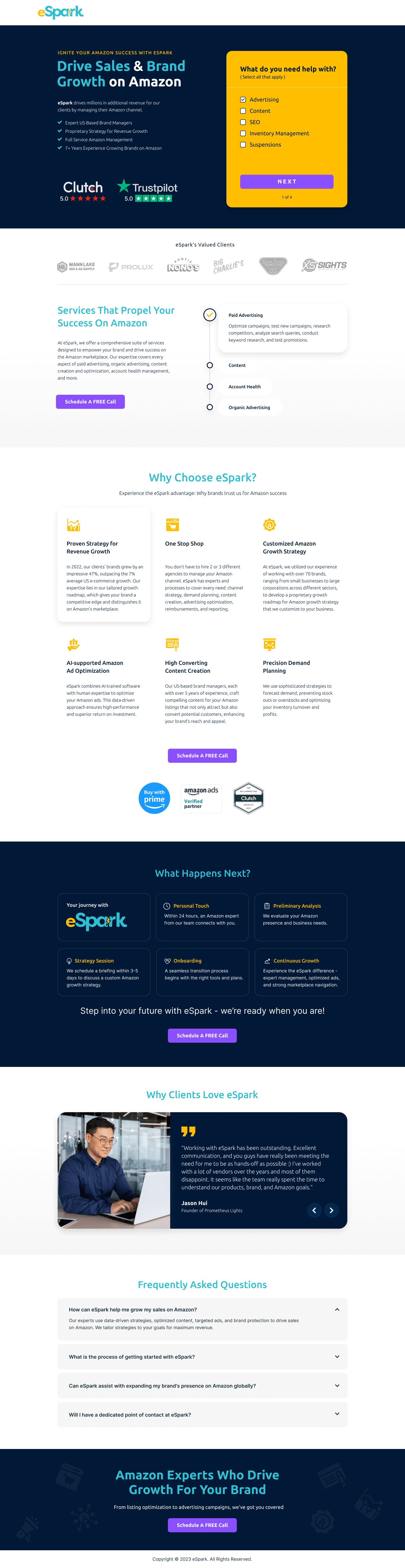
The methodology section, “Play Guitar From Scratch”, “Play Better, Learn Faster”, “Taking Care of You and Your Guitar”, “A Portable Luxury”, breaks the offering into clear benefit categories. Each has a heading, an illustration, and a supporting paragraph. This structure tells the visitor what the learning experience will feel like, not just what it contains. The “Portable Luxury” framing is particularly smart: it positions learning on a phone or tablet as a premium convenience rather than a compromise.
The video testimonials function as live demonstrations. For a music learning product, the proof isn’t in what students say. It’s in what they play. Any video showing a student progressing from beginner to competent player is more persuasive than a hundred written testimonials. We placed this section mid-page, after the methodology has been established, so the visitor watches it already primed to see the method proven.
The “Available in Appstore” badge and platform display resolves the “where does the learning actually happen?” question. For digital products, platform visibility reduces the mental friction of imagining how the purchase translates into actual use.
The pricing visibility (without requiring a click to reveal) reduces the anxiety around commitment. When price is hidden, visitors assume the worst. Showing the price transparently filters out non-buyers early, which is more efficient than engaging visitors who will never convert once they see the cost.
For music and creative education, the aspiration is as important as the methodology. Visitors aren't just buying a course. They're buying the identity of being someone who plays guitar. Pages that connect the offer to that identity, rather than just listing what's included, create stronger emotional pull toward conversion.
Mu6label’s trust strategy is product-first: show what learning with the platform produces. The video testimonials are the trust centrepiece. Supporting elements include the structured methodology (signals pedagogy), the app availability (signals polish and investment), and the “Just Start Playing” CTA positioning (signals accessibility rather than gatekeeping).

"The best proof for an education product is always a student's before-and-after. If you can show someone who started with no skill and now plays competently, you've made the implicit promise of the course tangible. Nothing written does that as effectively as video."
Read more about how we approach trust signals in our guide to Ways To Increase Landing Page Social Proof.
The "A Portable Luxury" benefit framing turns a technical feature (mobile access) into an aspirational identity signal. Luxury implies value and quality, and framing the convenience of mobile learning as luxury rather than limitation shifts the visitor's mental model from "I'm making do with my phone" to "I'm getting premium access wherever I am."
The page has two conversion paths: sign up for the full course or access a free introductory lesson. The free entry point is critical for a product competing against YouTube, it lets the visitor experience the methodology before committing. Visitors who complete a free lesson are far more likely to purchase than those who decide cold.
"For any education product competing against free content, the free-to-paid conversion path outperforms the direct purchase path. Give them enough of the experience to feel the quality, and then the paid upgrade is a logical next step rather than a leap of faith."
WordPress was chosen for this project because of the content management flexibility, the course library can be updated, new lesson modules added, and pricing changed by the client’s team without developer involvement.
Guitar learners practise on their phones. The page was designed and tested at mobile width first, making sure that all methodology illustrations scale correctly, video testimonials play without full-screen redirects, and the CTA is immediately accessible from the bottom navigation.
Video testimonials on a page require careful performance management. We used poster images with click-to-play rather than auto-playing video, which keeps the initial load fast while making the video testimonials accessible on interaction.
Three changes would push this page’s performance further:
The immersive dark aesthetic and strong methodology framing distinguish this page in a crowded market. The “Portable Luxury” benefit framing and video testimonial approach are strategically sound. The score shows the opportunity to make outcome timelines more specific and to add a direct comparison section that addresses the free-content objection explicitly.
Browse our full collection of landing page examples to see how we apply these principles across industries. Want an education or subscription product page that converts? Talk to our team.
People trust credible experts. Certifications, awards, media mentions, and expert endorsements boost credibility.
People follow the actions of others. Testimonials, reviews, and client logos build trust and reduce hesitation.
Eye-tracking shows people scan pages in an F-shape. Placing key content along this path increases engagement.
Simpler pages convert better. Reducing visual noise, breaking forms into steps, and clear copy lower mental effort.
Mu6label is an online guitar learning platform designed for people who've always wanted to play but never had the time or access to traditional lessons. The page targets aspirational beginners who are attracted by convenience, learning at their own pace, on their own device, without booking a tutor. The positioning is 'the most effective way to learn guitar' rather than 'another online music course.'
The headline makes a directional claim, not 'a good way' or 'an easy way' but 'the most effective.' This superlative positioning differentiates Mu6label from the hundreds of guitar tutorials on YouTube and generic course platforms. Effectiveness implies a methodology and structure that free content doesn't have. It sets an expectation that the rest of the page then needs to fulfil.
Guitar learning is a tactile, emotional journey, text reviews describing progress can't convey it as powerfully as seeing and hearing a real student play. Video testimonials let the product prove itself: if the student sounds good in the video, the course works. For music education specifically, audio-visual proof is the most direct form of social proof available.
The 'Available on Appstore' and platform availability signals reduce a specific objection: 'Where do I actually do this?' Visitors who know the course is accessible on their existing devices, phone, tablet, browser, have one fewer barrier between them and signing up. Platform availability is not a feature to bury; for digital products, it's a friction-reducer.
Other CRO breakdowns from our lookbook
We design high-converting landing pages for B2B and B2C brands. Let's talk about yours.
Get a Free Consultation Or browse more examples →
Founder & CEO of Apexure, Waseem worked in London's Financial Industry. He has worked on trading floors in BNP Paribas and Trafigura, developing complex business systems. Waseem loves working with Startups and combines data and design to create improved User Experiences.
Get quality posts covering insights into Conversion Rate Optimisation, Landing Pages and great design


"When you're competing against free alternatives. You can't win on features, there will always be someone offering more for less. You win on outcome certainty. A buyer who truly wants to learn guitar will pay for the fastest, most structured path to getting there. Make that outcome vivid, and the free alternative stops being the comparison."