
Two founders say hi before the services do.
Mojojet's digital marketing agency page, built in WordPress for B2B buyers picking an agency. Founder photos, six tabbed services, a Hertz testimonial and a 500+ smiles stat, plus the campaign results it still lacks.
- Primary CTASchedule a Callthe button the page is built around
- GoalClick-Throughwhat counts as a conversion
- PlatformWordPressclick-through page
- Built forB2BConsulting
- The page as built, not a mockup.Analysed by Apexure, not by Mojojet.
- Client
- MojojetConsulting
- Industry
- Consulting11 examples
- Audience
- B2BClick-Through
- Platform
- WordPress96 examples
- Page type
- Click-throughClick-Through
- Analysed by
- Waseem BashirMarch 2026
What the page does, and why
Why this page was built the way it was
Mojojet competes in one of the most commoditised markets online, digital marketing services. Every agency promises results, ROI, and growth. Differentiation can’t come from the service list; it has to come from the people and the proof.
The design brief called for a page that felt approachable and competent simultaneously, not the cold corporate style that enterprise agencies use, and not the informal style that freelancers use. Something in between: professional, human, and credible.
Design decisions
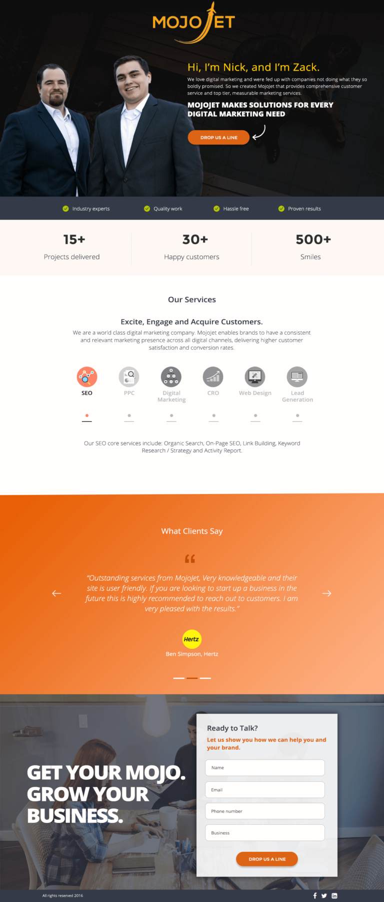
The founders in the hero (“Hi. I’m Nick, and I’m Zack”) is the most distinctive element of this page. This direct, informal introduction does something most agency pages don’t: it makes the relationship personal before the product is described. The founders’ photo is real, conversational, and unpolished in a way that signals authenticity. B2B buyers respond to this because they’re ultimately buying time with smart people, not an abstraction called an “agency.”
The warm orange gradient on the testimonial and CTA sections creates visual pacing. It’s a colour signal that says “something different is happening in this section.” We used the gradient sparingly so it retained impact; if every section used it. It would become wallpaper.
The three credibility stats
15+ projects delivered, 30+ happy customers, 500+ smiles, are positioned mid-page after the service section. The “smiles” metric is intentionally light. It signals that Mojojet is a warm, people-first firm rather than a metrics-obsessed agency. This tonal choice reinforces the founders-in-hero opening.
The tabbed service navigation (SEO (PPC, Digital Marketing, CRO, Web Design) Lead Gen) gives a thorough service breakdown without overwhelming the page. Visitors interested in SEO can read the SEO description without processing the PPC section. Each tab has its own sub-description and CTA, so every service path has a clear next step.
The Hertz testimonial placement in the gradient section creates visual contrast with the white service sections. The orange background makes the testimonial stand out as a landmark, a place where the page changes emotional register from informational to validating. The Hertz brand name does more work than the quote itself.
The "500+ smiles" metric is a deliberate tone signal. If all three stats were hard numbers, revenue, project count, retention rate, the page would read as purely analytical. Adding a human metric ("smiles") tells the visitor that this agency values relationships as much as results. It's a culture claim, not a data point.
Trust architecture
Trust on this page is built through: founders’ faces (accountability and humanity), client count (proven track record), Hertz testimonial (enterprise credibility), and detailed service descriptions (competence signals). Together they address the primary B2B objection, “are these people good enough and trustworthy enough to manage our campaigns?”

"Showing your founders' faces on a landing page is the highest-trust move an agency can make. It says: 'we're real people, we're accountable, and we're proud of what we do.' Anonymous agency pages invite scepticism. Named, photographed founders invite dialogue."
Read more about how we approach trust signals in our guide to B2B Landing Page Examples.
The "GET YOUR MOJO. GROW YOUR BUSINESS." section at the page bottom uses the brand name as a pun-adjacent call to action. This kind of tonal consistency, where even the final CTA reinforces the brand personality, creates a more memorable page experience than a generic "Contact Us" ending.
Conversion strategy
This is a click-through page, the CTA drives to a consultation or contact form rather than capturing on-page. The page’s job is to build enough confidence in Mojojet’s capabilities and personality that clicking “Schedule a Call” feels like reaching out to people you’ve already met, not cold-contacting strangers.
"The 'Schedule a Call' CTA only works if the page has done its job of making the visitor want to meet you. If you put 'Schedule a Call' on a page that shows no personality and no proof. You're asking a stranger to call you. Put it after faces, client names, and outcomes, and you're inviting someone who already likes you."
Platform: WordPress
WordPress was chosen here because it integrates with Mojojet’s existing marketing ecosystem. The page content and design can be managed without developer involvement, and the CRM integrations handle lead routing from the contact form.
Mobile experience
Agency pages are frequently reviewed on mobile during business travel or between meetings. The founders’ hero image scales well on small screens, the tab navigation converts to a vertical accordion on mobile, and all CTAs are thumb-accessible.
Founder photography and gradient sections can slow pages if not optimised. We used compressed WebP images for the founder photo, kept the gradient as CSS, and lazy-loaded below-fold content. Clean code and minimal third-party scripts kept load time under 2 seconds.
Evolve today
Three changes would push this page’s performance further:
- Add specific campaign results: “We grew organic traffic for [client] by 340% in 6 months” is more convincing than a general endorsement. Even one specific metric in the service tabs would shift the page from a credible pitch to a proven track record
- Video from Nick or Zack: A 60-second video where the founders speak directly to camera about their approach would boost the human-first opening and dramatically increase dwell time
- Client logo bar: A strip of recognisable client logos (beyond just Hertz) above the fold would immediately signal the calibre of work before the visitor reads anything
Browse our full collection of landing page examples to see how we apply these principles across industries. Want an agency page that converts? Talk to our team.
Waseem founded Apexure in 2015 and has led its work on 3,000+ pages for 300+ clients since. He writes about what the team sees after the click, which is pages, forms, tracking and the systems behind them.
What the page leans on
The principles at work on this page, each named in the analysis above.
Authority bias
People trust credible experts. Certifications, awards, media mentions, and expert endorsements boost credibility.
Social proof
People follow the actions of others. Testimonials, reviews, and client logos build trust and reduce hesitation.
Visual hierarchy
Controlling what visitors see first, second, and third guides them toward the conversion goal.
F-pattern layout
Eye-tracking shows people scan pages in an F-shape. Placing key content along this path increases engagement.
What people ask about pages like this
Mojojet is a digital marketing agency offering SEO, PPC, digital marketing strategy, CRO, web design, and lead generation. The landing page targets brands seeking consistent and relevant marketing presence across all digital channels, with a focus on higher customer satisfaction and conversion rates.
Showing Nick and Zack, the actual founders, in the hero personalises a service that could otherwise feel faceless. B2B buyers are hiring people, not platforms. When the founders are visible, the relationship starts before the first conversation. This human-first opening creates an immediate familiarity that a logo or product screenshot cannot replicate.
Mojojet offers six service lines: SEO, PPC, Digital Marketing, CRO, Web Design, Lead Generation. Presenting all six as equal panels with clickable tabs lets visitors self-select the service they care about without processing irrelevant information. The active tab shows detailed copy and a CTA, passive tabs remain available but don't compete for attention.
The testimonial from Ben Simpson at Hertz is effective because of the company name, not the quote. 'Hertz' is a globally recognised brand. Seeing it beneath a positive quote about Mojojet transfers brand equity: if Hertz trusts this firm, the visitor's own risk of engagement feels lower. Always hand-pick testimonials for recognisability over polish.
Three more, taken apart the same way



Want one like this?
Tell us what the page has to do and where the traffic comes from. Within 48 hours you get a written quote from the people who wrote this breakdown. Already have a page that is not converting? Send it for a free audit instead.
UK hours, which is the East Coast morning.
"Agency landing pages have one conversation to win above all others: 'Why should I trust you with my marketing budget?' The answer has to come from real humans, real numbers, and real client names. A generic agency page that shows no faces, no clients, and no outcomes answers nothing, and converts nothing."