CRO breakdown of Forge47's dark-themed digital marketing agency lead generation page. Design analysis and expert conversion insights by Apexure.
What is ConvertScore™? ConvertScore™ is Apexure's proprietary landing page performance metric. We evaluate every page across four dimensions — Copy & Messaging, Layout & Hierarchy, Trust & Social Proof, and CTA & Conversion Path — to produce a single score out of 100.

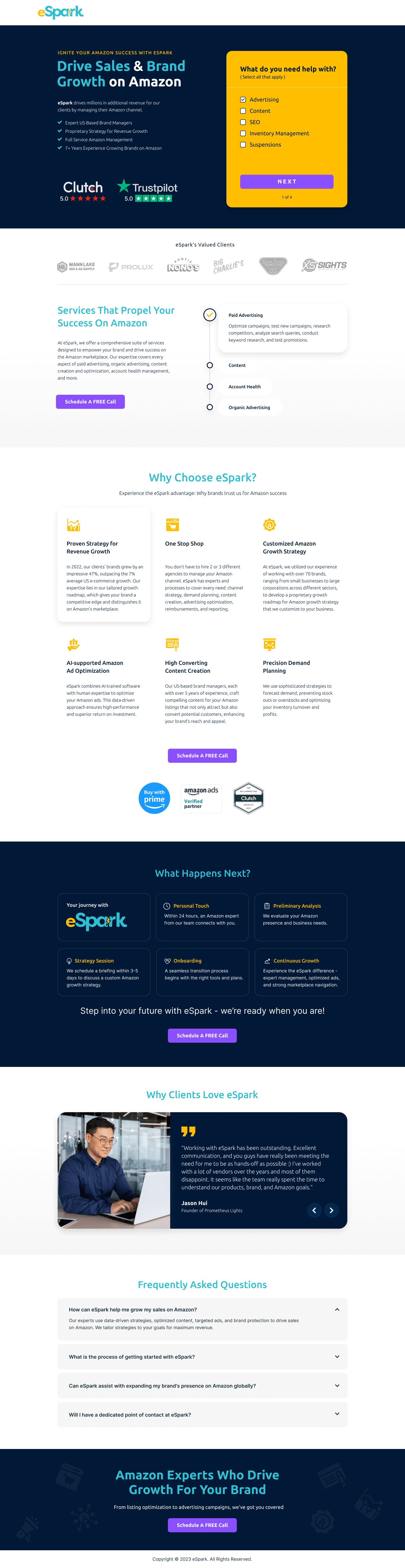
Forge47 needed a second landing page variant to test a different positioning angle. Where the yellow page leads with energy and creativity, this dark version leads with strategic partnership and trust. The brief was to capture a more deliberate buyer: someone evaluating multiple agencies carefully rather than responding to a brand’s aesthetic immediately.
The “Boosting Your Success, Together!” hero headline leads with the client outcome (“Your Success”) and immediately adds the partnership modifier (“Together”). That isn’t accidental. The headline is designed to land with buyers who’ve been overpromised by agencies and now want a partner rather than a vendor. The hero background photography shows a handshake moment, reinforcing the partnership framing visually.
The “Not the other way around” sub-headline is a trust reframe. Most agency copy describes what the agency will do for the client. This line reframes the relationship: Forge47 works to benefit the client, not the other way around. It directly addresses the scepticism experienced buyers carry about agency self-interest.
The “Hand-picking Your Vision / Planning & Design / Launch” three-step process is illustrated with custom graphics that match the dark, orange-accent colour scheme. The process section does a specific job. It shows that working with Forge47 is structured and predictable, not open-ended and ambiguous. Buyers evaluating agencies are often anxious about the onboarding experience. Showing it in three clear steps removes that anxiety.
The four service deep-dives (Full Marketing Strategy Development, Evidence-Based Marketing Approach, Time-Efficient Marketing Strategies, Effortless Collaboration and Cost-Effective Services) use a two-column card layout against a near-black card background. Each card has a bullet list with specific sub-actions. That level of detail signals genuine capability rather than aspirational positioning.
The orange “CONTACT US” button at the page close sits against a clean dark section with no competing elements. The CTA placement is deliberate. By the time a visitor reaches the bottom, they’ve read the process, the services, and the positioning. The single-option close removes decision paralysis.
The "We Aren't Your Average Agency" section does something valuable: it names a common failure mode ("cookie-cutter approach") and explicitly rejects it. That creates contrast between Forge47 and the agencies the visitor has probably already evaluated. Naming the competitor pattern without naming any competitor is a persuasion technique that validates the buyer's scepticism while offering a credible alternative.
The dark premium aesthetic signals confidence and craft before any claim is read.
The three-step launch process makes the engagement predictable. Buyers who’ve been burned by vague agency SOWs respond strongly to structured process visualisations.
The four detailed service cards go beyond bullet points, showing exactly how each service area is executed. That depth signals Forge47 has a genuine methodology rather than a templated approach.

"The 'Our Expertise / Reinventing Tradition / In Sync With You' trio in the mid-page is a values statement disguised as a service description. 'In Sync With You' is saying: we won't go dark for three weeks and come back with a design you hate. For an agency buyer who's been through that. That's a promise worth converting for."
Read more about how we approach trust signals in our guide to B2B Landing Page Examples.
The "What To Expect When Working With Forge47" section uses sub-headlines that mirror buyer thoughts rather than service names. "Time-Efficient Marketing Strategies" speaks directly to a buyer who has wasted months on an agency that moved slowly. Mirroring buyer anxieties in section headers is one of the most underused copy techniques in agency marketing.
The page runs a linear persuasion journey: credibility (hero + positioning) → proof of process (three-step section) → capability depth (service cards) → conversion (contact CTA). The visitor who reaches the bottom has been taken through a complete case for why Forge47 is worth a conversation.
The single CTA at the bottom (“Contact Us”) removes optionality at the decision point. Unlike the yellow Forge47 page, which uses dual CTAs for dual audiences, this version focuses the close on one clear action.
Unbounce allows quick iteration on the headline, CTA copy, and service card descriptions through native A/B testing. For a page like this where the positioning is being tested against the yellow variant, rapid iteration matters more than design control. We can test whether “Boosting Your Success, Together” outperforms “Fuel Your Business” with specific traffic segments without rebuilding the page.
The dark layout needs careful mobile treatment. Collapsed sections can lose the visual hierarchy that makes dark pages work. We kept the hero copy at full size on mobile, reduced the service cards to a single-column stack, and made sure the orange CTA button stays visible within thumb-reach of the current scroll position.
Dark pages need careful attention to contrast ratios and font weight. Text that's technically readable on a bright monitor becomes hard to read on a phone at medium brightness. We tested this page at 50% screen brightness, the minimum reasonable viewing condition, and adjusted font weights and opacity values accordingly before launch.
"They're able to take a conversation and turn it into a design that exceeds expectations."
Three improvements would lift performance on this variant.
Add a results metric in the hero. A single specific number (“£2.3M in client revenue attributed to paid campaigns”) gives the partnership promise an economic foundation the current copy lacks.
Surface a client testimonial above the fold. The page currently places all social proof in the lower sections. A short attributed quote near the hero from a named client would validate the partnership positioning immediately.
Test “Book a Free 30-Minute Strategy Call” vs “Contact Us”. The current CTA is vague about what happens next. A time-boxed offer gives the visitor a concrete expectation and lowers the commitment threshold.
This Forge47 dark page demonstrates how a single colour palette shift can reposition an agency for a different buyer psychology. The partnership-first messaging, process visualisation, and detailed service cards work together to attract deliberate, high-value clients rather than price-sensitive ones.
Browse our full collection of landing page examples to see how we apply these principles across industries. For methodology, read our guide to B2B Landing Page Examples.
People trust credible experts. Certifications, awards, media mentions, and expert endorsements boost credibility.
People follow the actions of others. Testimonials, reviews, and client logos build trust and reduce hesitation.
Controlling what visitors see first, second, and third guides them toward the conversion goal.
Colours trigger emotional responses. Strategic use of contrast and brand colours guides attention to CTAs.
Dark layouts create a premium, confident visual identity that differentiates from the majority of white-background agency sites. They work when the content hierarchy is strong, headlines must be bright enough to snap the eye, and CTA buttons need high contrast against the dark field. Forge47's orange CTA against the near-black background achieves WCAG AA contrast ratios while creating a visual pop that directs attention precisely where conversion happens.
This landing page variant targets a more relationship-focused buyer, someone who values trust and mutual investment over transactional service delivery. The 'Boosting Your Success, Together' headline and the 'mutual trust' emphasis speak to buyers who have been burned by agencies that overpromised and underdelivered. Leading with partnership language filters for clients who are ready to collaborate, not just receive deliverables.
Each service block (Full Marketing Strategy, Evidence-Based Approach, Time-Efficient Strategies, Cost-Effective Services) leads with an outcome category rather than a tactic. 'Evidence-Based Marketing Approach' tells the buyer they'll get data and results, not just 'we do Google Ads.' This outcome-first framing keeps the copy reader-centric and answers the question every buyer is actually asking: what will this mean for my business?
An Unbounce agency page like this takes 2-3 weeks from brief to launch. The platform gives us native A/B testing, active text replacement for ad-matched headlines, and fast iteration on CTA variants without developer involvement. For agencies running paid traffic to this page, that iteration speed is a direct performance advantage.
Other CRO breakdowns from our lookbook
We design high-converting landing pages for B2B and B2C brands. Let's talk about yours.
Get a Free Consultation Or browse more examples →
Founder & CEO of Apexure, Waseem worked in London's Financial Industry. He has worked on trading floors in BNP Paribas and Trafigura, developing complex business systems. Waseem loves working with Startups and combines data and design to create improved User Experiences.
Get quality posts covering insights into Conversion Rate Optimisation, Landing Pages and great design


"Dark layouts carry psychological weight white pages don't. They signal confidence: 'we're not trying to look approachable. We're trying to look capable.' For an agency selling strategic marketing, that confidence positioning can attract clients who want experts, not people-pleasers. The challenge is executing it without losing warmth."