CRO breakdown of Forge47's affiliate marketing and web design lead generation. Design analysis and expert conversion insights by Apexure.
What is ConvertScore™? ConvertScore™ is Apexure's proprietary landing page performance metric. We evaluate every page across four dimensions — Copy & Messaging, Layout & Hierarchy, Trust & Social Proof, and CTA & Conversion Path — to produce a single score out of 100.
A marketing agency’s website is a live portfolio. Potential clients assess the agency’s capabilities partly by how well the agency markets itself. Forge47 needed a page that communicated creative capability and specific service expertise at the same time, while driving two distinct types of conversion: affiliate sign-ups and direct service enquiries.
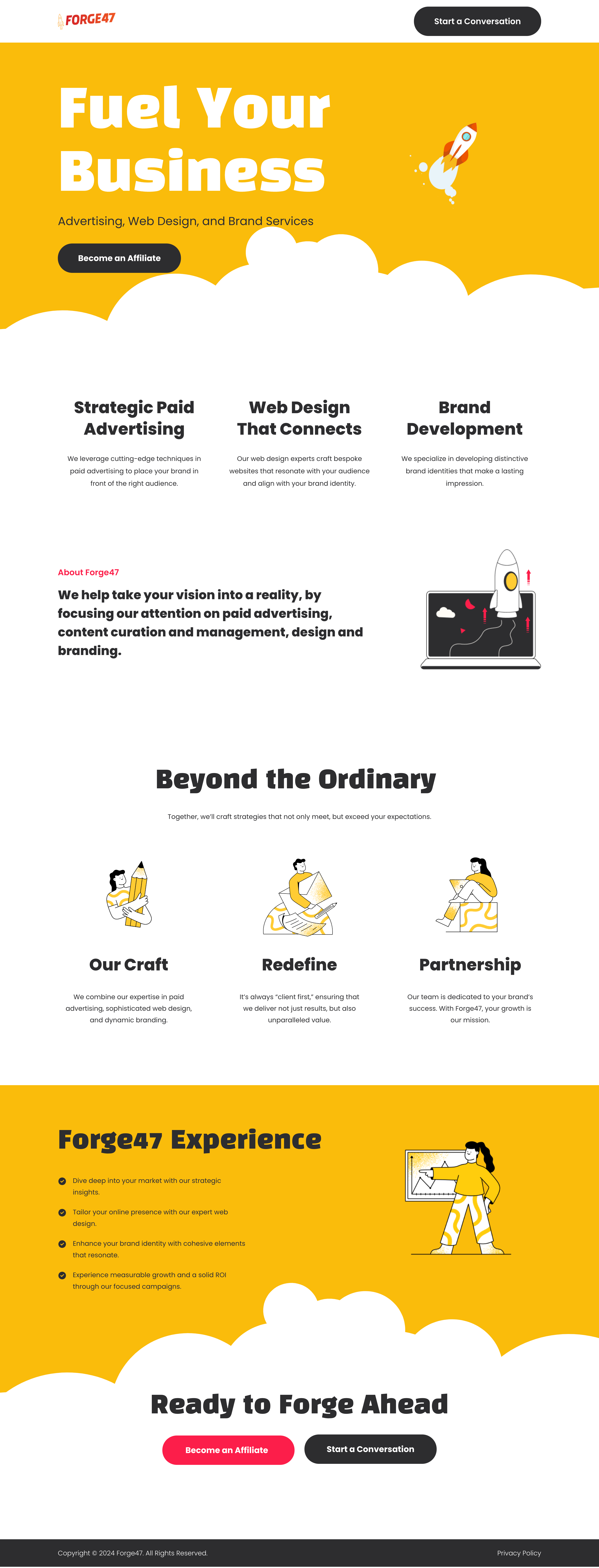
The bold yellow hero with the “Fuel Your Business” headline creates a visual identity immediately distinct from the sea of dark-themed, corporate-feeling agency pages. The rocket illustration reinforces energy and momentum without using photography, which is a smart choice for an agency without a team-photo budget. The yellow also sets an expectation of personality. This is an agency with a point of view, not a commodity shop.
The three-column service summary (Strategic Paid Advertising, Web Design That Connects, Brand Development) sits immediately below the hero with no separating section. The layout creates a fast service menu for visitors who want to evaluate fit before reading further. Each column is a single sentence that describes the outcome, not the process.
The “About Forge47” section with bold statement copy (“We help take your vision into a reality, by focusing our attention on paid advertising, content curation and management, design and branding”) sits to the left with a laptop illustration on the right. That section converts a scanner into a reader by leading with action verbs and a direct promise.
The “Beyond the Ordinary” section with three icons and process cards (Our Craft, Redefine, Partnership) describes how Forge47 works rather than what they deliver. That process-forward messaging builds confidence with buyers who want to know they’ll be treated as a partner, not a project.
The “Forge47 Experience” list with four measurable outcomes (strategic insights, online presence, brand identity, measurable growth) takes the abstract value proposition and makes it concrete. Each bullet starts with a verb, creating momentum and suggesting active delivery rather than passive consulting.
The closing section ("Ready to Forge Ahead") uses the brand name as a verb. That's sophisticated copywriting. "Forge Ahead" activates the brand identity at the exact moment of conversion, reinforcing the message that choosing Forge47 means taking action. The two-button close (Become an Affiliate / Start a Conversation) makes sure neither audience segment is left without a path.
The page itself is the first proof. An agency that has invested in a high-quality, visually distinct page is demonstrating the standard of work a client can expect.
The three-step launch process (Hand-picking Your Vision / Planning & Design / Launch) shows buyers what the experience of working with Forge47 looks like. Process sections reduce the perceived risk of hiring an unknown agency.
The measurable outcomes list anchors value in ROI language (growth, campaigns, design identity) rather than activity language (we run ads, we build websites). Buyers care about outcomes, not activities.

"The dual CTA on this page ('Become an Affiliate' and 'Start a Conversation') is a smart architecture decision. Running two acquisition programmes from a single page works when they're visually differentiated and serve distinct audiences. The affiliate path targets people who want to earn by referring. The conversation path targets people who want to buy. Neither cannibalises the other."
Read more about how we approach trust signals in our guide to B2B Landing Page Examples.
The page copy avoids the word "we" in favour of outcome-based language. "Your growth is our mission" keeps the reader in the frame rather than describing the agency's attributes. Buyer-centric copy consistently outperforms agency-centric copy in services categories. Clients want to know what happens to them, not what the agency is proud of.
The page serves two conversion tracks in parallel. The “Become an Affiliate” track targets network partners. The “Start a Conversation” track targets direct buyers. Both CTAs appear in the nav, at the end of the hero, and at the footer close, so neither audience segment has to search for their path.
The nav CTA (‘Start a Conversation’) persists across scroll, which means high-intent direct service buyers can convert at any point without scrolling back to find a button.
"Agency pages are sold on taste as much as proof. The illustrations on this page (the rocket in the hero, the flag-planting in the process section) communicate energy and ambition without needing a photoshoot. Consistent illustration style across a page creates a visual coherence that signals professionalism, even when the budget is lean."
WordPress suits this project because it allows full design control without the constraint of landing page builders. For an agency page where design is itself the proof of capability, pixel-perfect execution matters more than native A/B testing tools. The client can update copy and case studies without developer involvement.
Agency pages are frequently browsed on mobile when a prospect has been referred or has seen a social post. The mobile layout stacks the three service columns vertically, keeps the hero headline at large type size, and places both CTAs in a stacked format with clear visual separation. The nav condenses to a hamburger but keeps the “Start a Conversation” CTA visible in the bar.
All illustrations are were SVGs, keeping file sizes minimal while holding sharp rendering at every screen density. The page avoids hero images and video, which means it loads in under 1.5 seconds on a standard connection. Fast enough to pass a first impression test even when the visitor clicks from a slow mobile link.
"They're able to take a conversation and turn it into a design that exceeds expectations."
Three improvements would strengthen this page’s conversion performance.
Add client results in the hero. A single headline metric (“120% average ROAS improvement” or “40+ brands grown”) gives visitors an immediate performance anchor before they read the service descriptions.
Include case study thumbnails in the “Forge47 Experience” section. Screenshots or results cards from real campaigns provide evidence that the four outcome bullet points are backed by track record, not aspiration.
Test “Book a Free Strategy Call” vs “Start a Conversation.” The current CTA is warm but low-commitment. A specific, time-bound offer (“Book a free 30-minute strategy call”) gives the visitor a clearer picture of what happens next, which typically improves click-through.
The Forge47 page demonstrates how an agency can use its own design language as the first proof point of capability. The yellow brand identity, the bold typography, and the outcome-focused copy create a coherent case for hiring this team before a single portfolio piece is shown.
Browse our full collection of landing page examples to see how we apply these principles across industries. For methodology, read our guide to B2B Landing Page Examples.
People trust credible experts. Certifications, awards, media mentions, and expert endorsements boost credibility.
People follow the actions of others. Testimonials, reviews, and client logos build trust and reduce hesitation.
Controlling what visitors see first, second, and third guides them toward the conversion goal.
Eye-tracking shows people scan pages in an F-shape. Placing key content along this path increases engagement.
Marketing agency pages face an unusual challenge: the audience knows about marketing, so a generic-looking page signals low competence. The most effective agency pages lead with a specific capability promise, back it up with a process section that shows methodology (not just outcomes), and use a CTA that feels collaborative, 'Start a Conversation' rather than 'Get a Quote.' Agency buyers want a partner, not a vendor.
Yellow creates an immediate visual identity distinction in a category dominated by dark, blue-heavy agency designs. It signals energy, creativity, and confidence without the aggression of red. Against a white background with bold black typography, the yellow hero creates a premium, editorial feel, closer to a design studio aesthetic than a generic marketing firm. Colour is the fastest brand signal a visitor receives.
Forge47's primary acquisition path is through an affiliate programme, partners who refer business in exchange for commission. This CTA targets business owners who want to monetise their network rather than buyers looking for direct services. The 'Start a Conversation' CTA in the nav targets direct service buyers. Running both simultaneously means the page serves two audience segments without splitting into two pages.
A marketing agency lead generation page takes 2-3 weeks from brief to launch, including audience research, wireframing, visual design, copy, development, and cross-device testing. The key difference from other industries: agency pages require a higher visual standard because the page itself is a demonstration of design capability. We treat it as a portfolio piece as much as a conversion tool.
Other CRO breakdowns from our lookbook
We design high-converting landing pages for B2B and B2C brands. Let's talk about yours.
Get a Free Consultation Or browse more examples →
Founder & CEO of Apexure, Waseem worked in London's Financial Industry. He has worked on trading floors in BNP Paribas and Trafigura, developing complex business systems. Waseem loves working with Startups and combines data and design to create improved User Experiences.
Get quality posts covering insights into Conversion Rate Optimisation, Landing Pages and great design


"A marketing agency's landing page is both a sales tool and a proof of concept. If the design is generic, the visitor immediately wonders: is this really the team I want running my paid ads? Forge47's yellow and bold typography makes a statement before any copy is read, and that's intentional."