
What makes the best SaaS landing page? What is considered the best Saas landing page design? Landing pages are becoming increasingly more important every day, and with this article, we want to help you gain the knowledge to create the best SaaS landing page that will go above and beyond.
SaaS businesses have a tougher time designing landing pages than any other businesses. Even the slightest mistake, such as choosing the wrong button colour or providing a bad user experience, can ruin your efforts and negatively impact your prospects if you offer a purely virtual product.
Quick rewind – What does the Best SaaS Landing Page Look Like? A web page that provides visitors with information about specific software that can solve a problem. Over the past few years, Software-as-a-Service (SaaS) has become an emerging trend in the technology sector. Subscription-based software is becoming an increasingly attractive option for businesses when purchasing software.
The key to your success and growth may be getting new businesses to try your SaaS product or buy a paid plan, and having the best SaaS landing page can make a big difference in this process. The cost of digital marketing is high, so use goal-oriented landing pages instead of regular websites to convert more visitors into customers.
What is the Ultimate Way to Design the Best SaaS Landing Page? In our opinion, exploring real-world examples is the best way to learn about the best SaaS landing page best practices. In this article, you’ll find something to inspire your next SaaS landing page design, whether you’re sizing up the competition or just looking for inspiration.
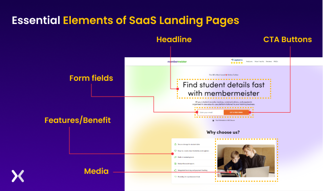
Almost all landing pages contain the same elements. Some are more relevant to SaaS businesses than others. A best SaaS landing page without these essential elements may lack content, user experience, or conversion potential.
Headline: A good SaaS landing page headline should be descriptive, relevant, and catchy, and it should accurately reflect the benefits and features of the product.
Hero section: The hero section should include an enticing image or video of the software product and a compelling call to action (CTA) that tells the visitor what to do next. The image should be high-quality, visually appealing, and accurately reflect the product’s features and benefits.
Features/Benefits: Each SaaS product or service should have the right image supporting its unique solution on the landing page.
Media: Using your software’s images and gifs to tell your brand’s story can help you reach your target audience. Through interactive media, marketers can capture and hold visitors’ attention.
Animations: These can be used to illustrate the key selling points of your software. They are great for explaining complexity easily (and quickly).
Form fields: Keep the form fields as simple as possible if you plan to collect email addresses; collect only the necessary information. Later in the customer journey, you can always ask for more details.
CTA Buttons: Make sure your call-to-action buttons are eye-catching above and below your content. It will help target people at different points in their decision-making process.
The best SaaS landing page should contain these elements, but you can learn more through examples. Let’s see some of them!
The following examples have been designed by Apexure and provide a great overview of how to design an effective SaaS landing page. We have focused on the strong points of the landing pages that our SaaS clients love and how you can learn from them.
We’ll examine each design, explore the different elements, and explain how they work. Overall, most of the SaaS landing page examples have commendable highlights and solid takeaways. For your SaaS landing page design, you can use similar tactics.
Let’s go!
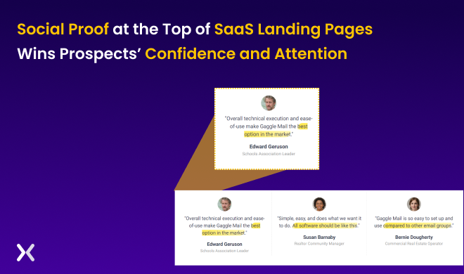
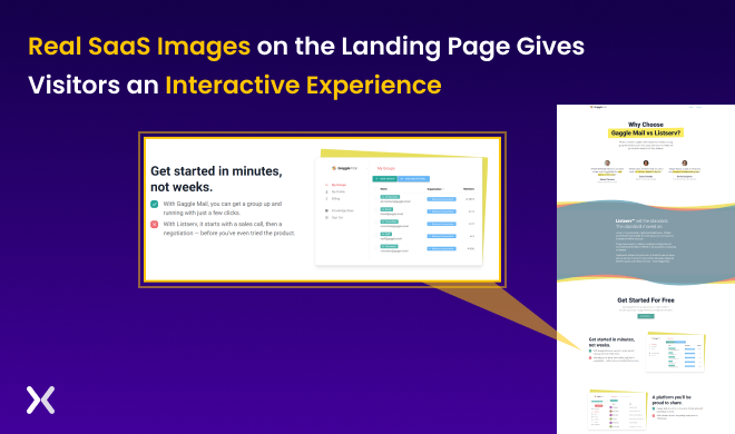
Gaggle Mail allows users to set up and maintain an email group easily. With Gaggle Mail, users can create a group email address for everyone to contact. It can be useful for teams, organisations, or people who need to communicate. Let’s check out some good sections of their comparison landing page.
Strong points:
Use of social proof: You’ve read the main header and started to scroll down. The first thing you see will be happy faces explaining to you in just a few lines why they like this particular SaaS service. And the great thing about these short content pieces is that many viewers will have read them before they know it, a great example of what the best SaaS landing page would include!
Use of whitespace: The generous use of whitespace gives the user a sense of space and calm. It also helps highlight and explains the service’s core essence, as there is nothing else to distract the viewer from.
Use of authentic software images: By using real software images, viewers are already taking a demo without them having downloaded a file, watched a video, clicked a link, or arranged any demo session.
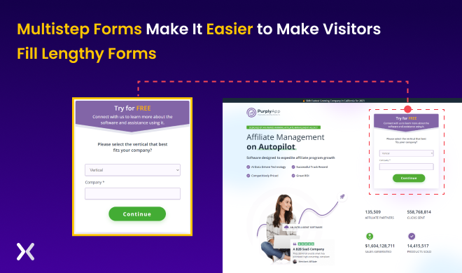
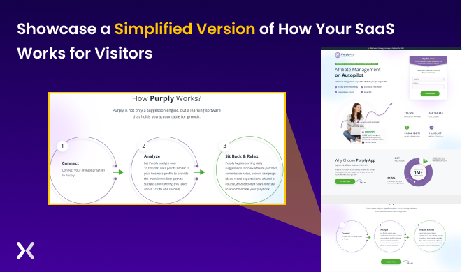
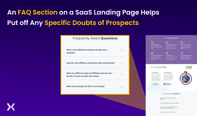
Purply is a marketing tool that allows users to view and monitor popular affiliates and identify compelling advertisement copies, marketing time, product pricing, and more. It is designed to help marketing teams receive automated recommendations about affiliate partners, trends, and campaign ideas. With Purply, users can analyse and track the performance of their marketing efforts, identify areas for improvement, and make informed decisions about their marketing strategy.
Let’s check the lead generation landing page of the Purply App.
Strong points:
Multistep form: Coming face to face with a long form to fill out can feel daunting, and applying a ‘multistep form’ approach is a great way to overcome this.
Clear explanation about how the SaaS works: People are often not as focused as we’d like them to be when we tell them about the software we’ve worked on for years. A clever way to bypass this situation is to try and explain your SaaS solutions in a few steps reflecting the way it will benefit them.
FAQ section: Put yourself in the shoes of your SaaS landing page viewer for a second and think about any specific questions they might have after reading through your content. List these out, and you give the viewer a feeling of being recognised and answer any queries they might have straight away!
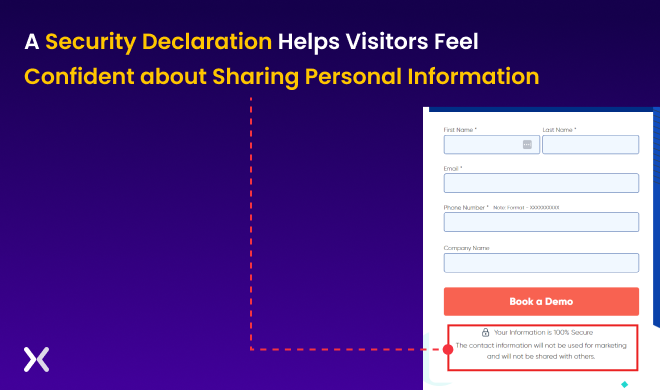
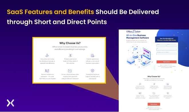
Office Solver is a software company that provides various tools and solutions to help businesses and organisations streamline and automate their office work. The software is designed to help users save time and reduce the complexity of their office tasks, enabling them to focus on more critical tasks and grow their businesses. Their SaaS suite includes various tools and features to help users manage documents, automate workflows, handle payroll, and more. Let’s examine the lead generation landing page of Office Solver.
Strong points:
Security Declaration: By adding a simple security text box saying your SaaS is super secure, you signal to the viewer that security is essential to your company. Make the security declaration an integral part of how the viewer will perceive your service.
Placement of CTA: Convert, convert, convert! It’s OK to use many CTA’s, just as long as they come from a different angle and aren’t all the same. Angle number one might not speak to person number A, and angle number two might not speak to person number B, but vice versa; it might provide effective conversion resulting in the best SaaS landing page.
The right way to showcase features and benefits: Instead of making an endless bullet-pointed-list of the numerous features and benefits your service will bring, try and recognise the – let’s say – six best ones. And then, try to write these up in equal amounts of text (less is more!), assign a nice icon to them, and you have created a beautiful overview of your service.
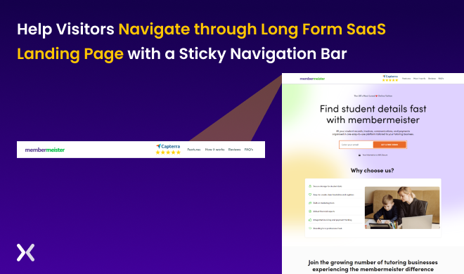
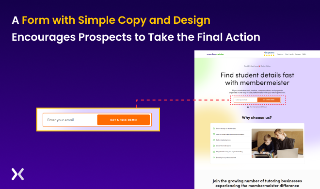
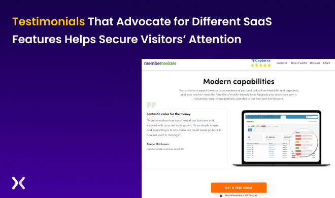
Membermeister is a software-as-a-service (SaaS) platform specifically designed to help tutors organise and manage their students’ data. The SaaS aims to make it easier for tutors to keep track of their students and manage the administrative aspects of their business, freeing them up to focus on teaching and other essential tasks. It includes various features and tools that help tutors create timetables, financial reports, and track payments, among other tasks.
Let’s understand the simple yet compelling design of Memebermeister’s landing page.
Strong points:
Sticky Navigation Bar: Sometimes, when you have a more extended landing page, it is helpful to have a sticky navigation bar on top. It enables viewers to jump to different sections of your landing page listed on the sticky navigation (sticky meaning it will always be on screen, fixed.) This means viewers don’t have to scroll through the page to find a certain section or scroll to the top to find the navigation bar again.
Simple form: Is your primary goal to collect email addresses. Why not make it simple by having one box and button? People are more likely to interact with simple things than things requiring effort.
Leveraging Features with testimonials: Have a fantastic feature you are super excited about? What better way than having others who are also enthusiastic about it tell your audience rather you? It will not only feel even better, but it will also make your service look good – an essential feature of the best Saas landing page.
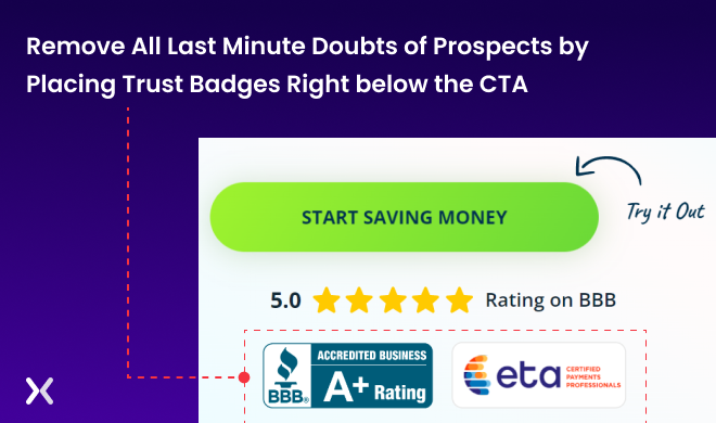
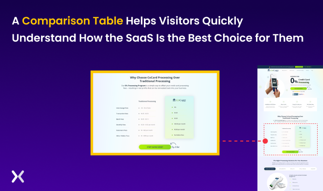
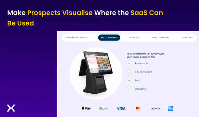
CoCard is a payment and point-of-sale provider that offers solutions for various institutions and distributors. It provides free credit card processing and customisable equipment at an affordable price. CoCard aims to make it easy for businesses to accept payments and manage their point-of-sale operations. It includes various features and tools to help businesses process transactions, track sales, and manage their finances.
Let’s take a look at the long form landing page of Cocard.
Strong points:
Trust Badges right below the CTA: Is the viewer unsure if they want to go ahead and make the transaction? Then it might help to see many certificates of excellence and other trustworthy emblems so we can reassure them signing up is the right thing to do.
Comparison Table: Are you winning on multiple fronts? Why not show that by implementing a comparison table showing how you and your competitor’s products and services differ? Sometimes a strong comparison table is all it takes to convert a prospect.
Creative showcase of Software applications in various setups: A viewer likes your service but is unsure if it would look good or fit well in their space. Then it would help to see the application ‘in situ’ meaning ‘in situation’; this could be several spaces and places to give an optimal idea.
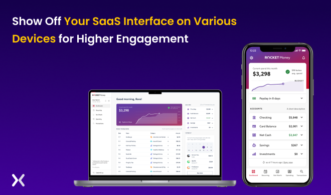
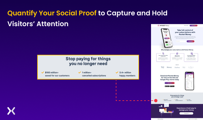
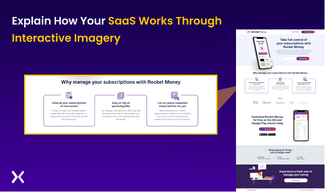
Rocket Money is a budgeting and bill management app that helps users track and manage their money. It includes various features and tools to help users keep track of their spending, set financial goals, and pay bills on time. Rocket Money is available in both a free (freemium) version and a paid version, allowing users to try the app before fully committing to it.
Let’s understand the intricacies of Rocket Money’s short-form landing page.
Strong points:
Showcases the SaaS in action: Similar to showing images of the actual application, this shows a demo before viewers have asked to have one. Showing your amazing UI/UX in full motion could help engage and ultimately convert them, so this should be a serious option to consider.
Quantifying social proof: Big numbers, strong percentages, exciting metrics. These can be impressive statements on how well your service is performing for your clients, how much their revenue has increased since implementation, etc.
Short and simple explanation of how the SaaS works: ‘if you can’t explain it simply, you don’t understand it well enough’ is how the saying goes. Explaining your SaaS service in 3 / 4 steps makes it easy to digest and engages the viewer to learn more, and you will find this on most of the best SaaS landing pages. The depth can follow later, after the conversion.
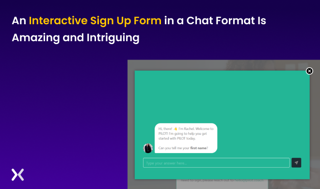
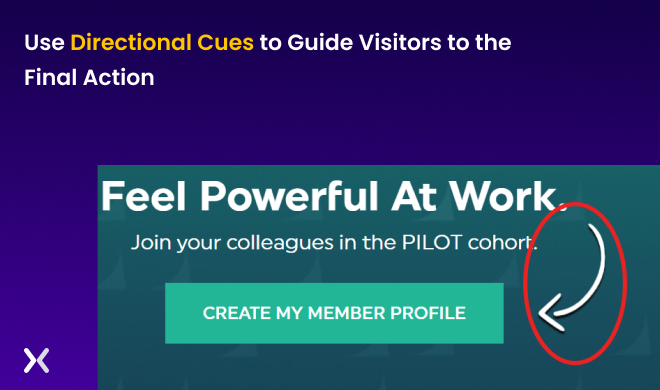
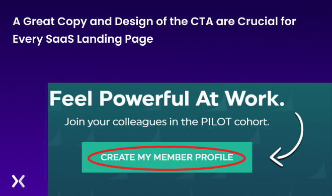
Pilot Coach is a mobile app or software platform that offers various in-app programs designed to help people feel more confident in their work environment and advance in their careers. It includes multiple features and tools to help users develop their skills, build confidence, and achieve their career goals. Some of the programs or services offered by Pilot Coach may include training courses, coaching sessions, and tools for career development.
Let’s take a look at Pilot Coach’s creative landing page.
Strong points:
Interactive signup form: Forms don’t need to be dull and boring, so why not go ahead and make them interactive and fun?
Use directional cues to the CTA: Make it super clear to the viewer what they should do, take them by the hand, literally, by showing them where to click.
Overall a great CTA (good copy and design): If crafting the very best SaaS landing page was a case of different sorts of diamonds, then your CTA should be the biggest, most shiny diamond of them all. It’s the one item that can turn engagement into conversion, so take the extra mile to make it well-positioned and well-written!
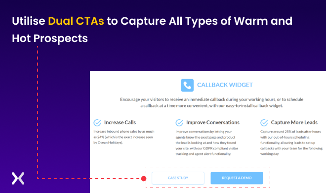
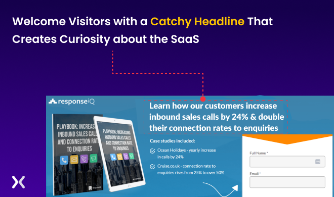
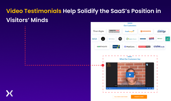
ResponseiQ is an innovative callback platform that helps businesses optimise their websites and pages for better customer service. It is designed to help businesses improve their inbound lead generation and make it more efficient. The SaaS includes various features and tools to help businesses capture and manage leads, track and analyse customer interactions, and improve the overall customer experience.
Let’s examine ResponseiQ’s landing page.
Strong points:
Dual CTA: Sometimes there can be more ways to Rome, as the saying goes. Why not consider more CTAs than one, as there often are more effective ways to get engagement and conversion. While keeping one CTA for hot leads, let the second CTA cater to visitors who are not ready to convert but have an interest.
Catchy Headline: A catchy headline will do a lot of the work, as this will pull the viewer in and open them up to wanting to learn more and engage with the rest of your content. It is super important and should have your full attention.
Video Testimonial: Sometimes, all it takes is to watch somebody explaining it all like you are in the same room. Proven to be very successful.
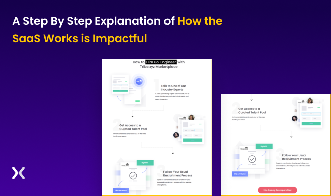
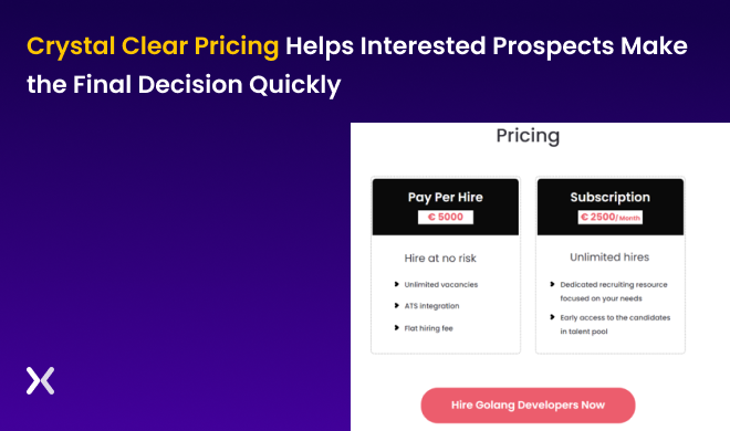
Tribe is an exclusive platform for talent acquisition that helps businesses find the best candidates for their open positions. It is designed to help businesses scale and grow by providing access to a network of specialists who can assist with talent acquisition. Tribe includes various features and tools to help businesses identify and evaluate potential candidates, manage job postings and applications, and streamline the hiring process.
Let’s understand the stand features of Tribe’s landing page.
Strong points:
Easy explanation of how they work: Try to bring it back to a few steps explaining how your clients would get from A to B working with your product or service.
USPs Highlighted: What’s so great and unique and great about your SaaS product? List them out, and highlight them!
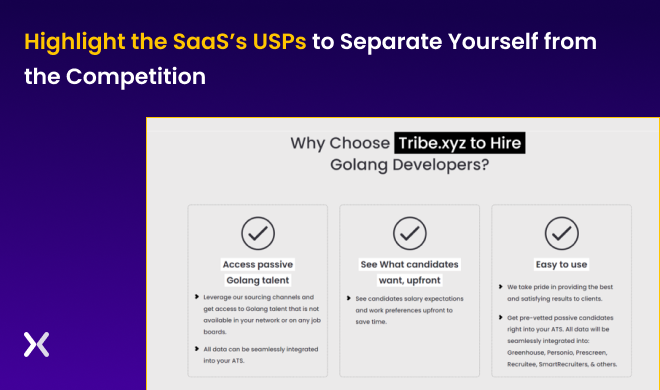
Clear Pricing: Life is too short for deciphering complex pricing structures. Consider keeping it simple by offering clear, concise pricing options with not too many tiny copy parts.
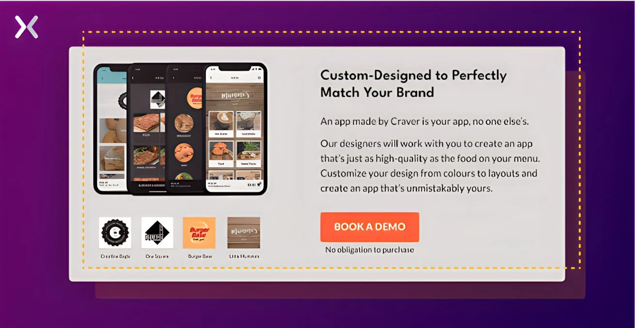
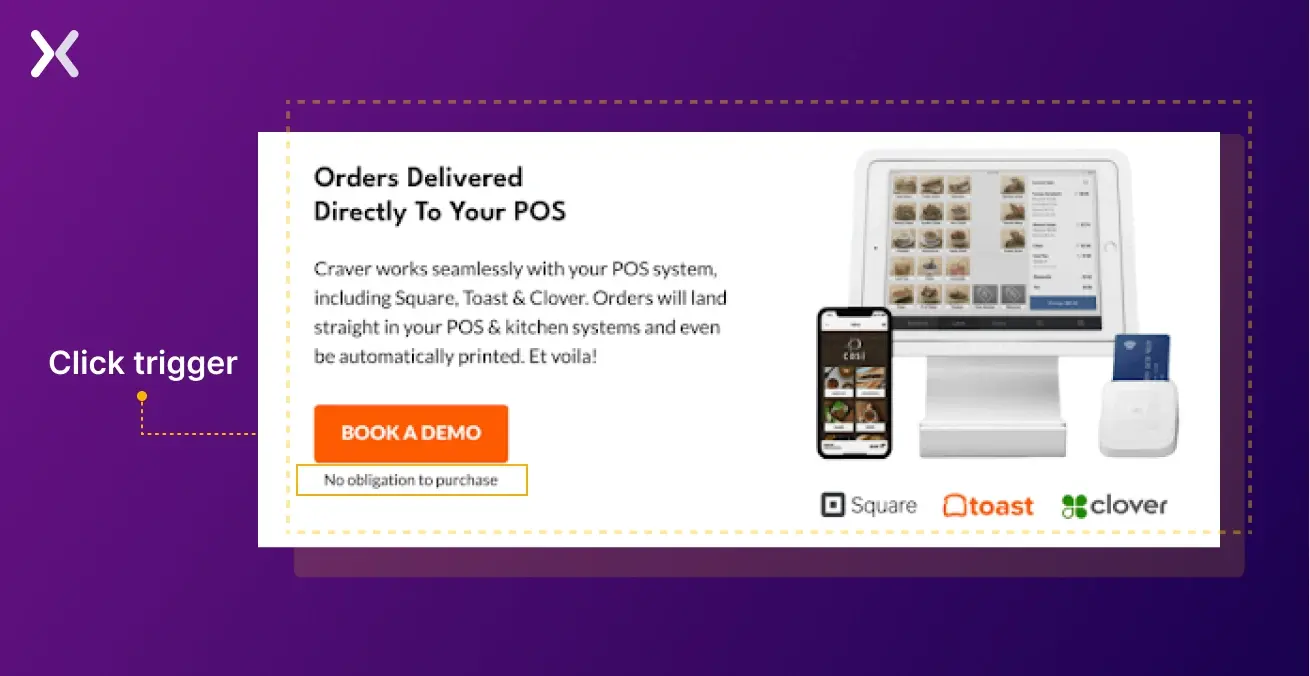
Craver is a mobile app platform specifically designed for restaurants. It aims to help restaurants increase customer engagement and lifetime value through an omnichannel approach, including mobile apps and online ordering.
Let’s see how they highlight their USPs on their landing page:
Strong points:
Clear imagery: The landing page uses clear images and icons that perfectly complements the copy and the clear look of the page.
Right Social Proof: It can sometimes be difficult to showcase social proof in a creative, but Craver’s landing page does so effortlessly. They have showcased all the clients they are working with while also highlighting the crucial USP of custom-designs.
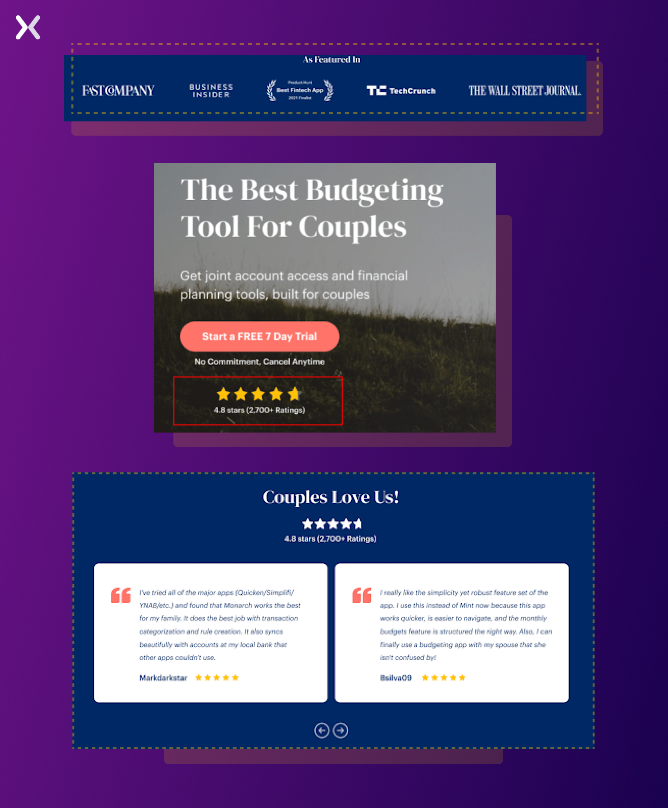
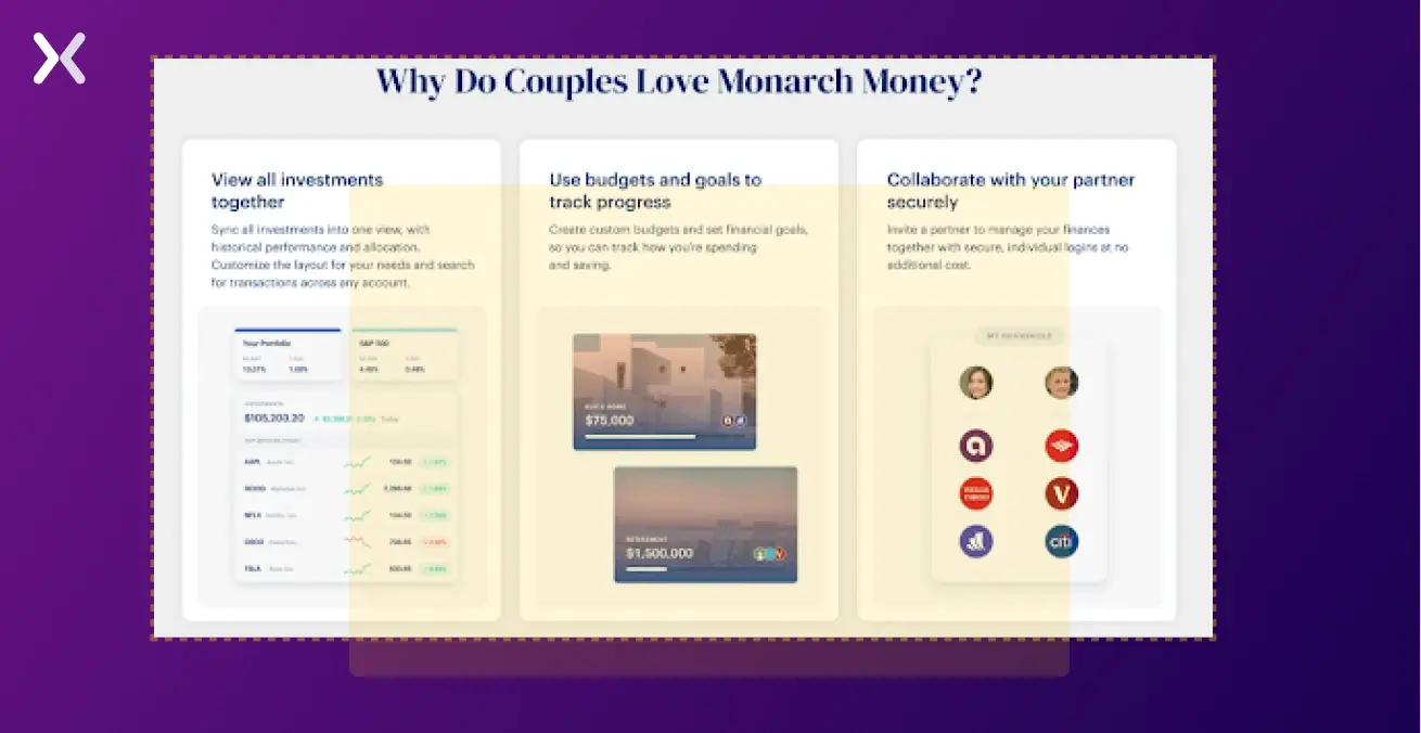
Monarch is a powerful money management tool designed for couples, advisors, etc., providing clarity and control over their finances. This particular landing page of Monarch focuses on couples and how they can sync all their accounts into one place, access the platform with their individual logins, and gain joint insights through shared reports.
Strong points:
The best SaaS landing pages are heavily optimized for conversion and user experience, which means they are continually tested and tweaked to determine what works best for their users.
Consider A/B testing different headlines, CTA button variations, or page layout variations to determine which version performs better. To understand what resonates the best with your audience, test out gifs, videos, and animations, to find out what works best for you. Remember, however, that you should continuously optimize your SaaS landing pages for mobile and desktop devices when designing them.
Other ‘No Nos’ for creating the best SaaS landing pages:
Is there hidden social proof that people are excited about your product? Sharing other buyers’ unique experiences is the best way to sell your products, so don’t keep it a secret.
Do not copy and paste images from the homepage or service pages without considering how they will look on the landing page. Rather than adding context to the copy, visual aids just fill the space.
Uncompelling CTAs like “Learn more about the product” aren’t going to captivate viewers.
From all the examples discussed, it is clear that many different elements go into creating a successful SaaS landing page. From a strong and concise headline to a clear and compelling call to action, many factors can influence the effectiveness of a landing page. Studying the best SaaS landing page examples and learning from their successes makes it
Whether you want to increase sales, generate leads, or build your email list, a well-designed landing page can drive growth and success. So take the time to study the best SaaS landing page examples, analyse what makes them effective, and use that knowledge to create a landing page that works for you.
As more and more SaaS brands adopt landing pages as part of their performance marketing strategy, we advise you to try them out too.
If you are looking for assistance, Apexure is here to help you create the best SaaS landing page possible! Simply reach out to us today for a consult (we have a great landing page to lure you in!), and we’ll explore the best way to implement all the learnings above in the best landing page for your business.
Related Article:
Founder & CEO of Apexure, Waseem worked in London’s Financial Industry. He has worked on trading floors in BNP Paribas and Trafigura, developing complex business systems. Waseem loves working with Startups and combines data and design to create improved User Experiences.


Drive More Sales or Leads With Conversion Focused Websites and Landing Pages
Get Started


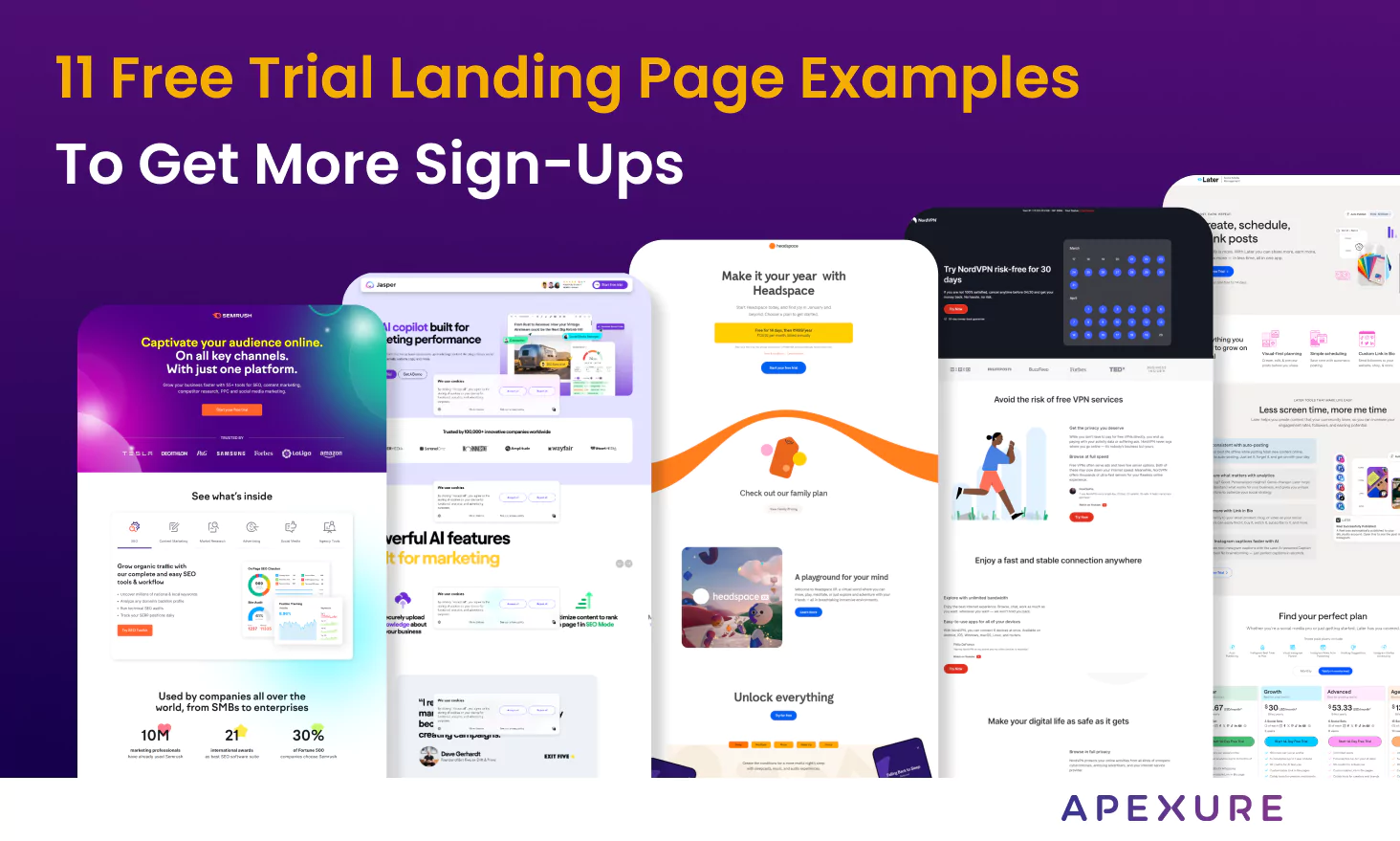
A free trial landing page is essential for introducing your product to the right audience and bringing them...
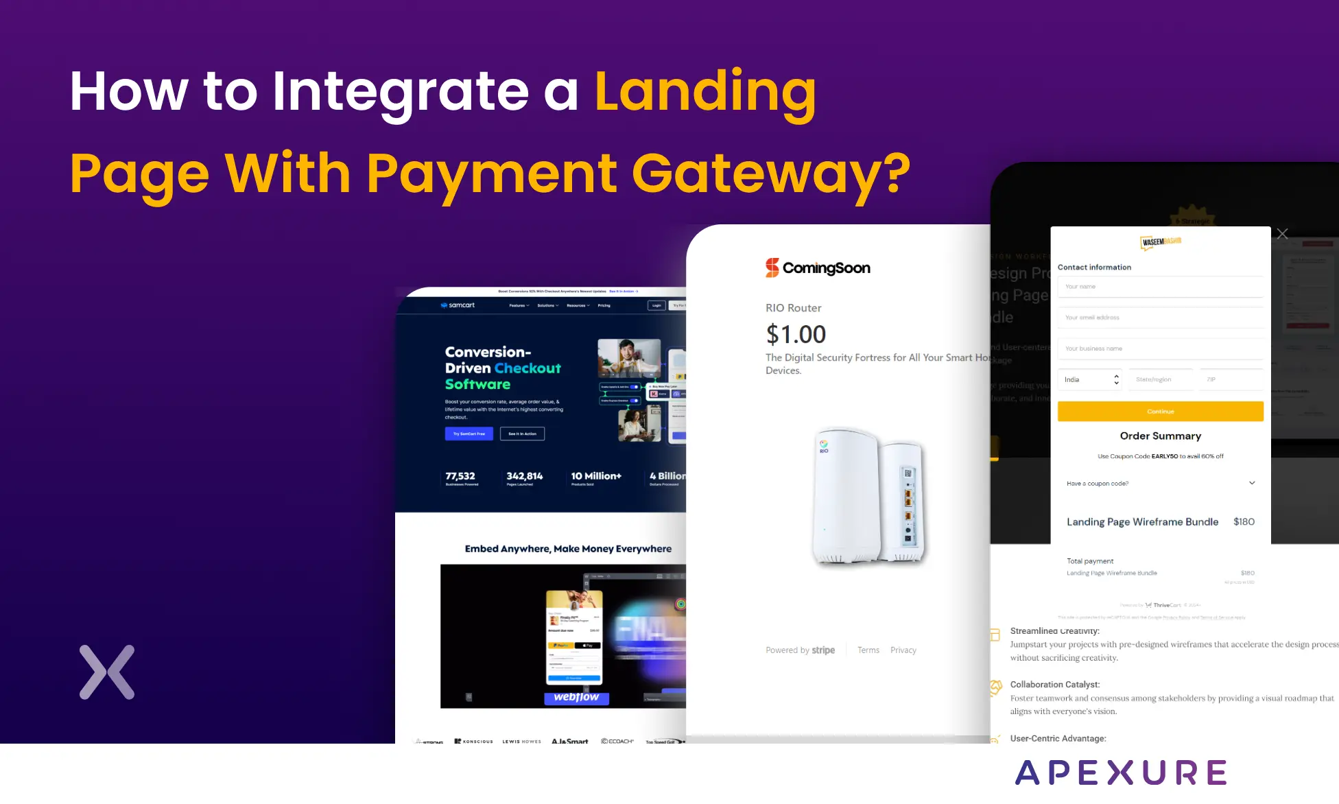
Landing pages with payment gateways can help you maximize your sales opportunities. Having a streamlined payment process is...
Get quality posts covering insights into Conversion Rate Optimisation, Landing Pages and great design
